its a mess to edit the envelope on the sample modulations section. this is just audio editing from 1990!
why not adding that kind of editor too, so we can do powerful gates?!
ahh wait…theres kontakt hmm? ![]()
its a mess to edit the envelope on the sample modulations section. this is just audio editing from 1990!
why not adding that kind of editor too, so we can do powerful gates?!
ahh wait…theres kontakt hmm? ![]()
Have you tried adding an envelope modulation device, setting it to point mode?
You get adjustable horizontal and vertical snapping- basically exactly the same as your screenshot above…
Think of this…
4422 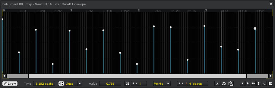
…as being more like this…
4423 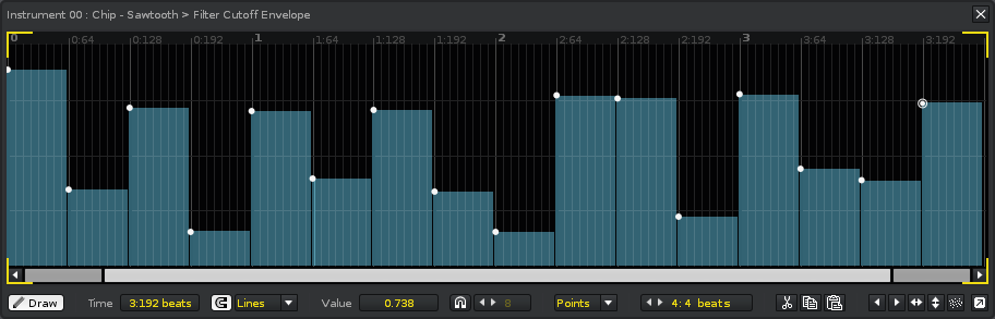
Same thing, just displayed a bit differently.
We could potentially think about displaying points more like solid bars, just to help reinforce what is actually happening internally.
Yeah, think about it. It is more appealing than points…
Why not add a “bar” mode besides points, linear and curve?
This would make sense since mouse interaction would preferably be a bit different for bars compared to points.
Dragging should respect snap modes, naturally.
EDIT: Then again… how would bars get created/deleted? Maybe a right click context menu providing “delete bar”, “split bar” and “distribute existing bars evenly”. The latter is a novel and great feature that would help envelope creation in general, imo.
bar mode should become the new point mode
But with points you can do finer adjustments than fixed bars right? (within the width of a bar you could do multiple points) Or are the proposed bars variable in width, depending on how long you hold a mouse click and release it in the automation editor?
You can make any bar as wide as you want, depending on where you drag the first point of the next bar to.
Point is still needed to resize the bar and set its offset. The advantage of being able to drag the whole top is that you don’t specifically need to pick the first point for that. All the other behavior remains (options to add points etc.) It is frankly just one small addition (visually and functionally) to what it currently is.
“bar mode should become the new point mode”
at least its a haptic and a visual problem…for me it happens often that i overlook those points, as they are too small. everyone works with bars…and imho its simply the best experience…
Agree. Apart from the practical reasons mentioned (editing-wise), there is another and perhaps less obvious reason why a dedicated “bar” mode would make sense, and also, why visualizing point automation as points does makes sense:
When you are automating a parameter using a point envelope, the parameter is only actively updated when playback pass a a moment in time for which a point is defined. This means that you can alternate between using pattern commands and graphical (point) envelopes, something which is simply not possible with curve and linear automation (they will always override the pattern commands, as their filled-out graphical representation would suggest).
So I’m all for leaving the point mode untouched, and instead supplement it with a brand new “bar” mode
+1000 to making point look like bars and being able to drag easier. Just a much better overview and control.
Vv got it perfectly right with his mock-up. You get the added bonus of being able to drag on bar edges instead of just the point.
That said, I honestly I don’t see how ‘bar data’ is ANY different form ‘point data’ so not sure we need a separate bar mode at all.
Linear and Curve automations are applied continuously, ie. they constantly apply their current value to the destination parameter.
Point automations are applied discretely, ie. they only apply their current value when an actual point is reached. During the spaces between each point the automation is technically doing nothing, so it’s actually possible for something else — meta devices, pattern commands, and so on — to interrupt the automation and affect the destination parameter.
If a new Bar mode automation were introduced, there would essentially be no empty spaces between each point (the visuals certainly appear to reinforce this), so it should probably apply itself in a continuous manner just like Linear and Curve automations do.
maybe just add some constraints to the line mode editing, so that instead of a clear distinction between point mode and line mode, we just use line mode with constraints in order to visualise the concept of a value-on-the-grid-and-sustain.
Ah, I see your point with the bar graph for point automation being misleading. It can be argued however that the current point graph looks more like spikes, when compared to the language of the other two modes (even though it is perfectly accurate technically)
Perhaps there is some middle ground? Dashed lines? Transparent bars? It would improve the readability/usability of the point graph. My 2 cents, in any case.
Re bar automation, I understand how they CAN be different, but don’t see a practical reason for true bar automation. Why would you even need to constantly keep setting a value to what it already is? Also even if you want this, it sounds more like a ‘tool’ for editing point automation.
tl:dr - +1 for improving point graph, -0 for bar automation
