If you want to look into this in depth, I suggest the following:
-
Change the layout of the button panel. Instead of being vertical, place the button panel horizontally at the top.
-
This will allow the window to be a bit wider (more consistent with the size of image monitors, which are usually wider than they are tall).
-
It will also leave the height of the panel “free”, so that it can accommodate vertical content.
-
Increase all the top buttons by 8 pixels of the width.
-
Use the two-column layout. The width of each subcolumn can vary, depending on the content.
Here is an emulation of what it would look like:
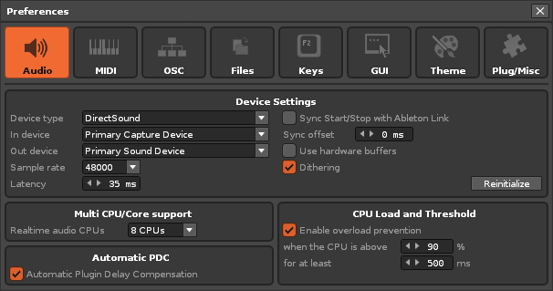
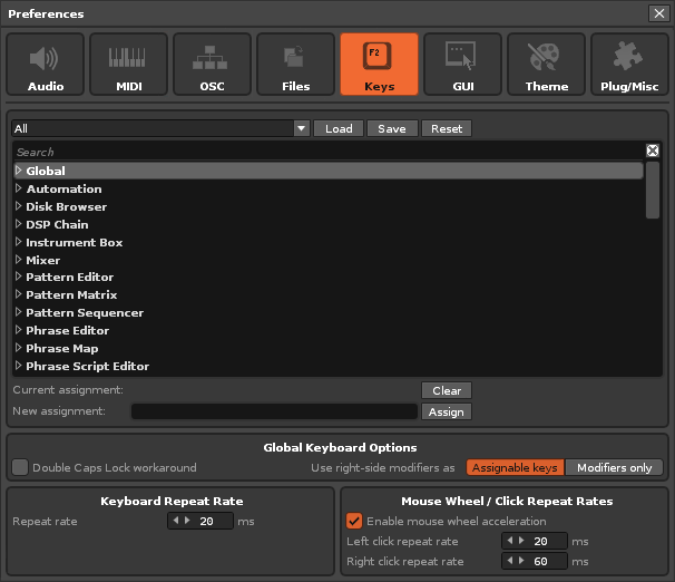
Audio Panel
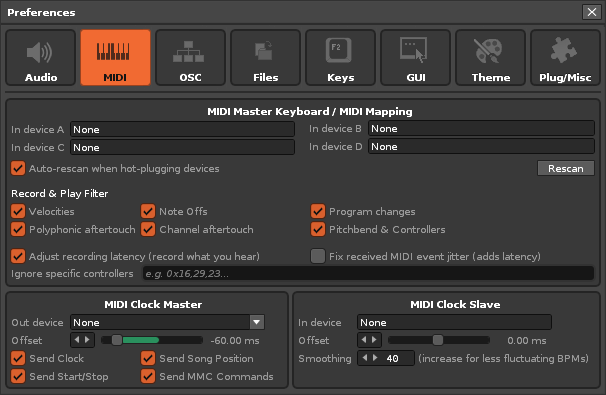
MIDI Panel
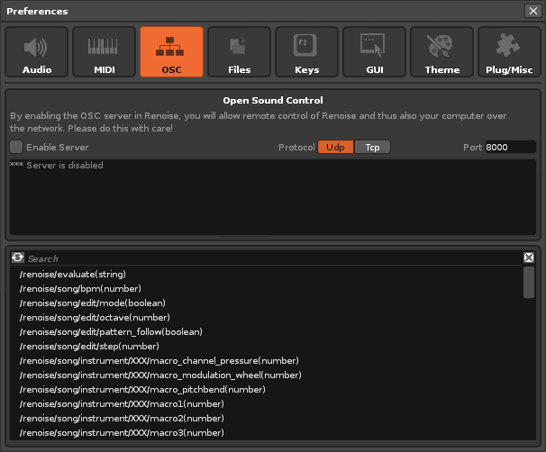
OSC Panel
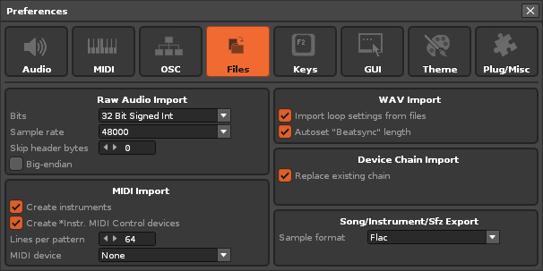
Files Panel
Keys Panel
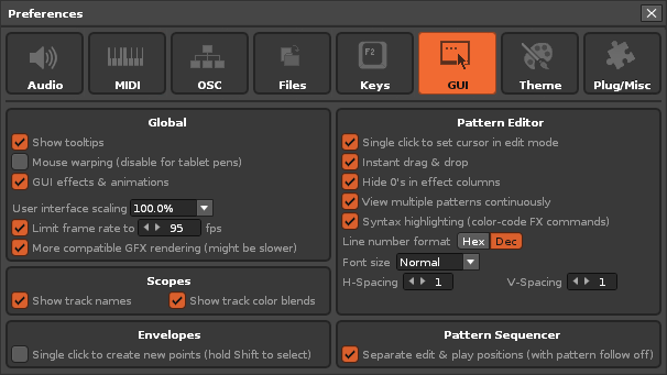
GUI Panel
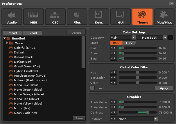
Theme Panel
Plug/Misc Panel
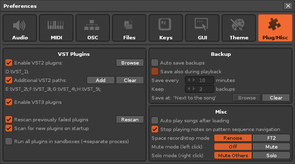
These panels display at least double the height for lists and allow the height of the window to be free to be modified manually if necessary.
They also allow for a fairly compact view (I’ve tried to keep the existing properties so it doesn’t look like too much of a change).
To do this, some width dimensions of some elements have been adjusted, such as the sliding bars or some buttons (originally they were very small).
I think that using the 2-column layout allows you to play better with the content so that viewing is more enjoyable…
It also allows you to include 3 elements in the same row, such as checkboxes and their descriptions, as shown in the MIDI panel.
Furthermore, this layout allows the use of either 2 subcolumns, or a single wider subcolumn that occupies the entire window, or a combination of both layouts.
For it to look “pretty” the elements must be aligned vertically, like the checkboxes. Main titles should also appear centered.
Finally, some subpanels have been increased in height to take up the space needed to fit “in the grid.” This also allows for more elements to be added in the future.
And the last detail: all the subpanels have enough empty surface so as not to overwhelm the eye. It is a good distribution of content.
Note: All of these views should fit well with any size scaling!
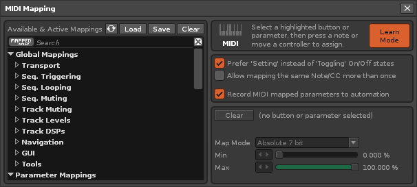
New Added:
MIDI Mapping Panel
Folded!
Unfolded!
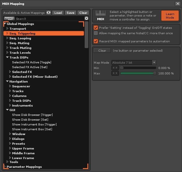
This would be the visual effect. The user would be able to scroll the list vertically. There would be an empty space on the right. Also, any new properties would be added to the right column, allowing the vertical list to grow slightly, which is not a bad thing.
I also think it would be nice if important panels had a large icon identifying them.
The rest of the panels in the Preferences window might behave in a similar way.