Brainstorming: Audio Tracks

You’re right. I don’t see an easy way to add waveforms inside a pattern. If we add those waveforms, patterns won’t look like patterns anymore.

And I ask myself : why the hell people want those waveforms ?

  • they want waveforms because they want to “see” and “edit” the sample waveform associated with the default pattern cell…
  • what cannot be done actually because the sample editor displays the sample/ instrument that is selected on the upright instrument box and NOT the sample that is actually played in the default track.

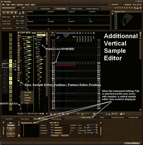
The only way to allow users to see and edit the sample that is played in the selected track is to add a sample editor view under the pattern editor view and to synchronize them better. The problem is that ther’s no place anymore in the GUI to do it (this place is taken by the automation tabs, tracks effects, …). So the only one solution I see is to change the orientation of the sample editor, and to put a vertical sample editor next to the pattern editor in a left side pannel.

Synchronisation implies 2 things :

  • When the song is played, the vertical sample editor automatically displays the sample that is actually played on the selected track in the pattern editor. By this way, people could quicky visualise the default sample waveforms next to pattern content, and easily edit the right waveform at the right time.

  • For now we use “0S effects”, “Beats”, “Samples” & “Minutes” in the sample editor timeline . BUT, a better correlation between sample edition and pattern lines, could be done if the sample editor timeline also displays “pattern lines”.
@KURTZ

i dont think the point is that anyone will have a sampleeditor in the trackview. it more about those mockups

a desired audiotrack format as new channel variation would really do the job.

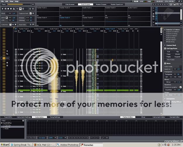
pvcf, thanx for the mockups, I think I’ve seen them somewhere else (probably in this thread) and I’ve tried to imagine how I could work with these vertical samples inside the patterns. But my real problem, with all this, is not only to see the vertical waveforms and move them up or down, but to “edit” them quickly and efficiently without dropping a second in the workflow. Imagine that I often work my samples with the full features allowed by the sample editor (including slices)… In the mockups you showed, you can select a portion of a vertical sample waveform, but what’s next ? I don’t see any cut/paste, trim, fade in / fade out, crop, auto-dc, reverse, maximaze smooth crossfade loop edition features. The problem with that pretty views, is that you cannot do that much with them excepted moving them up or down… (I guess that people expect from those views something like timestretching) and you don’t really see the related notes, associated pattern effects, and automations. In the end, a pattern cell is rich, and a simple samplewave form doesn’t help that much in terms of edition. Maybe we should add a typical floating toolbar with all those icons, allowing all the known sample edition features when selecting an audiotrack.

I’m not sure if i understand you: did you need a sample view in tracks with a complete sample editor ?
if yes, maybe you could ask the devteam if its possible to “undock” the sample editor ?

for my personal taste the plain optical view of sample is enough, its only for visualizing the sample tracks and arrangements, mainly for longer recording sessions and arrangements. (but for this its important).

Sorry, I’m stoopid, the specific edition features (trim cut paste reverse …) I wanna use could easily be available if I double click on a vertical waveform in the audiotrack, what could redirect me in the renoise sample editor…

… the first time I used an audiotrack it was in a MIDI DAW, because next to my MIDI arrangement I needed to add a few vocals. I keep on using this kind of software, I record lots of takes while the DAW plays the arrangement. This audiotrack is finally filled by “big” (long) samples. For now I can do the sample recordings within Renoise since the sample editor can do it quite properly. I also record my lead synth keyboard improvisations through renoise, it’s made of big (long) sample takes, that are recorded in realtime while the music plays in the background. But what I can’t do easily with renoise is visually & easily arrange my recordings in the pattern structure. I often need to fix some timing/tempo problems and snap to beats measures & timestretch my samples. For all this, the Renoise way of tracking doesn’t make it.

To build a pattern compatible kind of vertical audiotracks we could start to get some inspiration from “send” tracks, that can have automated DSPs and pattern commands, but that have no notes. Instead of notes audiotracks could only show the recorded sample waveform view (as shown in previous mockups but you can add the typical pattern commands if you want). You can drag & drop samples in audiotracks, samples automatically snap to the pattern grid structure. The dragged samples should be displayed vertically and turned clockwise. You can timestretch what you add in this kind of special track, while keeping the original sample intact. You could add some parameters like in the send tracks. You could define a color for each sample you drag in it. You could slice waveforms. And if you double click on the sample waveforms, it opens the sample editor where you can perform more detailed operations (crop reverse draw zoom trim …) . Those tracks can of course be rendered themselves and use some automatable DSPs. They can be grouped, ungrouped, background colored, like any other tracks.

Saying that, it requires from the devteam to natively code a quality timestretch functionnality ; it also means that the pattern window code should probably have to be a lot rewritten, to allow renoise to quickly display background scrolling waveform views without eating too much the CPU.

Just some quick unresolved thoughts, perhaps relating to audio tracks…

I’m enjoying the 2.8 automatable bpm. Naturally I’m starting to experiment with some poly fluctuating bpm’s with some tasty fractional symbionts as a compositional standard.

No doubt this can be done currently… example link, although in this example there is no fluctuation, just fixed poly bpm’s.

So… anyhow, experimenting with fluctuating poly bpm’s is not a live endeavor at the moment, this requires rendering a phrase then working live on the other fluctuating bpm.

The problem I’m encountering is the visual comparison of patterns and waveforms and perhaps the playback overlap as well ? of one rendered phrase to another live or rendered phrase.

I’m a software designer. I solve problems for a living. The main issue I face on a regular basis is figuring out which problems really need to be solved - honestly, and rationally. As such, I started thinking about Renoise as if it were my own project.

Starting from the assumption that I love what Renoise already does, I ask:

‘What do you actually find missing in its current workflow?’
‘Audio visualisation,’ I answer.
‘Why? Give an example where it holds you back.’
‘Okay - I import a drum-loop and have no idea where it actually ends. I have to listen/guess/hope after adding each note. This is particularly horrible when I’ve been away from my track for a bit,’ I reply.
‘So, it’s not the waveform itself you care about?’ I ask.
‘Uh… now you ask, no. I guess it’s… just the length,’ I reply.

So, for my purposes, a coloured semi-transparent single-pixel-wide vertical line showing how long the sample lasts in the pattern editor would actually do 90% of it for me!

I’d shift the position over by a pixel for each instrument used in the pattern (so the first instument used is in the first pixel, the second uses the next pixel over etc). This would allow me to see overlaps, etc. Potentially, even when minimised.

I’d make it a toggle switch somewhere in the options so people could turn it off if they hated it.

The only reason I ever wanted to see any representation of the actual waveform when using Renoise is so I didn’t get too confused when dealing with several different waveforms on a single track. Coloured lines would solve that problem without taking away anything from the current views, or forcing the sample editor to be in a newly-tabbed bar. Lines like this work on the OP-1, so I’m confident they’d work here.

Of course, all the extra time-stretching + full-audio manipulation, etc would be nice - eventually - but I think my initial solution is actually more in the spirit of what Renoise does. It solves the actual problem I face rather than just saying: ‘Can we use Renoise to make tea, too?’

Which would also be nice. I’m thirsty.

That is surprisingly smart.

Madrayken’s post makes a lot of sense to me. The thing I would add is to make the “sample marker line” clickable so you would get to your waveform just with one click.
preferably the waveform would appear in the lower end of Renoise. like illustrated here by Nordis:

The vertical waveforms will be the markers the ‘coloured semi-transparent single-pixel-wide vertical line’
This way you will get a great overview.
maybe these markers are handy to display in the pattern matrix also because this is more of an overview of your song.

Everytime I see a mockup like that, I realise how insanely much I want it to come true…
silently praying to the Hex gods

Summed up, this is what I think is needed: 1. vertical visualisations of the waveforms, because it helps not just to see the endpoints but transients too, so that f.ex. vocals and drum loops would be easier to align. 2 the ability to switch this on and off to conserve memory and screen estate, much like with the current autoseek function. That is all.

(In a wet dream scenario I’d love to see time stretching capabilities in the pattern editor too. In combination with visible audio tracks this would make Renoise endlessly powerful. But I know it may be beyond what is currently possible.)

Hell, just “real” built-in time stretching. probably the wrong thread though…

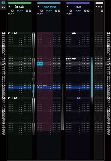
Maybe something like this?

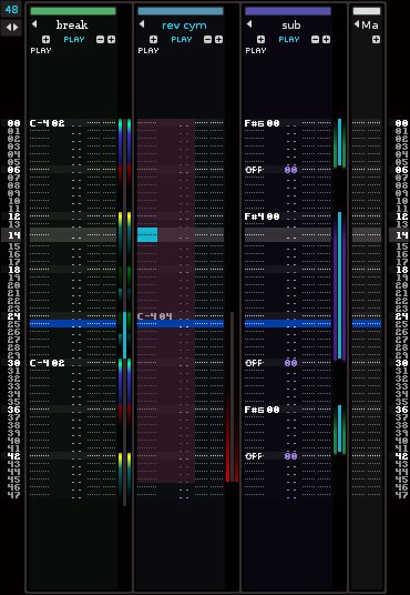
The middle part shows start/endpoints, the cyan part of the lines could show a loop is active, the gradients show volume and stereo (coloured spectrum gradients could show frequency).

3530 audiotracks.jpg

EDIT: that 00 in the sub tracks volume column should have been a note off.

Not sure the colours are right but this gives you the basic idea, as the the frequency changes the colour changes, like the waveforms in dj apps like serato & traktor.

3531 audiotracks2.jpg

regarding automation:

please, first re-sizable automation tracks. then automation- overlays. thanks.

I actually like some of the versions where the audio track is an integral part of a channel with note data. It is something that would make a lot of sense for people that would use the audio tracks for the purpose of freezing channels or recording external synths, and it would be a great solution for either of these situations.

I was thinking if you wanted an audio-track only channel, it could work in the same way as any other channel, but just with the notedata part minimized out. That way, there would be no difference between regular channels with no audio tracks, pure audio track channels, and integrated notedata/audio-track channels, they would just have different functionality turned on or off.

Edit: I was thinking about how audio tracks would work, and I wonder if they would still fit in with the tracker paradigm or work as a sort of meta thing. I have experimented with using the “render to sample” to record things on the Line-in DSP, and then turning on autoseek and playing back that sample in a different channel to make faux-audio tracks. It’s a huge hassle. My question though is if the audio tracks would be something you can reference from the sample bank or if they would remain as a meta sort of thing that can’t really be touched by the pattern editor. While the latter makes more sense, you would lose some of the granularity you get with working with samples in a tracker. Like, say you want to pitch slide whatever is being played by the current audio track for some reason. I reckon the sample bank and audio tracks would have to be separate things by necessity. :-/

I was also thinking, what if they integrated the line-in device with the very first part of the track DSP section, a record/arm section and a line-in/freeze selector at the beginning of the DSP chain. The pattern editor would work like a regular tracker channel unless these options were to be selected in the DSP chain section.

Highlighting a selection of the visualisation and dragging it up or down could create a new slice point on the sample and put a new note in, so samples could be easily rearranged just by highlighting and dragging.

could also be added to automation:

3541 audiotracksauto.jpg

[quote=“Dunks, post:210, topic:24794”]
Not sure the colours are right but this gives you the basic idea, as the the frequency changes the colour changes, like the waveforms in dj apps like serato & traktor.

3531 audiotracks2.jpg

COOOL!!! I WANT THIS but i think this column possible show/hide

and prety cool see this variation after colapse track

I like these ideas.
On each track there should be a small button, wich toggles “waveform view” for the track. If not enabled, the normal pattern-data is viewed.
I can see great benefits in a waveform-view for short samples aswell as long recordings.

(Also, with vertical waveforms… you “could” move the track-scopes down to each their tracks, tilt them 90 degrees, and reduce their sizes, to even better visualize the ‘playhead’. The track scopes are basically realtime visualisations of a playhead running from left to right on a waveform, right? -Might aswell rotate the waveform 90 degrees, and run from top to bottom of that waveform.)