Update
Further micro adjustments to the shape and weight of some glyphs

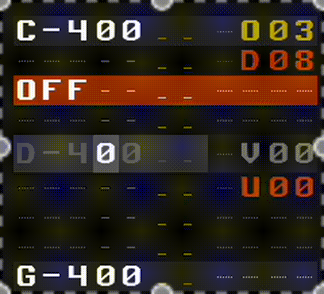
Fixed off center cursor/row on non hidpi displays
New version on original post edit
Update
Further micro adjustments to the shape and weight of some glyphs
Fixed off center cursor/row on non hidpi displays
New version on original post edit
I think I can understand your sentiments. However, the element of customization can often make something stable unstable.
I imagine one of the reasons Renoise’s development policy is conservative is because it makes the product unstable, in other words, it increases the support effort for newbies who have trouble.
I imagine the Renoise team is a small team, and I think that is a valid reason.
I don’t have a problem with people who know some of the inner workings and can fix problems when they occur, and for me, that is enough.
The customizability of Renoise is high enough.
Different text fonts can change size depending on the type of glyph they use, both in height and width. This can lead to various problems with fitting in relation to their containers.
Think of each text as being wrapped inside a box that must have a specific size. This is the case with all elements that contain text.
In addition, there is also the scale factor. Most problems with text can cause overflows (part of the font not being visible) or the surrounding box itself to change size seemingly unjustifiably. Since there are so many elements with text included, this usually becomes a problem for supporting multiple fonts.
The same occurs with tools, where it is advisable and almost necessary to have to correct the size of the text envelope to avoid problems (elements that are resized or misaligned due to changing the size or length of the text).
As if all this were not enough, different fonts do not contain the same number of glyphs. A specific glyph may be used that does not exist in another font. So the topic of changing fonts is not as easy as it may seem. The way Renoise and many other programs are designed, changing fonts is a pain in the ass.
ortunately, fonts can be patched manually. In my view, the best option is to use the original font, and modify the character (vowel, letter, number) that is necessary to make it more distinct, and do nothing else. Or, find a font that is very similar in size, even if it looks slightly different.
this is pretty cool mate, i will test this soon.
If you have problems with bad rendered artefacts or missrendered single chars in Renoise try to use an open Type Font Version (.otf) instead a truetype version (.ttf) This may help in some situations. btw. nice Theme!
happy tracking ![]()
Thanks!
polaris.xrnc (5.0 KB)
it’s kinda like a universal theme, all hues are usable! ![]()
ht2u2!