Instrument panel rework

I thought I would share this redesign of the instrument panel

Right now, it kind of sucks:

  • no breathing space, room for labels etc.
  • less room for matrix/pattern editor

instrument-overview-3.0.png?raw=1

But still, the general principle is good: provide only “top level” functions.
So I made this alternative which basically is the same thing, but better organized

instrument-overview.png?raw=1

May be it’s more logically to place this button most left? Coz sound flow is gonna from left (source with sampler/vsti) to right (fx chain).

P.S. Please, return zoomable keyboard on bottom of Keyzones editor. The previous release (2.8) was more suitable to works with zones related to keys.

Right now, it kind of sucks:

  • no breathing space, room for labels etc.

  • less room for matrix/pattern editor

With everything expanded it looks shitty yeah, but does everyone use it like that? I only have the vsti plugin & programs selection enabled and think it is quite handy to have on top of the diskop. Can’t say the new mock-up looks like it would be an improvement for me…

What was the reason this stuff got added last minute during the end of the beta? I remember some people having trouble reaching certain settings quickly because of the gui changes (people with one monitor set-ups?). Having these settings in the diskop, which is expandable on top of any other tab (sampler/plugin/midi), means you can reach them ‘everywhere’. Your new mock-up is only accessible in the pattern editor & mixer, like the tracks dsp effects & automation right?

Your new mock-up is only accessible in the pattern editor & mixer, like the tracks dsp effects & automation right?

Actually, that’s another thing I don’t like about the current implementation - you are seeing double :wacko:

With this design, you only see the “instrument panel” when you’re not in the instrument editor.

Edit: But yes, you are loosing the ability to edit automation while adjusting instrument properties, or edit DSP chain - just like in previous versions of Renoise

@Sound_Compozer: good point, it should be to the left. And with a less shitty icon :slight_smile:

Visualisation piano keys with work pattern its very good things. Maybe not beuty but its good for me. I think its very cool to merge or just add automation panel in pattern (alternative visualisation pattern, apple logic idea with automation) yeah i know we speak about million times.

@Danoise, I really like your concept better than the current one. Good use of the lower frame! The new instrument panel was something that felt quirky to me with R3. Not just because it was “something new”, but probably because it was too detached from the core of the GUI - the pattern editor.

and that piano should also monitor what (transposed) phrase is playing, not just what phrase (note) is playing :slight_smile:

Edit: But yes, you are loosing the ability to edit automation while adjusting instrument properties, or edit DSP chain - just like in previous versions of Renoise

it would be very awesome for workflow, if there would be the option to fold out a second dsp panel. So this would still be possible and you could also finally edit a meta device and its slave device simultaneously, without the need to permanently switch channels or adjust the automation curves with the dsp chain visible.

i thought of something like this:

Two dsp panels look confusing to me.
But i am absolutely fine with current aproach, so… Instruments are loaded on the right side, so their basic controls should be there also IMHO.

I’ll attempt to reverse the tables and talk about what is_good_about the current implementation.

Djeroek pointed out that the plugin / program selected is quite handy in the disk browser.

I guess this is not only handy from an ergonomic point of view, but also from organizationally - disk browser is the primary location for “loading content”, and practically all DAWs have those two features gathered together.

However, I feel that the way that this is done (currently) is severely lacking. My bet is that you’ll never intuitively start Renoise as a new user, open the program and locate the disk browser (hard enough in itself), and_then_discover that the little arrow next to the instrument properties will allow you to load VSTs - that is, _if_you have chosen to display the plugin properties of the instrument in the first place.

To solve this problem - and I mean, really solve - we could offer a plugin browser which has been integrated into the disk browser. Sample or plugin? Just a question of clicking the right tab.

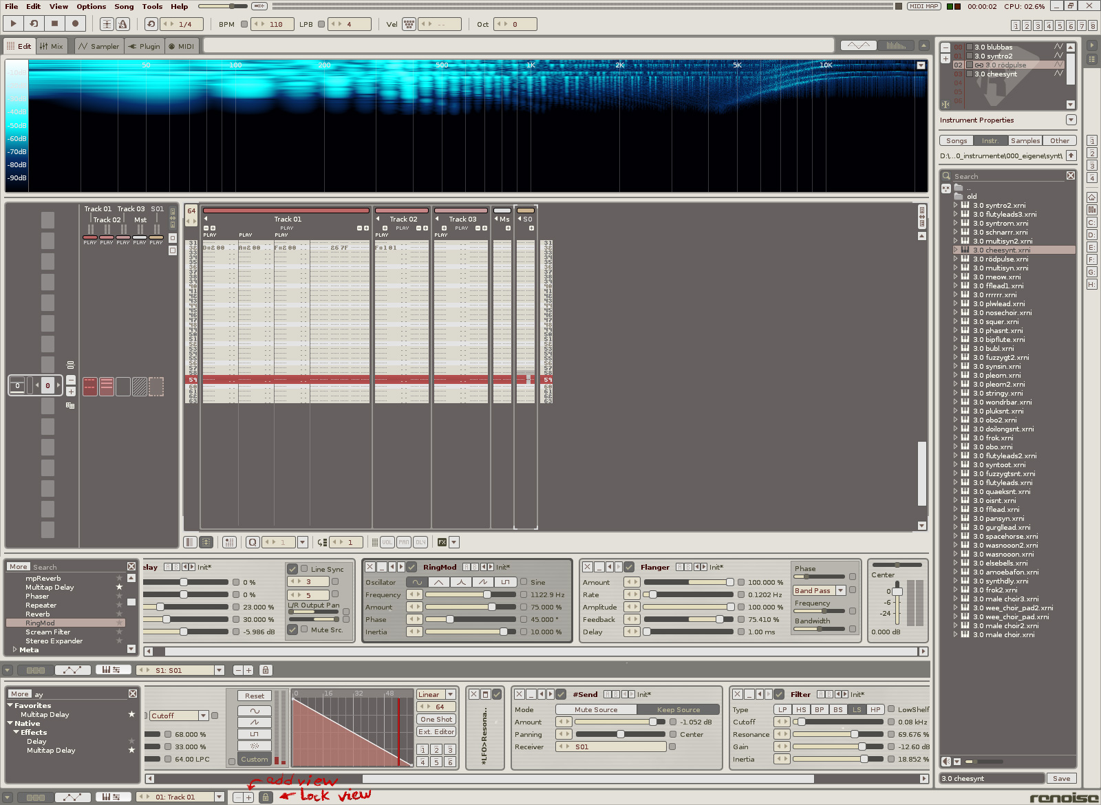
Akiz then points out that since loading instruments is done on the right side, their properties should be there as well.

I’m not convinced of this…I mean, yes from an organizational standpoint, yes. But let’s consider the actual workflows involved:

First of all, I’m very likely to adjust instrument properties during the initial sound-selection process (very important creative moment IMO!), so it’s of course nice to have these properties available.

But, my own experience tells me that if I really want to understand what I’m loading I will have the instrument editor open anyway, and that will currently result in Renoise_show the instr. properties twice (o_nce in the instr. editor, and once in the disk browser).

But perhaps worse, once you start composing your song, the position inside the disk browser is just plain annoying. Now you don’t want to open the instr. editor, but rather stay inside the pattern editor, mixer, matrix, whatever. I really believe having it in the lower panel offers so much in terms of a better, more clear layout.

Hm. seems that I failed in talking about what’s good about the current implementation…

But I guess I could point out that at least, those properties are always available to you - and sometimes even twice :badteeth:

The great thing about 2.8 in its design is you could have the automation, instrument, song setting or track-dsp lane visible wherever, in 3.0 automation and effects can only be switched underneath the pattern editor & mixer, instrument & song settings removed from the bottom lane. The changes suck on a one monitor set-up imo, 2.8 was more flexible.
With 2 monitors you can have the instrument editor expanded on one screen and tweak a dsp parameter or draw an envelope on the other without switching screen tabs, great but not everybody has the luxury.

I think the instrument panel in the diskop was a solution for those complaining and missing the instrument settings of 2.8 and wanting to do quick global instrument volume changes when in the pattern editor or mixer. Bloat was added though, but luckily this is configurable.

Basically, if you return to how 2.8 handles the screen estate, (the extra tab in your mock-up works, but should also be optionally visible underneath the sample/instrument editor) than you can get rid of the redundant instrument panel in the diskop.

You may leave in vsti selection, + integrate vst & tool selection in the disk-op as well. Be able to have it expandable again, be able to load all Renoise particularities and Renoise is winning imhoafaik.

My workflow or templates gets updated every now and then,

my thoughts on the matter reflect what I’ve been doing lately.

I’m one of the users that does the double peek or use both sections,
the upper left tabs and instrument properties on the right.

Although its only been recent that I started to use the tabs section more

due to the recent “Downloads” section on the Renoise website,

using the sample editor more to share share instruments.
I didn’t even know the pitch range modulation was configurable to 96.

Another reason I started to use the tab section more is, for evey time I load instruments,

I have to route them to its dedicated track.

I do most, if not all of the pattern editing in a single track for all instruments involved.

This way, I can see the relationships of each pattern, I find this simpler and easier to look at,

than having to collapse/uncollapse grouped tracks.

I do think that loading content or the sonic palette selection process is an important one,
and would consider that in the same mind-set as synth patching or instrument creation, and even mixing.

Although to most, I would think mixing is probably in the later stages.
Currently, the sonic palette selection process gets its own session time,
separate from truly exploring the Pattern Editor.