So making things look good for people with a HiDPI monitor is real nice and all, but I don’t think it should degrade the visual quality for users at the default settings of “normal size” font and 100% scaling.
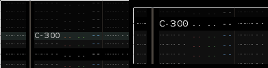
I uploaded these side by side screenshots to demonstrate. The left one is “normal size” at 100% scaling, and the right one is at 150% scaling (which is unusable for me because I don’t have a HiDPI monitor).
You can clearly see that the dot in the zero is off-centre at 100% but it’s perfectly fine at 150%. And there are a LOT of zeroes in a normal Renoise pattern, they all look off, and it makes the graphics designer in me very sad. I’m sure I’m not the only one.
Now I read in another thread that you can change a config file and revert back to the old font. I’m going to do that because I really can’t work like this. Imagine the reverse if you like, you’re a musician, trying to do some graphics design, and the radio that is playing music in the background keeps skipping beats, messing the tempo and glitching out.
I think that selecting the old font should be an option in the settings screen, because right now it’s kind of hard to find. I’m lucky I even noticed the post saying it was possible!
However I’m also filing this as a bug report because while I can fix the problem on my side, clearly this font is not meant to be rendered at this size, or maybe the renderer is like, really bad at hinting. I’m not sure what went wrong, but fonts shouldn’t look like this, not for a program that you use multiple hours a day.
People have said before they don’t “like” the font, but I thought it should be useful to point out not the matter of taste, but what is actually wrong with it, so that it can be fixed.
I see now that the problem is that it uses DejaVu Sans Mono, which I didn’t even recognize because of how awful it looks at small sizes. This font is not meant for rendering at that size. Just as a test, I replaced it with Ubuntu Mono, which I know renders a LOT better at small sizes and it looks better. Not good, but better.
… and I just noticed that the config file has two numbers in the Size field. Aaaaand the second one is not for line-height (like CSS). It is in fact for the width and the height, which means that somebody somewhere thought it might conceivably ever be a good idea to stretch the aspect ratio of a TrueType font. That’s um yeah. I mean the font is open source and you can do whatever you want, but this WILL make the designers cry.
Imagine having two pitch bend wheels, for the left and right channel separate. Sure it might offer some possibilities for really cool experimental music IF you know what you’re doing (which I’m starting to doubt when it comes to fonts), but for almost all normal usage you’re gonna completely wreck the sample unless you move both pitch bends exactly the same. That’s what you’re doing to the font if you tweak its aspect ratio.
Ultimately, I decided to go back to the 3.1 bitmap fonts. I normally like Ubuntu Mono a lot, but it doesn’t look good in Renoise. And it’s a bit too much of a hassle (having to restart renoise, edit the config file with sudo rights, copying the font files …) to try out my other favourite monospace fonts at various sizes.
Fun trick I found, you can sort of use the four small/normal/big/huge settings like 4 font “presets”, they don’t need to be the size that their name implies. So I could actually put the 12px Ubuntu Mono at the “small” size, and the regular old bitmap font at the “normal” size. That way I can switch between them without having to restart.