The real work around is to use phrases. Offloading motifs into phrases yields exceptional compositional flexibility within a pattern based framework. Honestly, if anyone is using renoise and is not making extensive use of phrases on a regular basis, they’re really cutting short the capabilities of this (awesome) software. Phrases DEEPLY extend renoise’s compositional and arrangement capabilities, not to mention their utility in generative approaches to composition and their utility in sound design.
Let’s make everything vertical - even the sample editor.
The problem with phrases are that they exist in an entirely separate view that you need to keep switching between (for each instrument and phrase separately), and more importantly the actual contents of a phrase are not shown in the main Pattern Editor nor in the Pattern Matrix. This means that you cannot get an overview of phrases next to one another, their lengths, polyphony, or any other vital information about the contents of a phrase. In fact you simply need to remember the contents of each phrase individually, which an awful cognitive load.
What I was talking about earlier is a system of proper visual feedback and user interaction elements to solve these exact issues. The only things phrases potentially solve is the ability to slightly more conveniently move note data across patterns, but with no visual feedback. Not to mention phrases don’t contain automation, so even when it comes to moving blocks around, they don’t solve the problem in its entirety anyway.
Phrases are not a solution to hardly any of the problems a well implemented Arranger view would address. It’s good if you’ve found them to be helpful for you to overcome some of the limitations imposed by the pattern structure, but they do not work for me.
I wanted to use phrases for my generative system today, but ditched the idea due to the lack of a pickup phase (basically, having the note-on event be at line x so it triggers before the actual note in the pattern editor). I might as well generate all data directly to the main pattern view. It suffers the same “note-on bias” that is engrained in pattern editors in general. I guess this whole paradigm is some kind of effect of pickups only being ~20% or so of the total amount of notes in a rhythm ![]()
Well, I wouldn’t. It’s rather a kind of step sequencer that processes chip sounds. ![]()
Thought provoking but makes sense ![]()
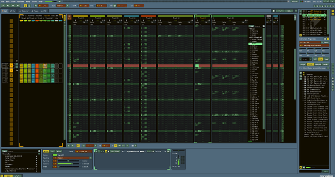
Let’s try imagine the FX lane was in a column, same with the scopes etc… Try hide upper/lower frame to get a feel of it and then imagine everything was vertical, frankly not a bad feel.
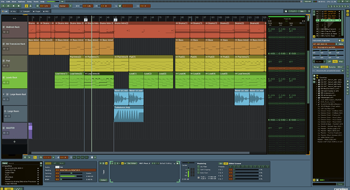
I have an alternative idea, I know most of you hate it, but imagine there is only a one column pattern editor open, the rest is horizontal with the arranger being the main focus. I’ll have to try make a mockup to see how that’d work. (but I pretty much love Renoise as it is, just would love a horizontal pattern arranger like Ableton has)
To me it’s simple, you input notes on rows => it’s a tracker, anyway clearly SoundTracker drew inspiration from this app.
This is one thing I would like to see change. If there is no “Note-Off” in the preceding pattern, color in the following patterns to visually indicate that something may be playing through. If there was some visual indication of sample length in the pattern matrix aa well, that’d be awesome; doesn’t have to be a waveform.
As far as making an entirely separate “Arranger” view, I’m not for or against it. I would probably prefer that the Pattern Matrix simply get added functionality. I like that it does things differently, and would like to see how keeping to the same train of thought it could provide the same information but in a rather different way.
I think it is fine as it is.
I think horizontal scrolling is a really bad idea. I even would say, Automation should be vertical, too ![]()
![]()
![]()
![]()
I’d love that!
Here’s my final torture piece for you guys, the song arranger is in focus and only showing the pattern editor for the currently selected pattern/clip … ![]()
That does make sense when both arranger and pattern editor are vertical
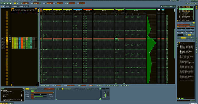
Oh yes, with vertical automation (per note, closable/expandable) also MPE would be possible!! The puzzle now would fit together perfectly.
Ooh, now I want vertical automation ![]()
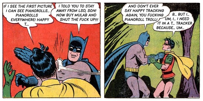
If i see the first picture i can see pianorolls… pianorolls everywhere!

But psssst!.. Dont say that to loud in this forum!
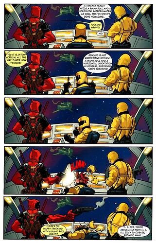
happy tracking ![]()
hahaha ![]()
HAPPY TRACKING! ![]()
Daunting to say the least, but… Change sometimes is good and necessary as a matter of fact.
Though wouldn’t that defeat the purpose of the FX command lanes, or would you per se, use the vertical automation lane in conjunction with the FX lanes?
Personally I’d take the latter and use it as a basis to visualize the automation alongside the FX lanes.
Would be neat and super useful.
Agreed ![]()
