Seriously, what do you think about keeping pattern editor and pianoroll completely separate? I think that most logical solution would be inserting pianoroll lane before automation lane in left corner menu.

yeah, horizontal piano roll will draw in those guitar hero/rock band/audiosurf kids like flies! (=
Custom color for highlighting notes, like custom colors for the pattern editor and tracks.
Like highlighting important notes from a book,
a user could highlight notes on the keyboard that make up chords and scales for example.
If two chords share the same note or if a user is using two different scales,
a user can give it a third color to indicate the note being shared by other chords or scales.
Or track by track color indication ?
Sorry for jumping into this thread late. But is there any downloadable beta of the piano roll tool for renoise yet?!
With the assumption that playback will be vertical like the pattern editor.
Show the rhythmic lengths horizontally and perhaps in numbers depending on the LPB.
In following example there are 15 total events and at 16 LPB, shows the step lengths per event.
After that, shows the total rhythmic value in lines.
---- means this is the highest rhythmic value. (I used four lines to indicate the total amount of different rhythmic values)
–
- means this is the lowest rhythmic value.
[_ _- _ __ _ _ _- _ __ _ _ _- _ __ _ _ _- _ __ _ _ _- _ __ _ _ _- _ __ _ _ _- _ __ _ _ _-]01_--4]-
[_ _- _ __ _ _ _- _ __ _ _ _- _ __ _ _ _- _ __ _ _ _- _ __ _ _ _- _ __ _ _ _- _ __ _ _ _-]02_--4]-
[_ _- _ __ _ _ _- _ __ _ _ _- _ __ _ _ _- _ __ _ _ _- _ __ _ _ _- _ __ _ _ _- _ __ _ _ _-]03_--8]--
[_ _- _ __ _ _ _- _ __ _ _ _- _ __ _ _ _- _ __ _ _ _- _ __ _ _ _- _ __ _ _ _- _ __ _ _ _-]04_--4]-
[_ _- _ __ _ _ _- _ __ _ _ _- _ __ _ _ _- _ __ _ _ _- _ __ _ _ _- _ __ _ _ _- _ __ _ _ _-]05_--4]-
[_ _- _ __ _ _ _- _ __ _ _ _- _ __ _ _ _- _ __ _ _ _- _ __ _ _ _- _ __ _ _ _- _ __ _ _ _-]06_-12]---
[_ _- _ __ _ _ _- _ __ _ _ _- _ __ _ _ _- _ __ _ _ _- _ __ _ _ _- _ __ _ _ _- _ __ _ _ _-]07_--8]--
[_ _- _ __ _ _ _- _ __ _ _ _- _ __ _ _ _- _ __ _ _ _- _ __ _ _ _- _ __ _ _ _- _ __ _ _ _-]08_--4]-
[_ _- _ __ _ _ _- _ __ _ _ _- _ __ _ _ _- _ __ _ _ _- _ __ _ _ _- _ __ _ _ _- _ __ _ _ _-]09_-16]----
[_ _- _ __ _ _ _- _ __ _ _ _- _ __ _ _ _- _ __ _ _ _- _ __ _ _ _- _ __ _ _ _- _ __ _ _ _-]10_--4]-
[_ _- _ __ _ _ _- _ __ _ _ _- _ __ _ _ _- _ __ _ _ _- _ __ _ _ _- _ __ _ _ _- _ __ _ _ _-]11_-12]---
[_ _- _ __ _ _ _- _ __ _ _ _- _ __ _ _ _- _ __ _ _ _- _ __ _ _ _- _ __ _ _ _- _ __ _ _ _-]12_-16]----
[_ _- _ __ _ _ _- _ __ _ _ _- _ __ _ _ _- _ __ _ _ _- _ __ _ _ _- _ __ _ _ _- _ __ _ _ _-]13_--4]-
[_ _- _ __ _ _ _- _ __ _ _ _- _ __ _ _ _- _ __ _ _ _- _ __ _ _ _- _ __ _ _ _- _ __ _ _ _-]14_-12]---
[_ _- _ __ _ _ _- _ __ _ _ _- _ __ _ _ _- _ __ _ _ _- _ __ _ _ _- _ __ _ _ _- _ __ _ _ _-]15_--8]--
Can’t help to notice that the screen in the clip has a striking reseblance to the sample keyzones screen… Not that I’m after a piano roll, but you see where I’m going with this, right?
Oh… haven’t seen it that way. You may be on to something, dude…
DO IT THE OVERLAY WAY ?
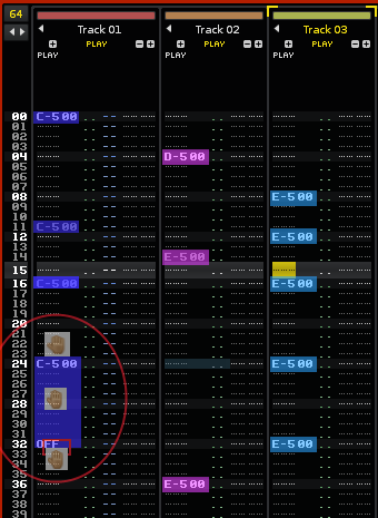
IMO the most significant difference between tracker editor and piano roll editor are note length editing and time position editing.
For note length: as long as you just use samples it’s no problem, but if you use VSTi’s you have to define the note off/release by
entering the OFF parameter. Now, if you want to fine-adjust the length, you have to adjust the parameters in the OFF delay column.
And this can really be cumbersome to do. The same for fine adjustments of note start positions. Piano roll bars are much more intuitive and representative for doing things like that.
One solution to solve at least the note length/timing problems would be to combine Tracker view optionally with a vertical piano roll overlay. This is similar to the Bitwig approach of combining note events and envelopes in one view:

In this mockup one can adjust:
- the start position and length of a note event by grabing and dragging the head of the overlay bar
- the note end position and length (note off) by dragging the tail of the overlay bar
- start and end position of a note event by dragging the overlay bar in the middle
When holding “alt”-key the start and end positions are fine adjusted. In this case the fine adjustments would appear as values in the delay column. Also a vertical zoom factor could be optionally applied. BTW: this also could be done for WAV-clips / samples or even automation data. Just display the waveform / automation data as another overlay or column etc.
Cool idea!
I like the mockup and the color overlay thing aswell ![]()
+1
Yep, i think so too. A “time line” is really easier than a “time plane with numbers”. In renoise your eyes genereally have to follow X (finding the correct column), Y (finding the correct line) and NUMBERS that get added to Y for gaining a greater time resolution. Whereas Piano rolls have actually only bits (0 and 1) on a time line X.
IMO a tracker adds complexity for saving screen space. The way the data is visually represented in a tracker is no more helpful to me, since I have enaugh screen space and like simpler approaches more.
But the way you edit tracker data is still faster, because you can basically access ‘audio channels’, ‘song positions’ and ‘fine song positions’ with X, Y and numbers, which helps actually. Two more ways to define the data (compared to piano roll) make the editing (with keyboard) faster.
Sooo… both these ‘view types’ are appealing.
Hmm, I think, it would be quite good to display both data representations at one time. But I’d vote for displaying ‘piano roll’ and ‘tracker view’ side by side and not with any overlay, unless you can make sure no pixel of the either ‘view type’ hits a pixel of the other ‘view type’. It would be too much screen space saving. Wanting to save screen space and having more stuff drawn at a place reminds me of the confusing mute/unmute/solo-button. Two buttons (mute button and solo button) are usually [M] and [S] in other daws, but renoise saves space and puts draws these two buttons at one place. This is too much of an aliens GUI to me. …::::…__.:.:::… Overlayed stuff confuses me and if not in Bitwig and Aodix, where do gui elements get overlayed at all?
I don’t have bitwig to find it out. ![]()
Here’s my suggestion. I don’t know if you all have used FLStudio, but I’m up for some stealing from there ![]()
Look at this picture:

You can bring up the piano-part of the image in FLStudio by either clicking the button labeled 1 or by holding ‘K’.
My suggestion is, turn that piano-view 90 degrees clockwise and have it appear next to the active track when holding ‘K’ or some button, one piano line per line of the pattern.
Make something in the part labeled 2 for velocity.
Make it possible to drag the note over several lines (this isn’t possible in FL).
Automatically translate notes from piano view into regular “trackerspeak” in the pattern and vice versa.
This would be awesome imo, hope you all agree ![]()
My mockup:
The horizontal piano roll should be able to extend out from beneath each PLAY column, kind of like a shelf.
IMHO all those piano keys are unnecessary. The notes itself are lost between white/black keys.
If at all I would just display a kind of “headline” piano layout.
just wait till mxb finishes his piano-roll tool.
I more thought about a layout like Airmann said:

Notes in the tracker columns are missing. But IMO the notes could also display nicely the delay values of the note on/off events on the left in the track. Maybe an zoomable version of the pianoroll would also greatly help editing the delay values using the mouse (not that I in particular would vote for that feature).
A piano roll would generally help the more visually oriented people to see rhythm and melody shapes more clearly.
I wonder: Does the engine supports notes shorter than one line, like the notes on the right which are ending before the line ends?
Thank you for the mockup ![]()
Yeah, after seeing the mockup i’ve gotta say i agree with that. Maybe a piano row up top and then just a grid would be better, something like elmex proposes… Or hm, you kind of lose track of the notes there… Maybe repeat the piano row kind of faded in the background once every so and so many rows? Or maybe even first row not faded, second row barely visible, third halfway, fourth barely again, fifth almost fully visible, barely visible, halfway, barely, almost fully etc…
But Jonas, you’re saying mxb is working on something?
News to me. ![]()
![]()
