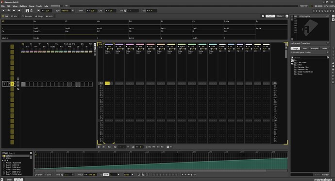
Yes, I realized this for the first time when I was trying out some themes. When I wanted to go back to default it surprisingly didn’t look the same as before. I had never loaded another theme into Renoise before and it always looked like version 2.7 with yellow and white accents (even after installing all the update versions until 3.4), which was my start in terms of Renoise. So I grabbed the old default theme again and made it more eye friendly. The white is less white, the yellow less bright with a tiny tad of orange and the overall grey a little bit darker.
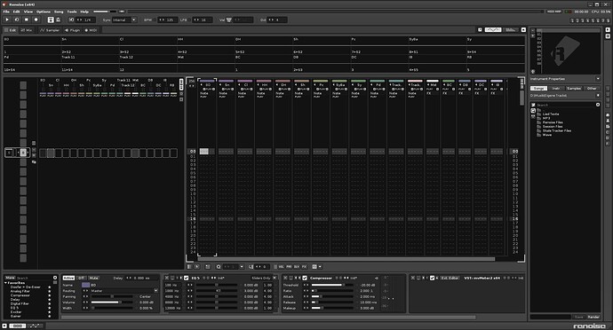
Anyway, I’ve made my own themes a while ago and the one I’m using all the time looks like this:
TNT Basic.xrnc (5.0 KB)
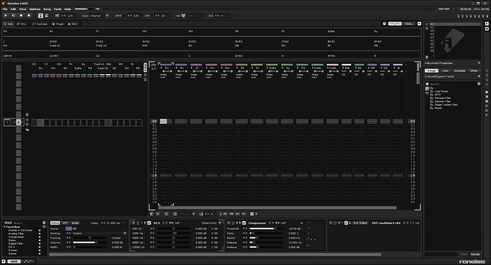
I’ve also made a darker version of the theme above:
TNT Night.xrnc (5.0 KB)
As you can see I prefer dark neutral themes. The less colorful the better. They’re basically the old default theme without any colors and everything is darker. The only thing I left almost original are the colors of the pattern editor font, I just darkened them a bit. And of course the tracks still do have colors, but tamed.
Edit:
The Default theme 3.0 with eye friendly tamed colors in general and Renoise 2,7 inspired automation colors:
TNT Tamed Default.xrnc (5.0 KB)
I also improved the themes above a little bit, the song position marker was a tad too bright. ![]()


