Custom sliders demo, including the "panning slider"

Here is a good example of customizing the GUI of a window. In this case, the protagonist are the sliders. To highlight the panning slider:

Attachment 7992 not found.

I think there are 2 ways to do this. Using a native slider and using a native xypad, both using layers.In this case, I used xypad, rows with plain style and buttons with colors.

The advantages are obvious, but I want to point out some limitations or difficulty levels:

  1. The button that forms the head of the slider must be deactivated. _ Edit: use the pressed of button and remove_child/add_child for solve it!_
  2. It is necessary to adjust some additional dimensions, each time the dimensions of the governing xypad are modified.
  3. xypad has not pressed and released.Only one notifier (when you release the button)._ Edit: For a single direction, it is better to use a slider. It is slower and more precise for control with the mouse._
  4. For midi input, it is necessary to use the button, not the xypad. But it is possible to configure it.
  5. The GUI of the panning slider is a bit complicated to build.The native panning slider does not accept negative values to invert.

Months ago I published how to build a virtual piano.Along with these sliders, it is possible to build a totally customized tool, to be able to edit in the pattern editor using only the mouse.

Using only the button as a head, it is possible to use it as a window slide bar. So you can use a window with different objects and drag it with this system and it looks nice.The API also does not allow a scrollable window that contains objects, only text.All this is a bit convoluted. I just wanted to point out that it is possible to build it.

I am aware that some of youselves already know how to do it. But I have not found interesting information in the forums to build things like these.

Once again, as it is necessary to read the parameters of the selected note column. I use a timer that detects the line change. I want to remember that the API has a problem every time it jumps to the first line of each pattern after reading the later one. Returns the parameters of the first line of the previous pattern, in the first line, of the selected pattern.This should be corrected!

Please, Danoise, can you check this to fix it in the future version of Renoise? Thanks!

Edit :I would like to comment on another usability detail:When you press CTRL and the slider, it serves for greater precision, it goes slower.Ok, seeing this, it seems a bit strange that the mouse does not have “precision” when moving with the mouse wheel over the pattern editor. Currently, he jumps 2 lines. It would be great if, by pressing the CTRL key, the mouse wheel would skip a single line.This would greatly facilitate editing with this class of tools.

I won’t go into details, but I’ll drop some info that I’ve mentioned previously.

Regarding your points:

  1. Buttons need not be unactive. You can just quickly hide/show them, unnoticably, when they are clicked. The underlying control should then catch the mouse click.
  2. The XY pad has an observable that will trigger on value change. Normally, that will happen when the mouse is pressed. Mouse button release can be caught by using the snapback property, and checking if the snapback point is reached.

I recommend not using the XY pad if you only need one dimension. Sliders should work fine, and the XY pad has the drawback of requiring the user to switch ‘Mouse warping’ (in prefs), if you don’t want mouse movements to be strange in many circumstances.

Thanks Joule! Very interesting.

1)I can not get the xypad to catch the click of the mouse. Currently, I have a button disabled and below it is the xypad, and that’s how it works. If I activate the button, the xypad does not capture the click and if in pressed hidden the button, the xypad does not respond either.Did you use this with xypad, or only with sliders?Can you explain how you do it?

I have even used a timer to restore the button as visible, but the problem is that the xypad does not capture the click, since it is captured by the button. The function is invoked with the pressed of the button.

I recommend not using the XY pad if you only need one dimension. Sliders should work fine, and the XY pad has the drawback of requiring the user to switch ‘Mouse warping’ (in prefs), if you don’t want mouse movements to be strange in many circumstances.

I agree.A slider is better because it is thinner, slower, easier to control…I’m doing tests with both, with the xypad and with the slider. For a single direction, the slider for fine control is better.

Here is a one-bar demo tool:7994 ulneiz.custom_sliders_v1.0.xrnx

@Joule. Pleasek would you be able to take a look at the code, so that the slider head button remains active at all times?I can not do that.I have tried to use the “pressed” property of the button to hide / show the same button. Even using a timer. And there is no way.

How do you get this?

  1. Buttons need not be unactive. You can just quickly hide/show them, unnoticably, when they are clicked. The underlying control should then catch the mouse click.

Thanks!

Here is the viewbuilder portion, CUSTOM_VOL_BT is the id of the button:

vb:row { spacing = -919,
    vb:column { spacing = -21, margin = -1,
      vb:row { spacing = -26,
        vb:row {},
        vb:slider {
          id = "CUSTOM_VOL_SLIDER",
          height = 21,
          width = 947,
          min = -1,
          max = 889,
          value = 1,
          notifier = function(value) vws["CUSTOM_VOL_BT"].active = true vws["CUSTOM_VOL_BAR"].width = value+2 vws["CUSTOM_VOL_RW_WIDTH"].width = value+2 slider_value( value, 1 ) end
        }
      },    
      vb:row {
        style = "plain",
        height = 21,
        width = 923
      }
    },
    vb:row { spacing = -3,
      vb:column {
        id = "CUSTOM_VOL_RW_WIDTH",
        width = 1,
        vb:space { height = 5 },
        vb:button {
          id = "CUSTOM_VOL_BAR",
          active = false,
          height = 9,
          width = 1,
          color = { 120,120,000 },
        },
      },
      vb:button {
        id = "CUSTOM_VOL_BT",
        active = false,
        height = 19,
        width = 31,
        text = "..",
        color = { 090,090,000 },
        pressed = function() end,--function() micro_timer_btt_vol(20) end,
        notifier = function() vws["CUSTOM_VOL_BT"].active = false end,
        midi_mapping = "x"
      }
    }

My bad - the trick was slightly different than i remember. By quickly doing a remove_child/add_child on a rack containing the button, it will act as if it was “transparent” on the xypad.

I’ve attached a simple example!

PS. Some further advise for the future: if you need to catch the actual coordinates of the click, you’ll have to do that via the xypad notifier (further implying that the button notifiers sets/unsets some kind of “is_pressed” flag for some kind of canvas system knowing what’s going on).

7996 joule.no0b.testpad.xrnx

I’ve love to have the time to properly digest these awesome tricks and implement them in my own tools.

Kudos for wrapping it up so nicely, joule smile.png

Once again, as it is necessary to read the parameters of the selected note column. I use a timer that detects the line change. I want to remember that the API has a problem every time it jumps to the first line of each pattern after reading the later one. Returns the parameters of the first line of the previous pattern, in the first line, of the selected pattern.This should be corrected!

I remember you mentioned this, but do you have snippet which demonstrates the problem - something you can share with us?

I’ve love to have the time to properly digest these awesome tricks and implement them in my own tools.

expanding the topic a bit… xCanvas? :wink:

I’d be happy to give any input I can. The last conclusion I came to when dabbling with these things was that I probably need some kind of “behavior” class for objects - if the system is to be flexible enough and not just ad hoc solutions for dragging buttons et c… Someone with a proper education should know exactly how to lay these things out? :slight_smile:

My bad - the trick was slightly different than i remember. By quickly doing a remove_child/add_child on a rack containing the button, it will act as if it was “transparent” on the xypad.

I’ve attached a simple example!

PS. Some further advise for the future: if you need to catch the actual coordinates of the click, you’ll have to do that via the xypad notifier (further implying that the button notifiers sets/unsets some kind of “is_pressed” flag for some kind of canvas system knowing what’s going on).

@Joule. Thank you very much for this particular code! This little detail remove_child/add_child is great for many things! For the moment, I can confirm that it does not matter if you use xy_pad or a slider, since the function is executed from the pressed property of the button.

I like the code in particular because you have defined a class for the button. It is a great example of how to create a class, even defining an “id” that is not a string and then converting it with tostring. Thanks for sharing!

Personally, I really like that the look of the UI looks nice and beautiful. These things help a lot!

Someone with a proper education should know exactly how to lay these things out? :slight_smile:

Well, there are not many people in these forums that know how to do these things. :slight_smile:

Well, this is the final result:

7997 custom_slider_2.gif

Now the button numbers are read clearer, easier to read. This is an animated gif. But the real result is fine and precise. Sliders and CTRL are used for greater precision.

The panning slider is the most complicated. But with more layers it is possible to build it.With all these tricks, the result is pretty good for a customized look…

Note: the panning slider has an error of 1 pixel in its bar. It’s silly, but it shows.It’s a matter of adjusting it.

Here the old demo:

[sharedmedia=core:attachments:7992]

I remember you mentioned this, but do you have snippet which demonstrates the problem - something you can share with us?

Yes, give me a little time and I will share here a demo tool with the problem. Follow this same thread.

I remember you mentioned this, but do you have snippet which demonstrates the problem - something you can share with us?

@danoise.Here is a demo tool that can reproduce the problem:

7998 ulneiz.microedit_v1.0.xrnx.zip

Steps:

  1. Unzip the zip. Install the tool and load the attached song.
  2. Enable the top checkbox inside the tool to activate the timer.
  3. Play the song in Renoise (follow the player must be enabled).
  4. Important! With a little skill, try to stop the song on the first line of the next pattern.The result is that it reads the first line of the previous pattern, when the cursor is in the current pattern.This should not happen.It is not expected.
  5. Repeat step 4 from the second line. The reading of the data will be correct, of the current pattern.

Well, if you move with the mouse cursor, without the song playing, there is no problem reading data on the first line.

This demo tool does not have a pattern skip notifier, so it does not updates the data for each slider.It would be necessary to check if in this case the problem persists as well.

Well, this is the final result:

It seems to be working :slight_smile:

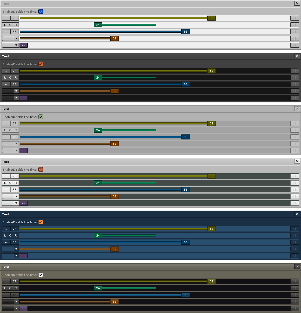
Just a note… when using tricks like these, It might be a good idea to test drive the GUI with different themes, including inverted themes and whatnot. At least if you plan to use them in public tools. I’m not completely sure that a rack with ‘plain’ style as overlay will appear consistent in all themes and situtations where it happen to work with the default-ish themes, so It’s probably a good idea to check that. Personally, I think it’s best to stick to native controls whenever it’s possible.

Is there any way to create a function that forces the reload of the entire GUI of the tool window?If this were possible, it would be simple to offer a section of preferences with the colors to choose, and that each user chooses whoever the color they want.

Unfortunately, the current API does not have a way to access Renoise theme colors (skins).I miss being able to access certain colors, such as the selection color, for example.Anyway, the colors that I have chosen (quickly) are quite dark. But making it look good on all themes is impossible.

If there was a way for the user to choose several colors, and with just a push of a button the GUI of the window would be updated would be great. Any ideas?

A separate topic, I’m making another “big” tool that uses sliders, and I’m not going to use this masking trick, keeping the original sliders.

That said, I remind Danoise to point out the need to update the sliders to be able to invert them, and be able to use them for panning, to the left and right, and to add the double-click to establish a reset or return value in the API.

The properties could be these:

vb.slider {
  id
  height
  width
  min
  max
  value
  notifier
  tooltip
  bind

  *return = value (double click of mouse)... 'return' or 'reset'
  *mode = string --> "default", "reverse" or "panning", 3 modes
  *pressed = function() --(why not?)
  *released = function() --(why not?)
}

--in "reverse" if vertical, from top to bottom; if horizontal, from rigth to left.
--in "panning" if it is horizontal the bar would work from the center to the right or left...
--similar to minislider and review xypad

Precisely, these tricks of this thread are made by the lack of these properties…

Edit:Maybe it is necessary that the properties min , max and value accept negative values … ???

[sharedmedia=core:attachments:7997]

7999 custom_sliders_themes_1.png

Inverse, Default, Redux themes… Perhaps in the clearest subjects it would require lighter colors. I think that with 2 intensities it would be enough (dark and clear).

Is there any way to create a function that forces the reload of the entire GUI of the tool window?

Ok, I think I am already know how to do it.With storing the new values in a table or in an xml and a button to apply would be enough. :ph34r:Anyway, I would like to know if the API has “something” that can be used to reload the complete GUI, without closing the window.

Not completely sure what you mean…

  1. You can’t change theme colors from the tool. At least not live, I think.

  2. If you need to do something like a complete “refresh” of a tool gui, you can rebuild the gui and remove/add_child it from a top-most rack acting like a container. Even simpler should be to :close() the old dialog and open a fresh one with the gui rebuilt. I can’t see a case where you’d want to do this, unless you’re doing something “wrong”… Viewbuilder rendering seems to be very consistent, except for some rack resize issues where some trial and error might be needed when scripting.

Btw… if you were talking about re-using theme colors for button colors, it’s totally possible to read the XML file containing the color presets. I discussed this briefly with Danoise some years ago, suggesting he should add it to his cLib. It’s not that difficult, but If I recall correctly, he was hesistant due to the testing required to verify it on all OS:es. Maybe it wasn’t just that important :slight_smile:

  1. You can’t change theme colors from the tool. At least not live, I think.

That’s true - just like with things like view presets, keyboard shortcuts etc. the API does not (will not) allow a tool to redefine these things.

Which makes sense IMO - the tool should respect the user preference, not the other way around :slight_smile:

And yes, I did import colors from the user theme, but it was mostly a “proof of concept” and not something I was ready to put into released tools.

Might indeed revisit this :slight_smile:

Anyway, I would like to know if the API has “something” that can be used to reload the complete GUI, without closing the window.

You need some code that either updates the view elements (you can always change the color if you have a reference around), or something that pulls down/recreates the entire thing.

Which approach you prefer, is of course up to you.

Also, the observable pattern is great if you want avoid having to “manage” a GUI every time some little value changes in the logic of your tool.
Observables are closely related to the Document API, which is what tool preferences are using.

Not completely sure what you mean…

  1. You can’t change theme colors from the tool. At least not live, I think.

  2. If you need to do something like a complete “refresh” of a tool gui, you can rebuild the gui and remove/add_child it from a top-most rack acting like a container. Even simpler should be to :close() the old dialog and open a fresh one with the gui rebuilt. I can’t see a case where you’d want to do this, unless you’re doing something “wrong”… Viewbuilder rendering seems to be very consistent, except for some rack resize issues where some trial and error might be needed when scripting.

Btw… if you were talking about re-using theme colors for button colors, it’s totally possible to read the XML file containing the color presets. I discussed this briefly with Danoise some years ago, suggesting he should add it to his cLib. It’s not that difficult, but If I recall correctly, he was hesistant due to the testing required to verify it on all OS:es. Maybe it wasn’t just that important :slight_smile:

Maybe with remove_child and add_child it is possible to change some color live.

Anyway, I’m contemplating several possibilities here. Well changing the color in some table and then pressing an update button that changes the color of some buttons (basically). Or, saving those values in an preferences xml. I’m thinking about building my own RGB color panel so I can save several values for several types of buttons. I’m thinking how to do this to take advantage of it in various tools. In the last months I have learned to build all these things.

On the topic of reading the XML that contains the colors of the theme, there is always some added difficulty, such as the fact that it is fully compatible with all OS. I suppose that in each system, the XML will be saved in a different site.

I have a tool made that manipulates folder addresses. I know it works well in Windows, because I’ve tried it. But I do not know if it will work well in MAC or Linux, because of the file paths, double bar //, \ and so on …

On the other hand, seeing that all this has relation with the GUI, I have noticed that the use of textures in the skins (themes of Renoise) drastically affects the performance when you hide or show multiple objects (visible true / false) or removes add multiple objects (remove_child, add_child). The use of textures can affect important lags in large window tools (resolutions close to 1920x1080 or higher) … I think I will open a new thread on this issue.

@Joule and @Danoise.Actually, the interesting thing is that the tool has access to the colors of the theme used (skin of the user), to adapt the tool to these colors. It is not about modifying the colors of the user’s theme, but about adapting the colors of the tool according to these colors.

It would be interesting to have access to the value of the theme colors (import them into a table inside the tool for later use), to be able to use them in the tool. A clear example is: build your own checkbox. What color do you use to mark it?Surely it will not correspond to the theme (skin) of the tool of the user.

That’s true - just like with things like view presets, keyboard shortcuts etc. the API does not (will not) allow a tool to redefine these things.
Which makes sense IMO - the tool should respect the user preference, not the other way around :slight_smile:

Lo and behold… The renoise.app API reveals that both : load_theme () and :save_theme() methods are available. So, it’s actually possible to make a custom theme editor tool that builds/loads a theme.xml file whenever the user moves some slider.

Not that any sane person would waste his spare time like that… but it should be possible :slight_smile: