Hi,
I haven’t had the chance to really work with the new Renoise until now. After finishing a bunch of other projects, I have to say that I am quite happy to make Renoise the core of my current project. It feels really, really good.
So I just spent some hours in the Sampler interface and I have to say, I love the workflow, I love the results, but there are tools I am missing and some GUI details that makes it clunkier than I believe it could be.
I have to admit the GUI part is quite a challenge considering how deep Renoise is getting with the sampler. Also, most of the “tools I am missing” come from what is possible in the Edit tab, aka your actual song. The reason why I’m missing them in the Sampler is because I believe the .xrni opens up a lot of possibilities in how we compose and also perform electronic music. Sequencing phrases from an external, more performance-oriented sequencer is what turns Renoise into the perfect performance DAW to me. Something that could not have been said of Renoise a few years ago. This great midi/osc integration makes this possible.
GUI:
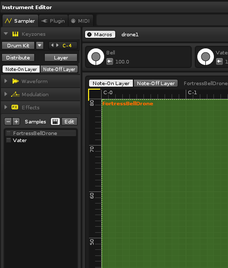
I find the Sampler requires a lot of clicking around since you have many tabs and subtabs. It becomes even more complex when you use many samples at once. Also, it feels like the Phrases were added later since its button is so far away from the other tabs. It also hides all the other tabs. I won’t go into details here as you are already aware of how it’s laid out. Instead I’m trying to identify where in the GUI there is space for a better layout.
I think it would be much less confusing to keep the 5 tabs at the same place. I see available space at the top, to the right of the Sampler/Plugin/Midi windows but since this navigation isn’t on the same level, it doesn’t make much sense to have the Keyzones, Waveform, etc. tab buttons there.
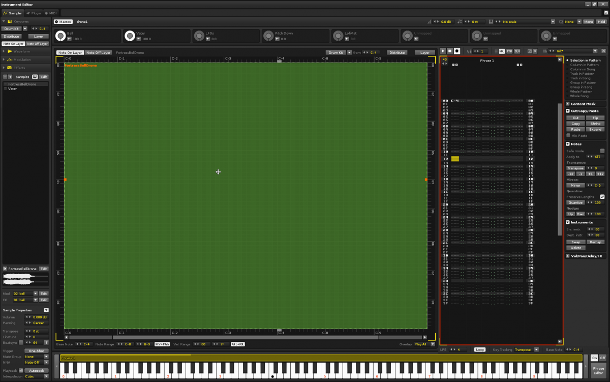
At this point I think it’s interesting to note that even though the Keyzones/Waveform/Modulation/Effects tab have a drop down design, you can’t actually open all of them and scroll (and this behavior is actually a good thing). Except that in the end, these buttons end up taking a lot of space on the GUI. In fact they take up all the horizontal space. They take about 1750px x 100px in my layout right now.The leftmost panel however remains visible no matter which part of the Sampler interface you are focusing on. The interface currently allows me to have 52 samples in the same xrni before I need to scroll that section. I think there could be room for the 5 tabs (Keyzones, Waveform … including Phrase Editor) at the top or at the bottom of this section. There is so much space available there that each of the 5 tabs could retain its dropdown style to further highlight which tab you are viewing and displaying some macro settings for this tab.
I know this doesn’t look very good but it’s to explain my idea. It could also include the Phrase tab as well even if I did not display it here.
Phrases will rarely use a very wide space. I’d say when I use them it takes up at most 15-20% of the width available… leaving a large black rectangle on its right. I often needed to open and close the phrases back and forth to tweak the other tabs. I think they both could be open at once. Yes I probably need the whole width at some point in the 4 other tabs but the phrase tab could be hidden like it can be now. The advantage lies in doing a small tweak to one of the Keyzones/Waveform/Modulation/Effects tabs without having to navigate between each tabs all the time.
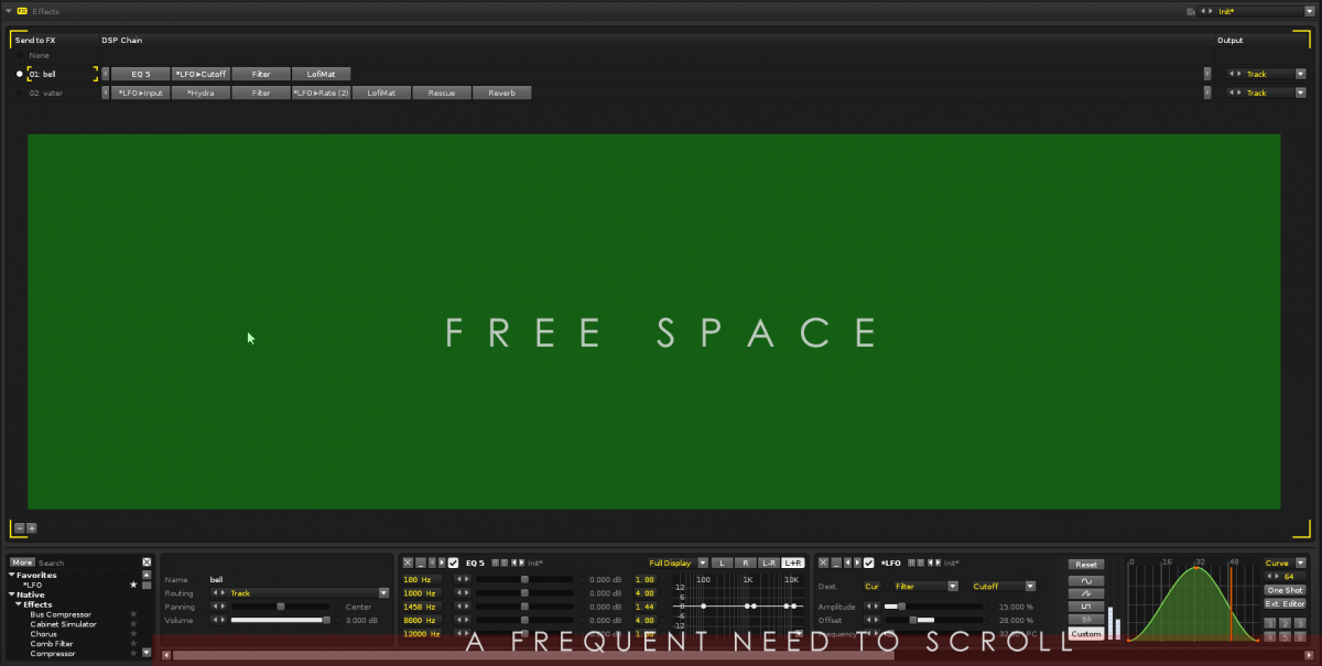
Now about the Effect tabs. I encountered this:
I know the current layout goes along the standard in Renoise’s Edit tab and simply displaying the effects on 2 layers one above the other would be a pretty bad idea, I’m wondering if there’s something that can be done. Maybe stack the effects vertically from top to bottom? I know this is weird but I know would get used to it and benefit from viewing more.
That’s about it for the GUI for now. I hope I make sense.
Now the functionality that I’ve been looking for, maybe I simply missed some of them even if they are available. Like I said, I know most of these features are available in the Edit tab but I want to work as much as possible within the phrases.
Sending one FX chain into another in order to have a master FX chain on the xrni when you have a bunch of separate ones. I’d like the Output dropdown menu to let me choose one of the chain below it.- Effect automations in the phrases. I noticed this need when I wanted to reset my LFO inside a phrase.
- Having the super awesome macros (advanced pattern editor operations) in the phrases. (There’s room for it)
- Mapping sample start and end positions and slices to Macros (oh!)
That’s it.
Thanks.


