2955 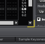
Is this horizontal arrow button position correct for 2.8.0?
Or just GUI cosmetic issue? Umm, I like 2.7.2’s…
2955
Is this horizontal arrow button position correct for 2.8.0?
Or just GUI cosmetic issue? Umm, I like 2.7.2’s…
ok i give up. what’s the issue you have with this?
2957 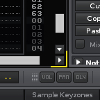
2.7.2
2958 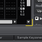
2.8.0 b7
Let’s compare it with another version and current beta version.
Which do you like?
I don’t want to feel this is kind of little changes in 2.8.0.
More room to scroll down and less room to scroll right…
For me its not a dealbreaker. Specially not now that you can collapse tracks. (and i think some scrolling bug fixes are related to this change)