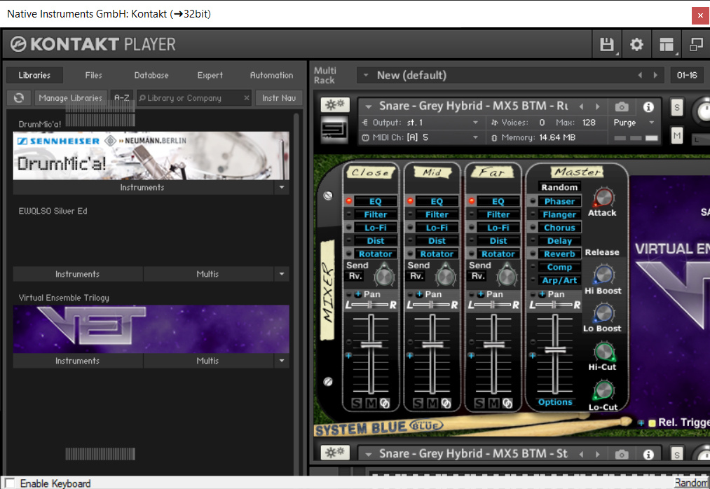
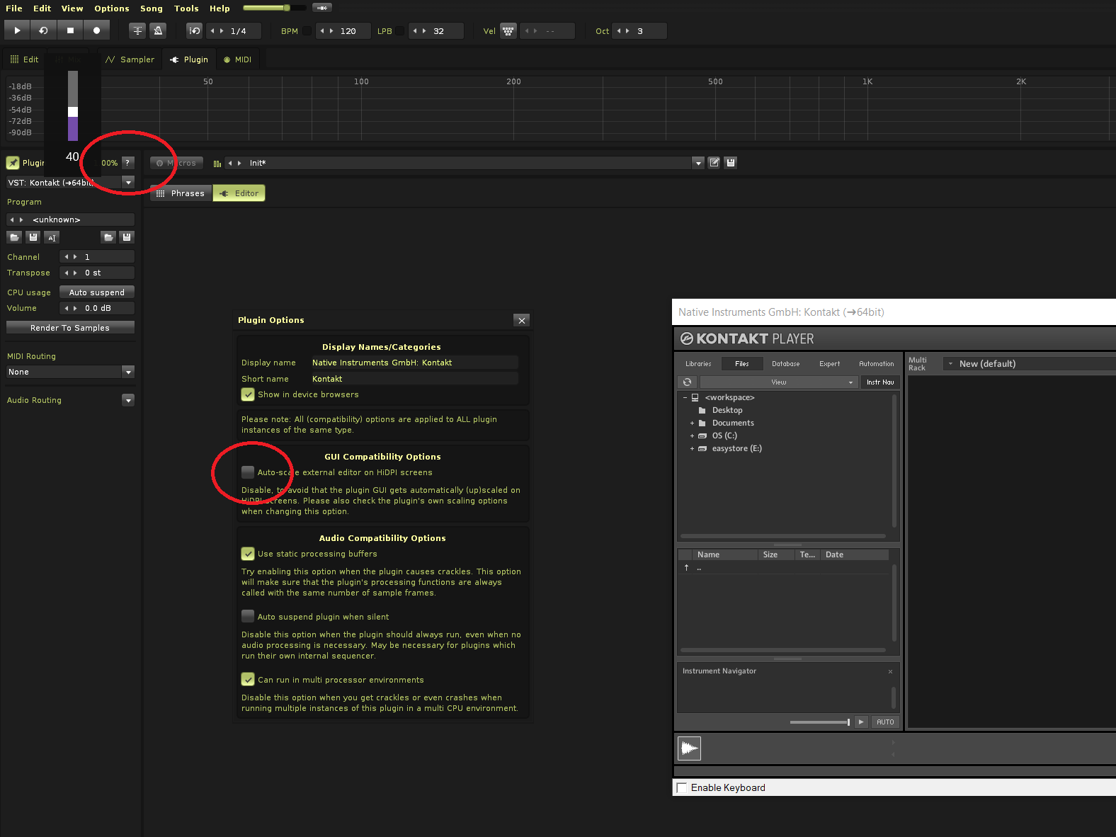
Hi. I’m having some problems with the Kontakt Player GUI in Renoise 3.2. The window that contains the plugin seems to be smaller than it should so that it doesn’t show all of its elements: the content doesn’t fit inside. So, for example, if I want to remove a loaded instrument from the rack, I can’t, because the cross I have to click is outside the area I can see.

If I click in the minimize/maximize icon a couple of times, this is corrected, but only until I do something else that causes the GUI to refresh. Also, sometimes the GUI does some weird things (overlapping of images, for instance). I thought this was a problem with the Kontakt Player, but then made a test in Renoise 3.1 to see what happened, and in Renoise 3.1 it works fine. Maybe there’s a GUI setting to take care of these things that I’m not aware of.
