Got my +1
This idea keeps popping up from time to time. So chances are good that there is a lot too all this.
I would like some kind of different edit mode for this. Or just some “object mode” settings you can quickly toggle on and off.
Perhaps settlings like:
- treat notes as objects
- include velocity/pan/fx
- Bundle data option, with tolerance setting
This way it is much easier to handle already existing data. Not just notes, but any data in the pattern editor.
For instance, when you see this:
C-4 .. .. 0101
--- .. .. 0101
Off .. .. 0101
--- .. .. 0101
--- .. .. ----
It’s kinda obvious that the bundle of “0101” should be one “object” that you can much easier modify with these edit options.
I wrote a longer internal post about this years ago. Don’t remember if some of this was shown public back then.
Anyways, nothing secret about it. I’ll just copy/paste the post here:
As mentioned earlier when we talked about new edit steps (jump to next note etc), I also mentioned something
about a entire new edit mode.
So I tried to visualize how this could be.
The idea is very simple. The goal is to move/adjust existing data in an
easier/alternative way.
It’s kinda like the mixer. We already had a dsp chain for each track, but the mixer made it a lot easier for
ppl to handle many devices and just
mix fast and easy and do small adjustments here and there.
So is this idea, it’s nothing new really, just a helpful tool do do some things faster.
My idea is that renoise automatically bundles the data in the pattern editor and create
several selection blocks. You can then much faster and easier directly move these bundles/blocks around.
For instance:
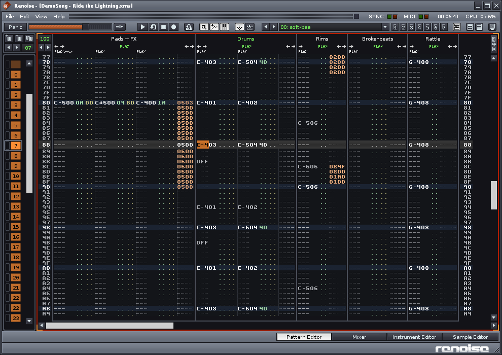
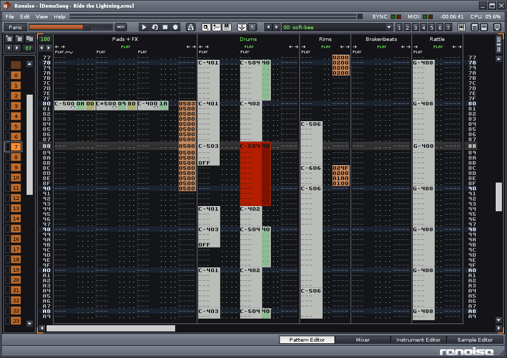
This is from one of the demo songs:
1445 
The way it works now is that if you wanna move a note up/down you have to select it, then cut/paste/DND,
or insert/del cells/lines etc.
Very tedious if you ask me. If you just insert a single clean c-4 note, then you are ok because you can
just delete the note and insert a new one, but if you have other data as well, then you wanna move the existing data.
So what if we had a mode (for now I call it ‘Object Edit Mode’) that would simply ,from some
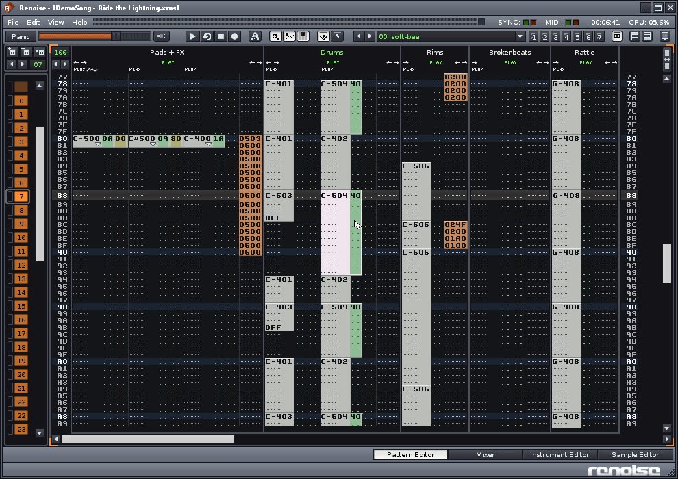
criteria, bundle data together automatically? Like this same picture:
1446 
I just inverted the colors of the pattern data. I don’t know if this is the best way, but this is just
a fast sketch of things…
You see now that the data is bundled into selection blocks.
In this picture the note close to center is focused. You can then simply DND any of these
blocks around.
Using the arrow keys on your keyboard will not move cursor around or move up/down
one line as you are used to. Now it will select next object. So in this case if I press arrow up
it will select the block above. When you come to an end (the top block for instance) then
you will start move one line at a time. Left/right arrow moves to next column with a block
in it (visible on the screen).
This way you very easily move to blocks using the arrows in a way similar to how you
navigate to devices in the mixer.
To move a block using keyboard only, you focus one or more blocks and press Enter
This will then enable you to move the selected block:
1447 
Red block means that you move this block with the arrow keys.
Press enter again to lock the block(s) again.
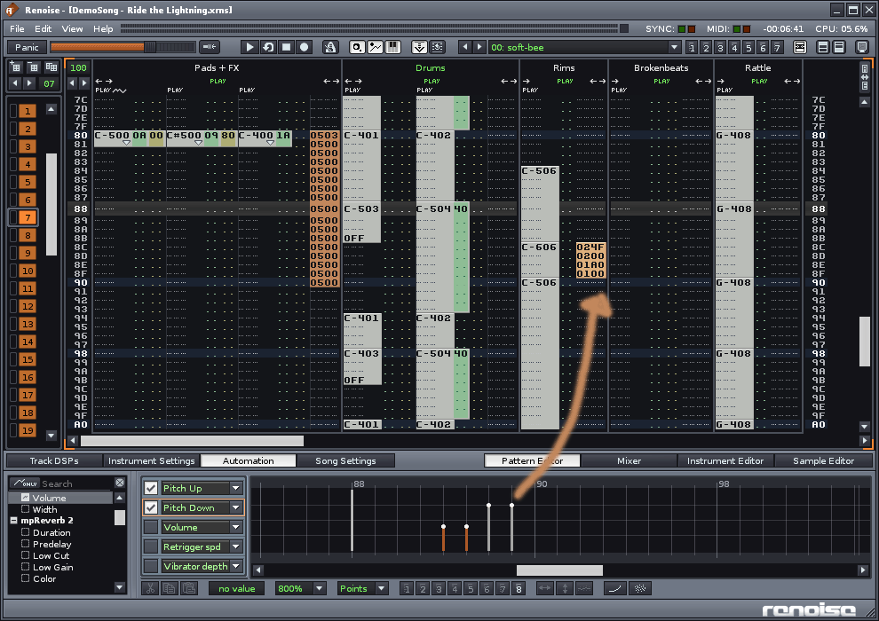
Now to push this idea further we can think of showing properties for these blocks in a graphical
way in the lower panel (in the automation or a combined (or not!) graphical window):
1448 
In this picture the little block of pattner fx’ commands are selected and shown in the lower panel.
Now in the lower panel I just borrowed things from other ideas just to give a clue of how this would look.
When selecting a note you see something like a piano-roll bar. It can be chosen to be shown by
the timeline and ignore the pitch separation like in a real piano roll. So for instance a chord
of 3 notes could be shown as 3 blocks next to eachother. The pitch is not what is important
here, the placement in time is!
If we had flexible lower panel you could also expand it a bit and also show a PR there.
The point is that is a graphical mirror of the data in the pattern editor.
This way it is possible to keep the visually quantized pattern editor and at the same time
have a more or less unquantified representation in the lower panel.
The lower panel have the advantage of not being dependent of showing the pattern editor.
When later having an arranger for instance then the lower panel would still be just as useful!
Also you can have independent zoom from what you see in the pattern editor and what you
see in the graphical editor. And that can save you a hell of a lot of time IMO.
If it was up to me I would love to have an option to toggle the Object mode and the normal
edit mode.
So when edit is ‘on’ you see the normal mode, and when you turn it off you see the blocks.
Of course this would be fully optional…
More ideas:
In the advanced edit box we could perhaps have a ‘tolerance’ setting to set how sensitive
renoise would be to set the blocks? Like how many lines between data, or if it should bundle
chords together etc or in the opposite range it will bundle only single cells… dunno if this is too
much. But something to thing about…
In the lower panel/graphical editor you have much more view options, like follow cursor, zoom
to block (like you see now), separate note columns, or show entire track, or even several
tracks etc. Much more zoom options etc…
More move options (using modifier keys): move objects one visible line, or move one real line,
or move one tick (this depends on how the pattern zooming concept will be)…
Hotkeys to adjust parameter values on selected block (also use mouse scrollwheel to do this?)
