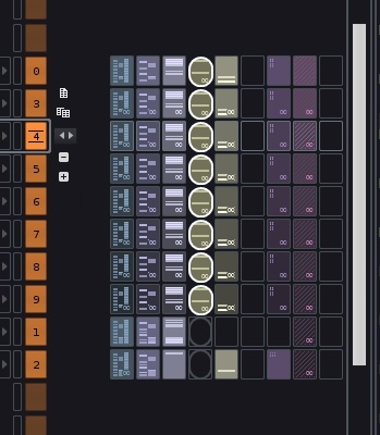
I must admit I’m not to fond of your mock up and used shape, whats wrong with how it is done now? I can only see benefit in making the current selection borders more brighter.
I have to admit that it is not the prettiest in the world, but I am all for better/ more obvious selection, particularly when you can have independently horizontally scrolling pattern editor and matrix now. This makes relative postion of the two cursors change quickly.