A thing that has bothered me in Renoise is being able to see in which track I’m in the pattern matrix at a first glance. I’d like a more pronounced view, have it be optional and/or be able to set the strength of the pronunciation. Extra slider(s) in the gui preferences for the lines that enclose and signify cross-hair position.
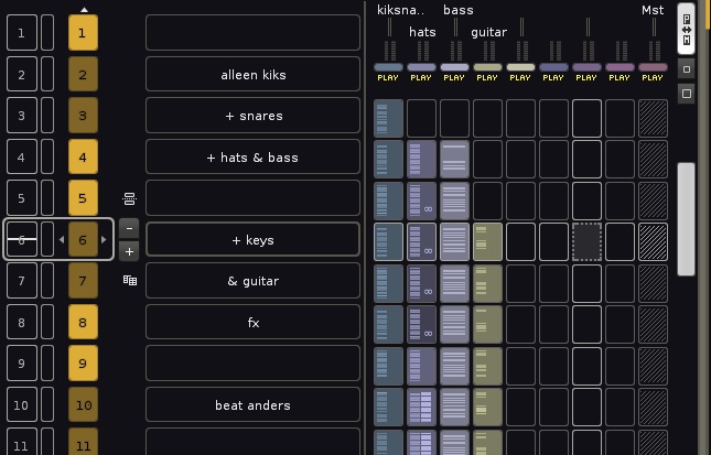
There is a difference in the graphics whether you’re focused in the pattern editor or in the matrix. When you’re working in the pattern editor, the matrix can look like this;
When the slots are empty in the matrix it is clear enough which pattern has the cursor.
When you’re focused inside the pattern editor, it becomes more unclear in the matrix when tracks have note-events / slots are full; 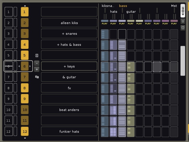
Notice I’m in the track named ‘bass’, you can see its differentiation in color in the top of the picture, yet the block that stands out most is a selection in a different track, empty slot in the same pattern.
Here I’d also like the cross-hair slot in the bass pattern of the 6th pattern stand out more.
When focus is on the matrix, it looks like this;
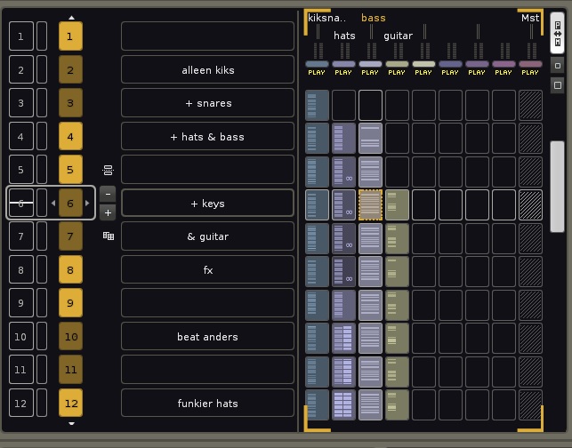
A little better with the dotted encapsulation, but also open for much improvement imo.
I’m a little colorblind  and have tried different themes to see this can be improved. But think a strength setting for the cross-hair lines in the matrix would be great, having a clearer encapsulated matrix slot where the cursor resides in the pattern editor. Anyone else could appreciate pimping of the matrix cross-hair?
First world problems during the rona, sorry.