1936 
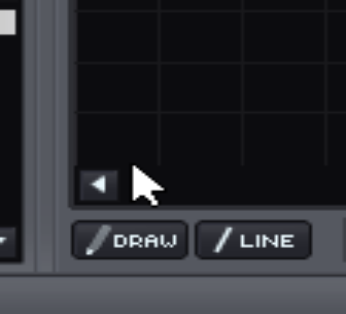
if you look carefully at the scrollbar, you will notice that the arrows are a little bit smaller than they should be.
also, there is a little glitch in the scrollbar background, which goes a couple of pixels too far on the left.
but the main problem is that there is not a clear definition of the boundary between the scrollbar and the automation view.
if for example I click where the mouse pointer is placed in the above picture, I would expect to place a new automation point on the automation view, but no: the scrollbar is actually moved as if I clicked on the scrollbar area.
it would be good to have a tiny horizontal line which shows the boundary between the two views; one like the other horizontal bars which are visible on the automation view; also, having arrows of proper size (i.e.: slightly bigger) would lead to less confusion