5000p x 5000p. I forgot to set it at 300 resolution for printing. But that’s a quick fix in Photoshop. Also, if you guys don’t like the noisy look of the spiral, there’s a clean version as well.
Wow, good point. If it were to be printed on black than I definitely agree with yours. But if it goes on a dark gray, I don’t think it would look as sharp.
I think mine’s neutral with the gray. But then again it doesn’t look as good on black.
This thread reminds me that I have to buy a new t-shirt (gave away my last one to my former girlfriend when it started to shrink, apparently washing it in 40 degrees changes the size a bit after a while).
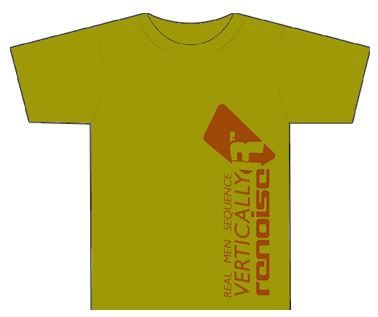
Edit: Oh, and on-topic: Nah, I like the original logo a lot more.
i like the first design, personally i think the “renoise” should be above or below the pi/shell/spiral/fuzzy distressed renoise logo pi shell spiral thing.
In it’s current incarnation, it may not fit well with that idea so possibly a white border (think 70’s style) around the letters. to match the actual logo in the design, (since it has the white fill in it) perhaps removing the white fill from the logo, and around the name, removing a little from around the name, similar to the white border spoken above just removed from the design.
If ideas were wanted i would suggest to add a highly intricate design pattern on the fins of the spiralicular renoise logo. as in sea shells they show highly detailed intricate pattterns.
wait, do we have vector art for the logo, or access to the font?