That’s fine. There are users who decide to use only the tracker. Others, who decide to use only the pianorolls. And there are also other users who decide to use both. That’s the good thing, to have several options to use. You can choose what you want.
Raul, I could’ve been rich if I charged for Nibbles…maybe even a warez version for some extra cred/developer flattery  I could dream
Ah, I was wondering why you didn’t fill in between notes to give a rough idea of length. Ok.
You do not know it well, because there are thousands of users supporting this project. ![]()
![]()
![]()
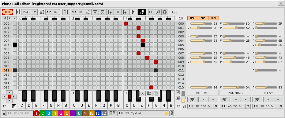
The image is very good to explain it.
I suppose if you’ve read the thread lately, you’ll see the answer.
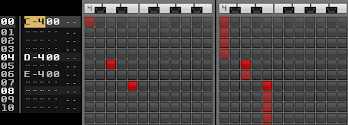
Imagine that on line 11 there is also a note-OFF. The reference is a tracker, keep this in mind. That there is one note below another does not mean that the sound is cut there. Even the note-OFF sometimes does not stop the top note. All this within the same pattern. The matter gets even more complicated among patterns.
I know that many users have other pianorolls as a reference, and they want to see the elongated blocks to mark the duration. But Renoise is more complex than that.
More details…
- The shutdown notes not only serve to stop the sound. Renoise is so good that he uses this “special note” for other things.
- A sound can be muted even when playing within of a line.
- In Renoise, programming “between patterns” is quite an odyssey. There may be extreme cases that make lengthening the representation of the note by its duration does not make sense.
- The performance will be higher if the commissioned functions do not have to be “cleaning” things when they really should not be there.
- The representation of up to 12 columns of note per track invites not to use this type of “rectangular representation”.
- The roll can really become saturated with colored slots very easily.
They are too many details …
Honestly, I think it works better by being true to what Renoise shows, which is one note per row. In the end, the important thing is to know where the firing note is, and where the note-off is, if it is.
…
For some reason this issue reminds me of the arcade game of the snake, to which the tail is growing while he is eating. ![]()
Someone wants to play? snake game - Google Suche
Sounds like business is booming Raul. Retire early and more time at the beach then ![]()
As for the show length thing. I’m not going to argue Raul (it’s been done to death hasn’t it?) Taking into account every little issue that Renoise could throw up etc… Personally (if it was my own tool) I wouldn’t take all that into consideration. I’d just do it as simple as possible. So long as my simple algo doesn’t crash or anything I wouldn’t mind a ‘crude length’ representation.
Just my opinion, I understand if people prefer no length representation rather than possible inaccurate messy representation of every single complication/nuance ![]()
If now, a user who has no idea of this topic, sees the two images of your screenshot, this user can think that in the image on the left there are 3 notes and on the right there are 10 notes (which is what you have done to take that screenshot, I suppose). The only way to do that is to make a superimposed layer and resize it. Actually, PRE already has several layers for other things. It would be too burdensome, in the case of wanting to ignore all the problems mentioned above.
By the way, I recommend not using the textures in Renoise to use large window tools. The tools, in general, do not get along with the textures (they are superimposed images in BMP format that stretch or contract). They can affect the performance with respect to the resizing of the windows. In powerful PCs you will hardly notice (if the code of your Viewbuilder is well built). But in old computers or laptops little powerful, it will be noticed enough.
hmm, you’ve got some points, especially about the disonnected pattern issue. at the very least it would still be cool to have an option per instrument/sampleslot/part_of_inst_name for additional boxes to be visible (with lowered tonal value so one can distinguish it from several notes in a row (or actually in a column)) but if it means a drop of performance then I think I can live without it 
Also I wonder if it is possible to add fx colums to the tool. Like a separate view where instead of a keyboard all automated fx device values are shown. I love the way to edit the v/p/d stuff so much, it would be fantastic to be able to tweak the fx in a similar manner. Let me dream, ok?! 
Uffff!!! You just played the most “delicate” part of the PRE, possibly the one that needed the most work. Adding the detection of “the effects parameters” within the functions that are in charge of updating the data could be very heavy, that is, affect the performance.
But since you have used the PRE3 and know approximately how it works, you will see that PRE is ready, or rather, PRE has set aside the issue of the effects columns and the sub-columns of sample effects in case I want to add it in a future. That is, this matter was planned before starting to program. I have already done several tools related to the control of the effects parameters, so I know what I am talking about.
This particular issue requires a lot of work. Think that not only are the parameters of common effects, but also all the effects related to the automation from the tracker (not from the automation editor), which are 4-digit numbers (they are no longer values of a range of 0 to 256 , but from 0 to 9999). Any change in the tracker implies a concrete update in the PRE. Handling all this would be somewhat complicated.
Instead, it would be possible to add something that is very practical and would save a lot of processing effort. It would be something like a valuebox and a slide bar, which would represent the row where the cursor is. So, with the mouse you can change the parameters very quickly.
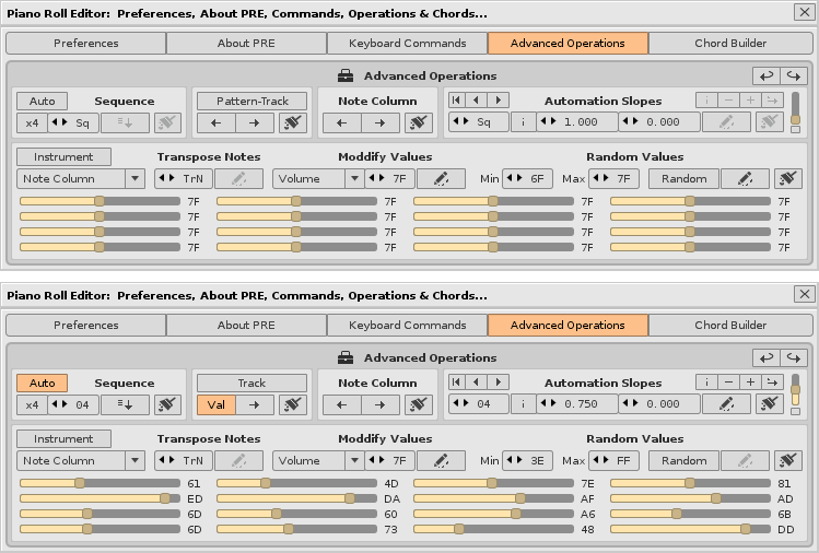
If we want to be practical, I would prefer to add another module within the preferences window, in the advanced operations tab, that would be dedicated to all effect parameters. It would be a separate thing, and it would not affect the performance of the roll. PRE has been conceived as pure notes editor, not effects.
I also imagined a column of SFX and EFX next to columns V-P-D. But every time I think about it, I prefer to maintain the performance of the roll and add another module. Would be the best.
For the moment, if you want to modify effect parameters, you will have to return to the pattern editor. There are also some options in the “Advanced Operations” module, in the PRE preferences window.
ufff2. yes, I had some idea that this wouldn’t be easy.Also I think it isn’t a great idea to cram too much features into one addon. PRE is already bursting, I just discovered the chord builder…![]() A separate tool to conveniently edit the patternfx the way PRE handles the vol/pan… columns would be awesome.
A separate tool to conveniently edit the patternfx the way PRE handles the vol/pan… columns would be awesome.
I am studying the possibility of adding a single column next to VOL-PAN-DLY. This column would be called SFX or EFF, depending on whether you have the selected column of notes (SFX) or the effect column selected (EFF, which would change depending on which column of the 8 available ones is selected).
Currently, when you select an effect column, the roll is emptied of information. In Renoise, the columns of notes and the columns of effects are like 2 separate things. These effects are applied on a line, not on a note.
Reference link: Effect Commands - Renoise User Manual
This changing column would cover the issue of manipulating the effects with the sliders. This is the idea I had from the beginning, but it is a lot of work.
…
By the way, currently, the columns of VOL and PAN ignore the rest of the effects (the amount accepts a much smaller range):
Volume Column
- Ix Volume fade in in the current note column, with step x*10. (0 - F).
- Ox Volume fade out in the current note column, with step x*10. (0 - F).
Panning Column
- Jx - Panning slide left with step x (0 - F).
- Kx - Panning slide right with step x (0 - F).
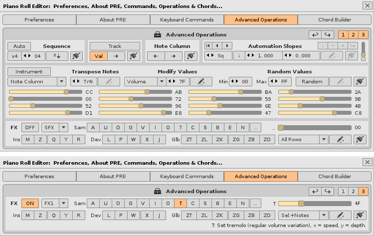
@weizenkeim. Well here is the new “FX module” to manipulate all kinds of effects within the effects columns (sample effects column and effects columns), within the pattern editor.
I’ve been thinking about this a long time, since version 1. I think this is the best solution to have everything in a small window, that does not invade much space and that is quick to use and direct. I usually put it superimposed on the DSP panel, under the pattern editor.
Here are all available parameters (minus the 4-digit automation values). The sliding bar is for the quantity. Enabled (ON), detects automatically the effect where the cursor is.
The pencil button allows you to clone the selected effect down in multiple ways, including the selection area or the detection of notes per line, even being in the effects column. In the lower part a description about the parameter appears. It is always a mess not to have this information in view.
I was eager to get here… The issue of the treatment of the effects has brought me headlong. This solution is very good!
In summary, we will have another module to manipulate parameters in a massive way.
sounds great! can’t wait to try it out
I have almost ready version 4. As always, I need to update the user guides again, which are like a burden that haunts me. Version 3 I launched it without being satisfied with the end of the guides (it would be necessary to update some details). Now I intend to improve the guides and that will take me some time.
The interesting thing about the new version is that the “PRE” will now be something more “intelligent”. It will allow detecting the notes to be played with the mouse on the roll: detecting the note, the track, the note column and the instrument taking advantage of the colors, and of course its volume/velocity value. I’ve also fixed a couple of unwanted behaviors, like in the effects column you should not record any notes and details like that (protect the written notes in the strangest cases).
Also the lower virtual piano will have more capabilities (when hiding the roll).
Now that it will be compatible with the parameters of effects, little more will grow and I may focus on the optimization of some functions, if they are not already. Actually version 4 feels like a very serious program already, without a doubt one of the best tools to edit and monitor notes that has never been created for Renoise until now.
The interesting thing about the new version is that the “PRE” will now be something more “intelligent”. It will allow detecting the notes to be played with the mouse on the roll: detecting the note, the track, the note column and the instrument taking advantage of the colors, and of course its volume/velocity value.
IMO the biggest feature in the tool that I’m looking forward to. This would immensely bridge the gap between piano roll and tracker sequencers in a medium happy like space that I wouldn’t imagine years ago.
I did not want to announce this new news here yet. But I’m working on a video tutorial for the PRE. Probably will be about 8 videos, about 14 minutes each, within the YouTube platform.
The language is Spanish and the subtitle is in Spanish (correctly corrected). Therefore, composers who want the English language can configure automatic translation into English. All explanations should be perfectly understood.
The first two videotutorials are now available here:
1.Piano Roll Editor (PRE). Basic notions. How to start?
2.Piano Roll Editor (PRE). Navigation. How to move?
To be continue…
When the whole collection of the PRE video tutorials are there, I will link them in the first comment of this thread.
I hope that the Spanish language is not a barrier. Enjoy it!
Two more videotutorials are already available:
3.Piano Roll Editor (PRE). Preferences Window. Configuration.
4.Piano Roll Editor (PRE). Peripherals Control. Keyboard Commands & MIDI Input.
Remember that the subtitles are in corrected Spanish. This way you can activate the automatic translation for the English language.
Enjoi it!
One thing I notice with PRE is I can’t control the vol/pan/delay on on rows where there’s no note is present. I sometimes use the Ixx and Oxx to finely adjust the volume for fade in/fade outs. If I do mark up a vol/pan/delay column with no notes on a row through the tracker interface, it does show up on the PRE. Would it be possible to incorporate something like this?
Yes. This particular scenario was the first one that I added for next version 4.0 (this version is scheduled for April). When you hide the roll, and only the Lower Virtual Piano appears, to the right appear 3 slicers for Volume, Panning and Delay, which are used to directly edit the selected row at the cursor position. Then you can edit these 3 values where there are no notes.
You can see a small demonstration in the 10th minute of the following video (I still have not translated the text subtitles correctly):
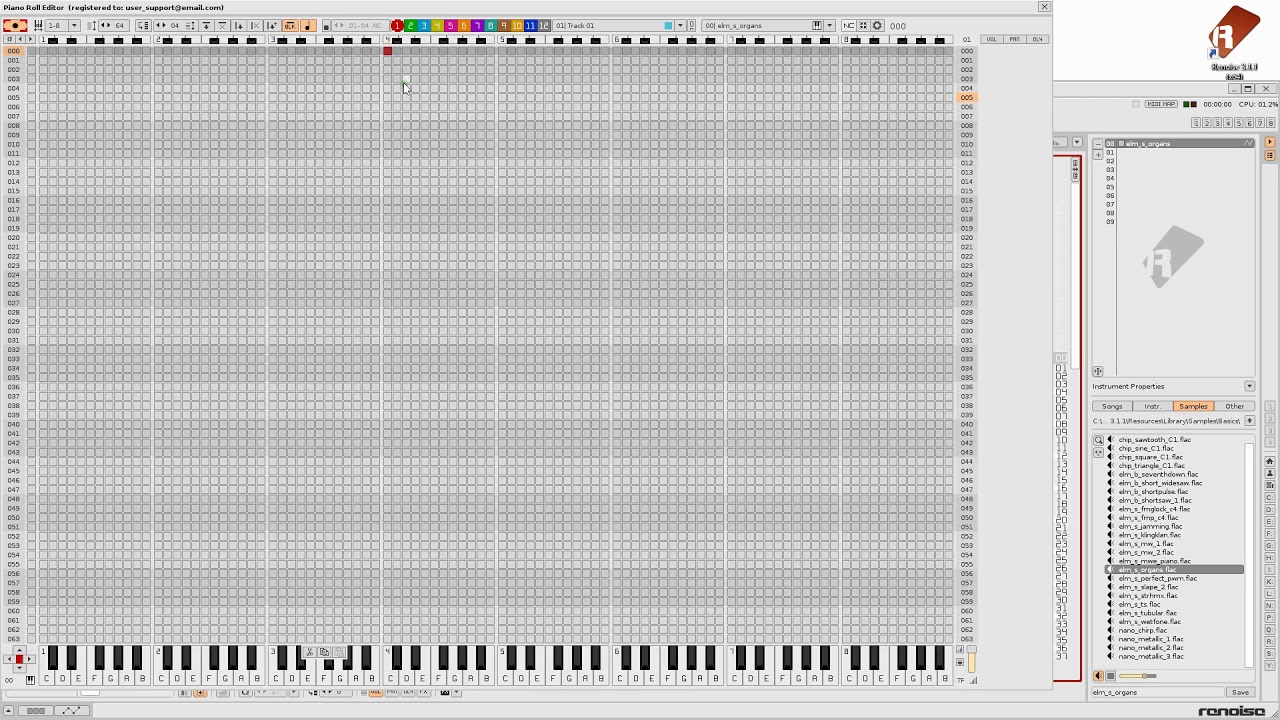
Look well when the roll disappears, and only the Lower Virtual Piano appears…
Version 4 of the PRE is almost ready for this month of April.
This version brings more improvements than the previous version, both in terms of functionality and new options and capabilities.
Some add-ons are:
-New “note monitor” inside the lower virtual piano (compact mode). And the option of “sort notes”.
-VPD sliders to manipulate the selected row of notes (volume, panning and delay parameters).
-The already announced FX module to edit effects parameters.

-Improvements in the selection of the range of lines, and the treatment of the internal clipboard.
-New MBxx and MLxx commands to control the metronome from the patterns.
-Time calculator panel, to easily set the compass, LPB, number of measures per pattern and number of lines per pattern, to apply in the selected pattern or in a selection of several patterns.
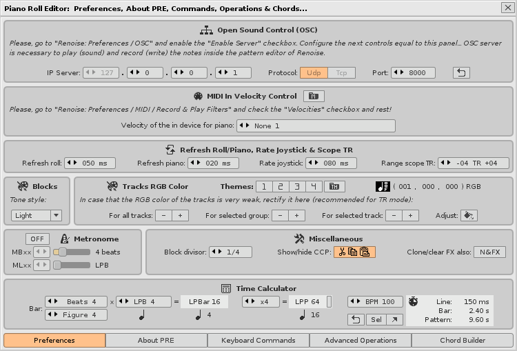
-New panel to show the list of keyboard commands. Now it will be possible to export them in a text file to print on paper.
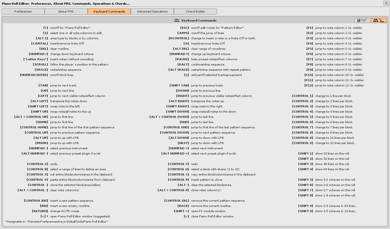
The news is many more… I have also tried to include some requests from users who have supported this project.
As usual, when I’m ready for its release I’ll post it in comment 1 of this thread.
I would like to purchase a copy of your Piano Roll Editor (PRE).
@DANADAX Thank you very much for your interest!
Look in your inbox. There you have all the details …
