New tool (3.3.2): Piano Roll Editor v8.5 build 326 (September 2021)

Virtually everything you ask for is already possible in the next version of the PRE, which comes with some very interesting usability news, apart from those already available.

Except drag, you can select and move the selection where you want, or clone it. It will also be possible to easily create chords with the USB keyboard and more things that have to do with editing notes with the mouse, which is where I have lost the most time now.

The issue of dragging vertically with the mouse is not possible due to the limitations of the API. There is no adequate method to solve this operation, without doing “weird things”.

At the programming level, by means of layers it is possible to drag an overlapping element with the mouse, but it can work well in a non-resizable and small grid, which is controllable, or for a rectangular area, such as a custom sliding bar.

That’s what Chord Builder is for. Build and save your chords or use the presets. Use the upper mirror piano to enter the chords with a single click.

There will be a way to make this much easier, just by clicking with the mouse. But I still can’t reveal how it’s done.

You can insert the note + a note-OFF directly, with a single click, and then change the position of the note-OFF. It’s very quick to do. It’s only 2 clicks.

To move chords, you only need to select them and then move them with just one click. You can select an entire area inside the roll and move it wherever you want.

For this is the Chord Builder. I suggest you learn to use it. Under the roll I can’t add another panel. It would take up too much space.

Wait to try version 6 of the PRE. I will still take time to publish it.

1 Like

PREv5 and earlier versions have a strange little effect of “ghost note slots” in the progress of playing the song. This is being corrected for the next version 6.

Optimization tasks are as important as the elimination of bugs or even the solution of critical bugs that can block the program. If the graphic performance is not rewarding, the user perceives that something is wrong, feels uncomfortable and prefers not to use the program in question.

One of the most complicated tasks when building complex window tools for Renoise is that the graphic performance must be remarkable and fluid. You think that any window tool is something additional that is added to Renoise. If Renoise already works “with shocks” or already has “failures” of graphic fluency, they will also be present in the tool. But the tool itself can also influence Renoise’s graphic performance.

Any variation in the fluidity in the progress of the song bothers the user. Generally, if this situation occurs, it is due to the poor optimization of certain functions that have to iterate between different ranges of values or that these iteration functions are too beasts. It is not a problem of changing the appearance of an object, such as the color of a button, which is certainly instantaneous.

In my experience, it is essential to optimize these functions along with a good design and construction of the GUI, otherwise, they can influence the fluidity of graphic performance. A skillful trick is to do something later, or even sooner, but not at the same time as another important process.

I disagree.

Do you want me to put the term “instant” in quotes? You could explain.

You could do, it might soften the blow a bit. The computer has got to run through instructions that take time to execute (even if the perception to the human is ‘instant’.)

@4tey. You are very gridded, but you’re right. But me too. Obviously I am speaking from perception when viewing a tool. That’s why there is a video above.

Any function, however slight, needs some time to execute, even if they are 0.00001ms. This is obvious.

What I meant is that there are “iteration functions” that can cause “a graphic delay”, because they must be executed before. And anyone can think that it is some delay of the viewbuilder (the API GUI), of the change of state of an object (change its appearance), as if that was a great job (change many objects at once). And no, these tasks are ultrafast. I am handling thousands of objects at the same time with this tool.

That said, what I show in the video is one of the things that caused me the most headache to solve. It is not easy to make everything work, when there are many states and you have to attend to them all. You change the switch somewhere and something fails. :slight_smile:

One does not realize these things until you do not schedule something complex in depth.

Edit: @4Tey. By the way, in my native language (Spanish language), the word “instantaneous” means a short duration. It is not a concept of something that has no duration. Does “instantaneous” mean something else in English? I ask because it is not the first time that happens with some English person. Something “instant” has never meant that it has no duration.

I usually interpret ‘instantaneous’ as no time has elapsed. That’s probably just my (incorrect) interpretation then.

Well at least I’ve learned that Raul :slight_smile:

This is like a contradiction. I guess it’s a “vice” of some programmers.

Take an instant coffee to my health! :coffee:

1 Like

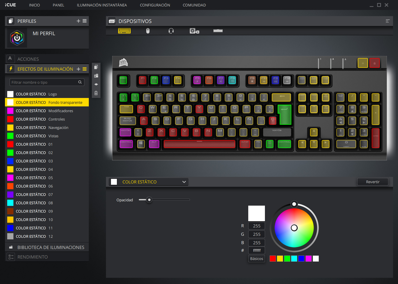
In the following image, I share a screenshot of the Corsair iCUE program, for the Corsair Strafe RGB Cherry MX Silent mechanical keyboard (Corsair Strafe MK.2 RGB (Cherry MX Silent)):
image
This setting is useful for using the keyboard together with the PREv6 tool.

The illuminated keys of different colors help to quickly identify and remember the main keyboard commands. RGB LEDs are useful here. Take advantage of the LEDs to better control your USB keyboard!

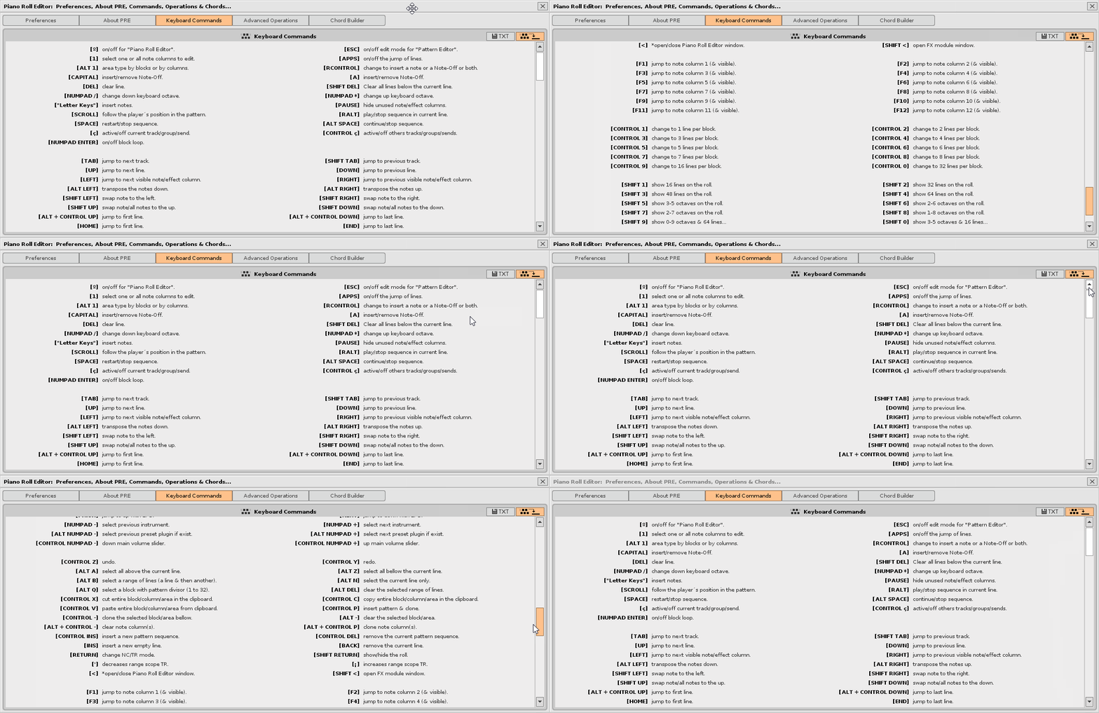
New custom slide bar for Keyboard Commands panel:
keyboard_commands_slider
API 5 does not have a native way to create a scrollable list of variable objects.
Here is a pretty good solution of a vertical scroll bar, using layers, a button and a minislider, with the “trick remove_child / add_child”. Unfortunately in API 5, sliders and minisliders do not have the property of “released”. This prevents easily building such solutions.

Thus, all the information is visible on smaller resolution screens, and will allow to add inside the list more keyboard commands more easily.

1 Like

:heart_eyes: PRE6 welcomes the slider to navigate between the lines of the pattern. In addition, it incorporates two buttons (up, down) to navigate between the patterns in the sequence.
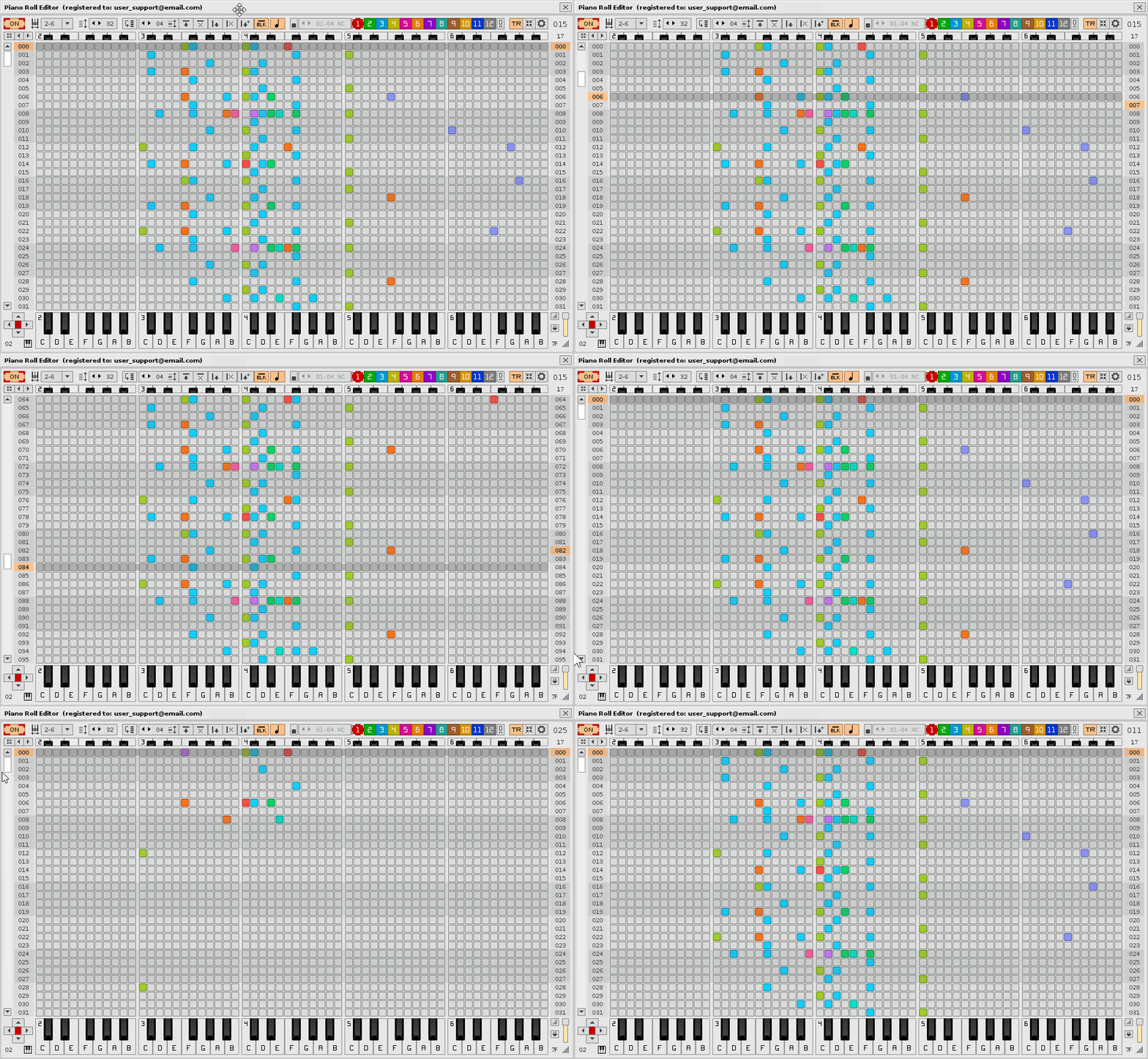
slider_roll
The mouse pointer is getting a lot of muscle!

2 Likes

This looks fantastic. Does it work in Redux, as well?

Does Redux even support Tools?

Nope.

Nope.

OK - thanks.

Thought so.

PRE is only available for Renoise v3 64bit (does not work in 32bit). Currently, I am preparing a version for Renoise 3.2.0 that brings interesting things, in addition to HiDPI support. In fact, I just need to update the instruction manual integrated with all the news. In fact, this new version covers some of the most important requests of some users.

@Raul I would love this tool, if you added bars/note lengths to your editor, including sub-column lengths. A piano roll :smile:

1 Like

This has already been discussed above the thread. The representation set for Renoise is more complicated to build blocks of notes (elongated rectangles). Technically it is possible and I know how to do it. But it would be a chaos in the superposition of layers in the TR mode, which allows to visualize the firing of the notes of up to 33 tracks (they are up to 16 + 1 + 16 superimposed layers). There is a lot of information there. If elongated rectangles were used, much of the information would be lost. For me, the important thing is to show where each note begins and its tone. Also, the note-OFF does not always stop a note and the jump between patterns is a bit “controversial”. It is better to be true to what Renoise shows in the pattern editor.

Instead, in NC mode, you can see up to 12 columns of notes, with their notes off, they are 12 overlapping layers.

I am using “color codes” in both display modes. If I wanted a simple single-layer, single-color Piano Roll, I could use the elongated rectangles for the notes and their duration, but I would only see one layer at a time, which I think is very limited, and would have problems with the note-OFFs.

What is the philosophy of this tool as an editor? Allow to locate and change those values shown in the pattern editor directly.

When building this tool, I have never intended to “copy” exactly what other Piano Rolls from other DAWs offer. In fact, this tool goes further with layering.

That said, a couple of adjustments in the API would be necessary for all this to work better, in case you want to use a single layer and notes with rectangles. In addition, it is wise to remember that we cannot do everything. The API has what it has and you, as programer, have to adjust to it.

In the next version of PRE, PRE6, it will be very easy to add a note with its note-OFF and modify the position of the note-OFF, all this with just two clicks, only two! It is even faster than dragging and dropping the corner of a rectangle, and note-OFF also has its own representation. You can eliminate it directly, you will not be fighting with an elongated rectangle.

It would be possible to make another smaller and simpler single layer pianoroll project, with rectangles for the notes. But it would be very limited and messy. It would be very nice and all that, but people would go crazy with the slowness to modify the rectangles. Think that you would be constantly fighting with the delay of each line, the “false” representation of the note-OFF, problems jumping between patterns, the overlapping layers (it seems that many forget this). There are too many things. No wonder no one has the guts to build and finish one. You do not dare to make one?

If you would do an object oriented abstraction layer of the notes and tracks, this would extremely simplify the complexity of this. I wanted to do that already, maybe I should actually try that. But I think danoise already did this, at least in a very basic way?


But I meant more something purely OO style, so you do not have to deal with the actual iterative pattern structure at all.

1 Like