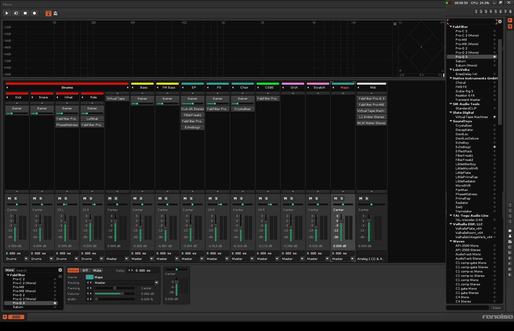
It would be great to have a sub-window in the mixer window for easy access to all your plugins. Similar to the instrument/songs sub-window along the right side in the pattern window.
Currently you can click “more” at the top of the plugins window below to have it extend upwards, but it won’t be permanently affixed there, and it ends up obscuring your first couple of mixer channels beneath. Having it on the right side of the screen would make more sense too not just to feel homogeneous with how instruments work in the edit window, but also because channels start filling up from left to right so the right side is more likely to be “free space”.
or just make audio fx window (left down corner) expandable by alowing it to go up to the top border of window upon some action (click some specific button within it? or just by hovering mouse over it?)
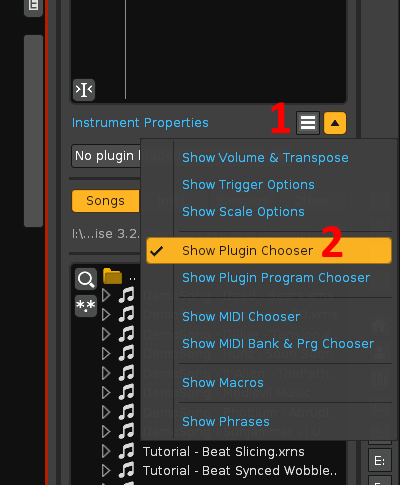
Thanks for the “Plugin Chooser” tip, even if unrelated that’s nice to know
I should specify that this applies to a detached mixer window on a second screeen, where you can’t have that sub-menu along the right side of the screen at all as far as I can tell. It’s only on the “main” screen.
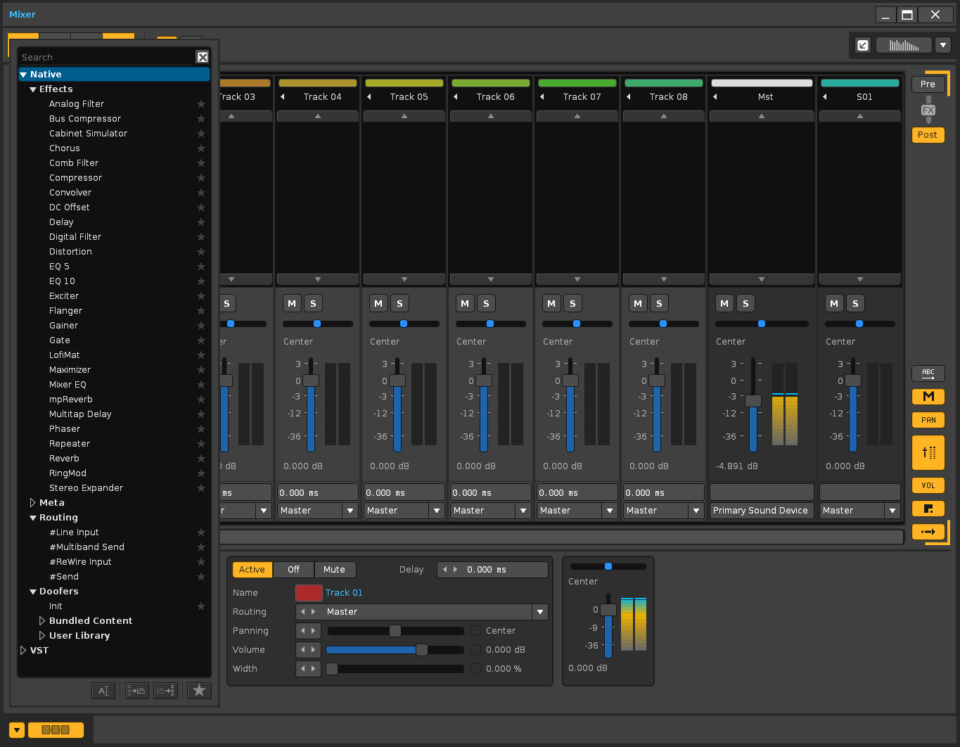
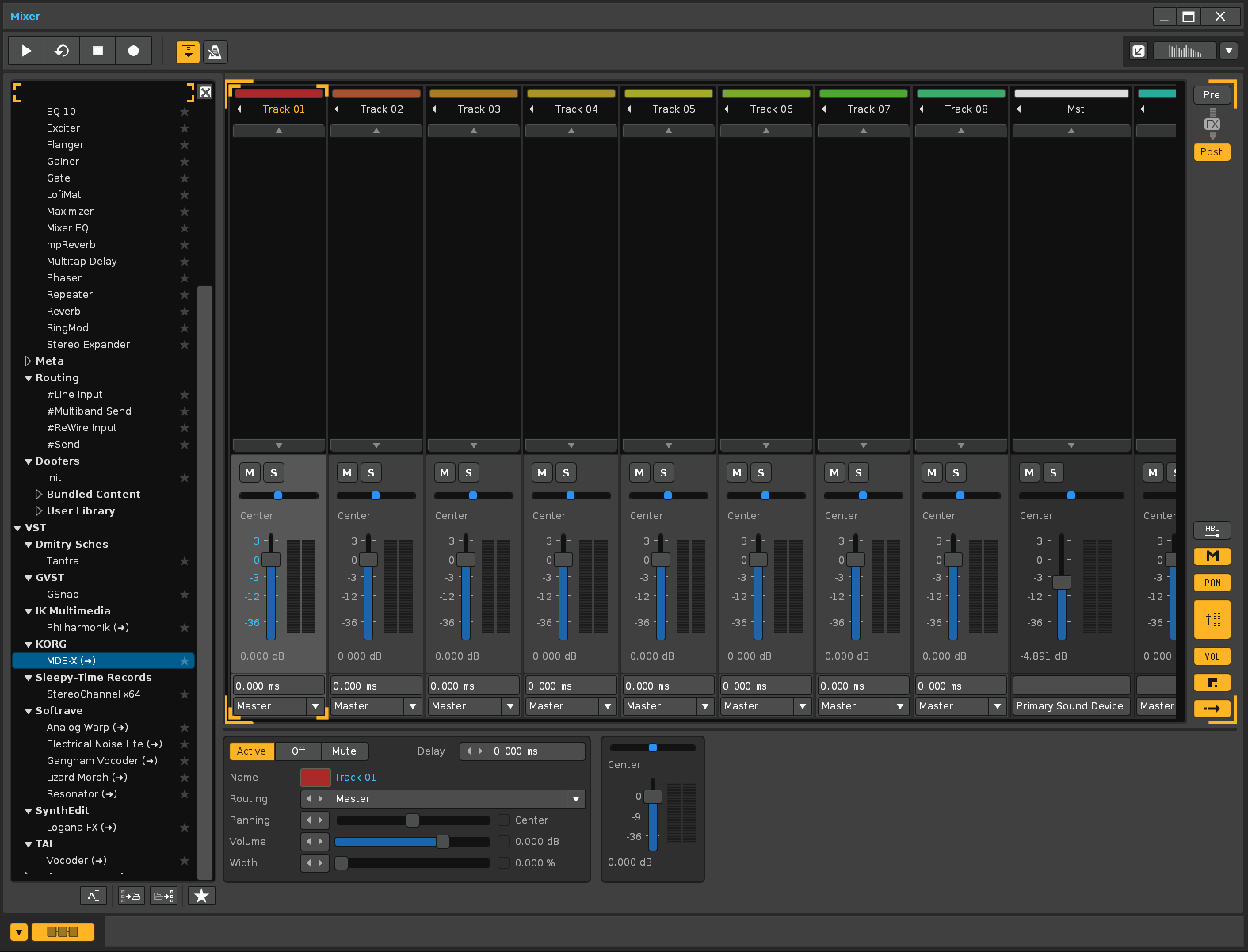
This is the mixer window (separately). On the left you also have the drop-down list of the VST effects. This is part of the lower DSP panel.
What you will not have is the list of VST instruments on the right, which are “properties” of the instrument.
Changing and anchoring that drop-down list would imply changing the list and moving the rest of the panels. That would mean taking it out of the DSP panel.
I know this is what it looks like, my point was simply;
A) You have to click it to expand it to full height each time
B) It hides the fader etc. of the channels along the left side, being on top rather than an indent.
C) Right side naturally has more open space and having it there would make it more consistent with the hiearchy on the other screen.
Just an option to have it over there would be a nice improvement to my workflow which is why I suggested having the option
edit: whether that means detaching the list from the DSP panel, or having a way to vertically align the dsp-panel along the right… either would work, but I don’t actually use the dsp-panel in the mixer window at all outside of selecting plugins.
The only consistent way to implement this would be to remove the panel from the list, but keep it anchored on the left of the window, not on the right. Simply, the rest of the panels would move to the right.
And to be consistent, it should also happen with the mixer in the main window.
Again, to be consistent, the same should happen with the automation panel listing.
Anyway, I doubt that something like this is implemented (because it involves removing the content from its source panel).
Yeah that would have been a huge improvement for sure.
I would have preferred it along the right to mirror the instruments list on the other display, when I use 2 displays, but that ultimately is less critical than just having it visible and easily accessible at all times.