Hi everyone. Sorry if this isn’t the right place to post this, or if this has been addressed before, but to my knowledge it hasn’t. I thought this might go into tool development, but I’m not sure yet if developing a tool is the way to go.
I would like to stylize Renoise in such a way as to remove most, or all of the pattern editor “null” grid, ie the array of tiny dots and dashes found in the note, FX, and volume columns. So far, I have tried going in the appearance editor in “Settings” > “GUI” and fooling around with colours and transparencies. Unfortunately, the background dots/dashes are set to always be the same colour as the notes which get inputted over them.
I have also tried fooling around with the font files (on a Mac) in Renoise (app) [show package contents] > resources > skin > fonts. I have tried swapping out different font files, and even editing the font files to manually delete anything which looks like a dot or dash, none of which seems to have any effect, unless I was careless about it which is possible.
I am thinking that the actual dots/dashes are not a font at all, and are simply hard coded into Renoise as pixels, but I’m not sure at this point. If anyone has any ideas I will happily try anything and report my results.
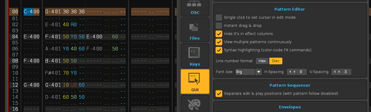
These are the options you can change (Renoise: Edit/Preferences/GUI: Pattern Editor)
You cannot remove the points as an option. You can hide the unwanted sub-columns on each track. You can also adjust the theme (Skin) so that the fonts are not “obtrusive”. Adjust your visual theme and you won’t need to remove the dots. In fact, the dots are like a dash that indicates that it fits in each place.
Also, you can save a song template (Renoise: File/Save As Template Song). Thus, all those changes (number of tracks, names, visible columns…) will remain.
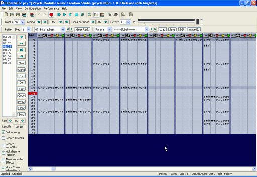
This is how it would look without points. The view would be cleaner to read the data when the pattern is already composed.
I believe that Renoise show the points when no value appears. That is, it is part of the font. Maybe modifying the font would be a solution (DejaVuSansMono.ttf). They are various types of points.
I would also prefer a view without soundtracker style placeholder dashes.
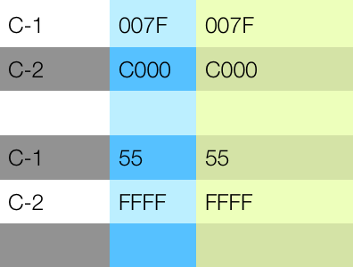
Instead the alternating background could simply use two states, “bright” and “dark”, and the highlighted bars then a bit lighter or so. The font should have THE SAME COLOR ALWAYS, instead you would slightly change the background color using the column color scheme definitions. Maybe like so:
This would be IMO a hell of a readability improvement. Very clear, no distracting lines.
Here is an example how it should not look like:
I also don’t like the black spacing between the tracks, since it tends to look ugly with specific color combinations in the theme. It could be solid consistent instead, having only a thicker line.
The the value columns already could be bars which vary in length dependant on value.
Thanks for the clarification and images, Raul & ffx.
Maybe modifying the font would be a solution ( DejaVuSansMono.ttf ). They are various types of points.
I did try to do that. I used the open source font editor Fontforge and deleted everything that looked like a dot, dash, or underscore from the character table of DejaVuSansMono.ttf (there were many). I then copied the edited font file and replaced the other font variants in that folder with the same one, just to be sure.
This appeared to have no effect on the pattern grid though.
Remember to close and reopen Renoise, after replacing the fonts. But perhaps, the points are generated in another way, and do not depend on the fonts. I have never tried it.