Could the progress bar be removed when a render is complete and replace with text that says: “Done!” ??
We shall pray that it doesn’t come anytime soon. But should Renoise devs ever stop, all code must be opened up.
So the geeks can jump on it and tear apart to the very last screw and bolt. ![]()
+1
Umm I don’t really understand. What’s wrong with the current implementation, and in the end how does it really differ from the suggested one?
well… I’m not debating this suggestion… It’s quite a trivial one… either you agree on or don’t. If the devs don’t get to it I think I’ll live.
As someone suffering from mild OCD, I agree with this.
bump
![]() let me give you an example:
let me give you an example:
you want to render a track. start the render process. you get off the c.puter to make some food and whatnot.
get back and cant remember if its rendered already (missed the click?!)
stupid!
c’mon, it just looks a bit … ehm … unpro!?!
I don’t really understand the point that’s trying to be made here.
Since Renoise 2.0 (and probably earlier, I can’t quite remember) the render progress has looked like this:
2480 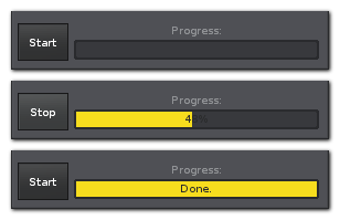
Can somebody please explain to me exactly what is confusing or bad about that?
How is this…
2481 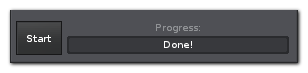
…or this…
2482 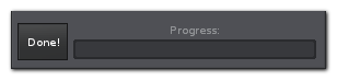
…or this…
2483 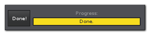
…etc…
…any better or less confusing?
Changing the button behaviour definitely feels wrong to me. Why should the button itself say “Done”? What exactly should happen when I click the button that says “Done”? Will it start rendering again, or close the dialog, or something else? If it should close the dialog, then why should it do that instead of letting me render again? If it should start rendering again, then why should we confuse people by making it say “Done” instead of “Start”? Etc.
How does altering the look of the progress bar change anything? It has already been showing “Done” for years now. What other possible way could it show that the rendering process has finished and is ready to start again (if the user chooses to)? Looking at the three quick variations I demonstrated in the above images, how are any of them better, or less confusing, or easier to remember when you come back from the kitchen with your terrible short term memory? ![]()
I think we’re generally open to suggestion here, but so far I simply don’t understand the argument that’s being made.
it would be lovely for the rendering window to have “Open Folder in finder/Explorer” so one can define a folder, render, and then jump to it.
Just like with those Export Tool scripts ![]()
dblue is right. period.
I’d also like a shortcut to set path to same location the current song was last save in (or opened from) but these are a different topic really…
This is what I would suggest:

It’s not an issue of something being confusing or bad, it’s just a matter of making feedback from the UI more clear. I am frequently multitasking, especially when a system is rendering… I like to glance over my shoulder and not have to read 8 pt font to know if a render is complete… other visual ques could be helpful, such as what I’m suggesting in the mock - Simply removing the bar and replacing with highlight colored text that says “Done” would probably do it for me, but I’d also suggest removing the text that says “Progress” unless there actually is a render in progress. Take it or leave it.
sorry if my feedback sounds harsh, here or in my last reply about explaining this - it isn’t meant to be, I’m just very matter of fact and thought this suggestion didn’t really need much 'splainin… I guess it did. ![]()
Thanks!
ok, sir.
If you’d said this to begin with then a lot of confusion could have been avoided ![]()
I don’t really understand the point that’s trying to be made here.
Since the first post in the thread the request has looked like this:
“Could the progress bar be removed when a render is complete and replace with text that says: “Done!” ??”
Can somebody please explain to me exactly what is confusing or bad about that?
heh heh.
17 posts later… There is obviously merit to the statement whether you want to believe it or not.
Screenshots, details, and diplomacy always works better than blurt and submit.
I think that’s the point that was trying to be made. I don’t think the reduced quote means that was the only argument considered. It was just to save space in the reply. Or at least how I took it.
Reminds me of many another thread…
I personally don’t see
as being any clearer than

for a completed Render!
But if it really makes that much difference to your observations I would be happy for it to change to your suggested graphic.
What about a Render Complete pop-up? Or is that too obtrusive?
The screenshots are misleading.
Instead of 48%, the middle should be at like 85% or higher.
Then, for the glasses crew (like me), it’s hard to to tell the difference between 85% and Done.
Perhaps it could change from yellow to green or something when it reached 100%.