There’s a regression in the font rendering in Renoise 3.5 and 3.5.1 compared to 3.4.x and earlier releases. This is on an up-to-date Windows 10 installation.
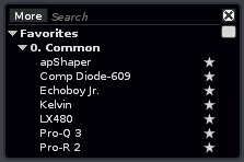
This is in 3.4.4, where the line spacing in the DSP effect list is appropriate and matches the height of the box (no wasted space):
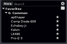
This is 3.5.1 (and 3.5 for the matter). Notice how there’s one fewer item visible (no Pro-R 2 show in 3.5.1), which is pretty critical considering how few items can already be seen in this box by default:
That and of course the approximately half a line of empty space that doesn’t fit a line is just wasted. I’d hope to revert the line height to as it was previously (imo the preferred option), or alternatively increase the height of the box to accommodate the same amount of items.
Also as an aside, maybe time to finally re-think the size and implementation of the DSP box UI in general? It’s starting to feel a bit “2005” in terms of usability… (although I love being able to rename plugins into anything I want in order to sanitize and clean up messy names; please don’t ever get rid of this!)
Worth noting that this seems to only apply to this tiny tracks DSP list box, and not for an example the VST/plugin instrument instrument box. Comparing those, the text is rendered identically with the same line height.
That DSP box indeed needs an overhaul, just like the disk browser. Maybe they should get unified as it’s common in most DAWs nowadays. There’s so many features in that little DSP box which likely no one expects and uses.
Regarding the line height: this was done on purpose. I’ve unified the line heights in all lists in the UI. Nearly all of them used a slightly different height to force things to fit in, just like in this example.
Having one more item in there doesn’t solve a problem IMHO, but being consistent with the layout tidies up the UI in general.
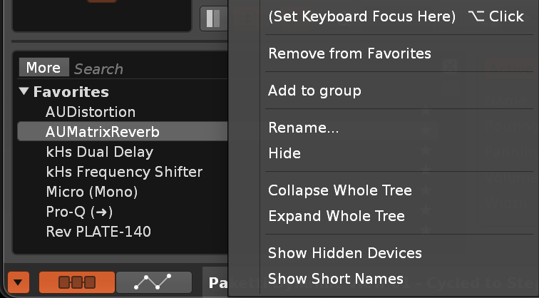
ok i really didn’t expect “Show Hidden Devices” to be there
edit: didn’t seem to show any hidden devices though (like legacy devices?)
edit: i tried to favorite a preset but wasn’t able to add it to a group. hmm.
edit: presets can be dragged around. but i can’t seem to find a spot where i’m supposed to put them into, at least not in favorites space.
“Show Hidden Devices” shows devices that you’ve manually hidden (via right click). I sometimes hide VST2 versions of plugins for example (Renoise can still load old songs that use them, but they’re no longer in my way).
I hope the DSP/file browser UIs don’t change too much, they’re my favorite of any DAW (which I admit could just be familiarity bias).
I really can’t agree here with this approach. Unifying templating and layout is good, but this is clearly a special case where the line height was previously chosen to accommodate the a specific amount of items in the list to maximize the use of the space. I can’t believe any user was bothered by this or even noticed that the line height was slightly tighter in this instance.
Currently the box looks mismatched with an awkward margin of empty space at the bottom, and it displays less information. That’s two very annoying problems that sit right in front of me the vast majority of the time while using the program. More visual consistency is only helpful is it solves a visual or a practical problem, but in this case things have gone the opposite way. I’d even say this violates consistency within the box itself since the line height is clearly inappropriate for its current size.
I would suggest reverting this or providing a special flag or setting to revert the line height to the earlier value, until the DSP selector box is eventually overhauled and this whole issue becomes moot. This is to me a big enough issue that I might stick to 3.4 for the time being until addressed.
Just a touch. IMHO it’s a good thing to unify font heights and everything about it, because it tidies up things and brings some order. You have to scroll anyway, there are way more than just 8 or 9 devices that need to be selected. So what exactly is the problem here? Is your workflow getting destroyed because there are 8 lines instead of 9 lines now? There’s no difference.
Yeah, that’s more than 10% less context, making the DSP selector (arguably one of the most important UI elements in the entire software) noticeably more cumbersome to use, which is compounded by the fact that it’s not exactly great to begin with. Less information displayed necessitating more scrolling and making it slower to find things doesn’t feel good. It’s a UX downgrade, and the extra features added in the update just really offset the loss.
Not to mention it looks inharmonious and lopsided with about half a line of empty margin at the bottom, while much less at the top. Like, if this was about fixing small visual quirks in the UI, I’d at least expect attention in making the margin consistent… in that case I’d at least sort of understand the change.