Small Suggestion [vol] [pan] [dly]

A Small Suggestion for [VOL] [PAN] [DLY] buttons.

I think It would be useful that if when one of these columns is hidden and therefore the buttons unchecked, it could be represented in the buttons off state that there is some hidden data.

i.e.

You have the volume column hidden and the [VOL] unchecked. It`s unchecked state could be a different colour. Green instead of grey.

Similar to the sort of indication that you already get on DSP slider`s when automation has been added in the song.

Per pattern would make sense in my mind, but a further colour could be added for in Song aswell if consistant with the DSP method…

EDIT

Attachment 832 not found.

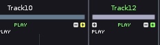
Just a quick mockup, colouring lettering rather than button.

-Volume column showing
-Pan hidden but has data in current pattern
-Delay hidden but has data in other patterns

1

Nice mockup. +1

The colours could also be extended to the pattern fx column [+] buttons near the top of the tracks :

White (as now) for showing/ no hidden data.
Green for hidden but with hidden data in current pattern
Yellow for hidden but in other patterns.

843 screenshot 9.jpg

Track 10 has hidden fx data in other patterns
Track 12 has hidden fx data in current pattern

Sounds ok to me.

This could apply to [+] and [-] buttons for pattern data also.

+1

being colorblind I’d go for the symbols just to be sure :)

Would user defined colours help there?

–excuse my ignorance if the answer is obviously no, have heard there are varying degrees of colourblindness…

Colors also won’t work because of Renoise being themeable, button colors can be whatever by default.

Also isn’t that a bit too much or info for those tiny buttons, causing more confusion than being helpful?

I agree. The idea is nice, but in this case colour would not be an appropriate indicator. It would be better to display something that is visually distinct and not easily misinterpreted.

The idea of colouring came from the current behaviour of how DSP sliders showing automation , i.e. to keep a consistancy.

I`ll see if I can come up with some nifty icons to do the job for the smaller icons that may work…

Ok my first thought was add extra buttons to pattern bar, but does`t really fit concept and adds clutter.

853 hidden columns.jpg

Simpler would just be an arrow to replace the [+] button when data is heidden, as you are not really adding new columns but revealing hidden ones:

(smaller than):

Attachment 854 not found.

Edit: Seems to be a new forum bug that small jpegs are blown up in preview??

I think the important thing is to have a very clear difference between the main on and off states. Regarding the DSP devices, when there is no automation data the indicator is essentially blank, but when there is some automation data the indicator clearly changes to a different icon, and it has some extra details that catch your attention more easily. That’s mainly what I was referring to earlier.

There is no on/ off state for the mini buttons.

Like I said before I am happy for, icons rather than colours. Icons may suit the mini buttons, colours the pattern bar icons, maybe a combination…

Either way a solution to this would be useful I think.

But there isn’t a plus [+] symbol now, is there? Where would the plus/arrow be located?
Would your idea take up extra space?

These are the [+] symbols being talked about.

843 screenshot 9.jpg

The idea shouldn`t take up any extra space, of modifying/colouring the symbols when pattern data is hidden.

He’s referring to the [+] button to add a pattern command column. This is positioned in the top/right corner of every track and is always visible. (Ok, not ALWAYS… it disappears when you reach the max number of columns, but you get the idea, haha)

:) Yes the [+] button suggestion was added on in a later post.