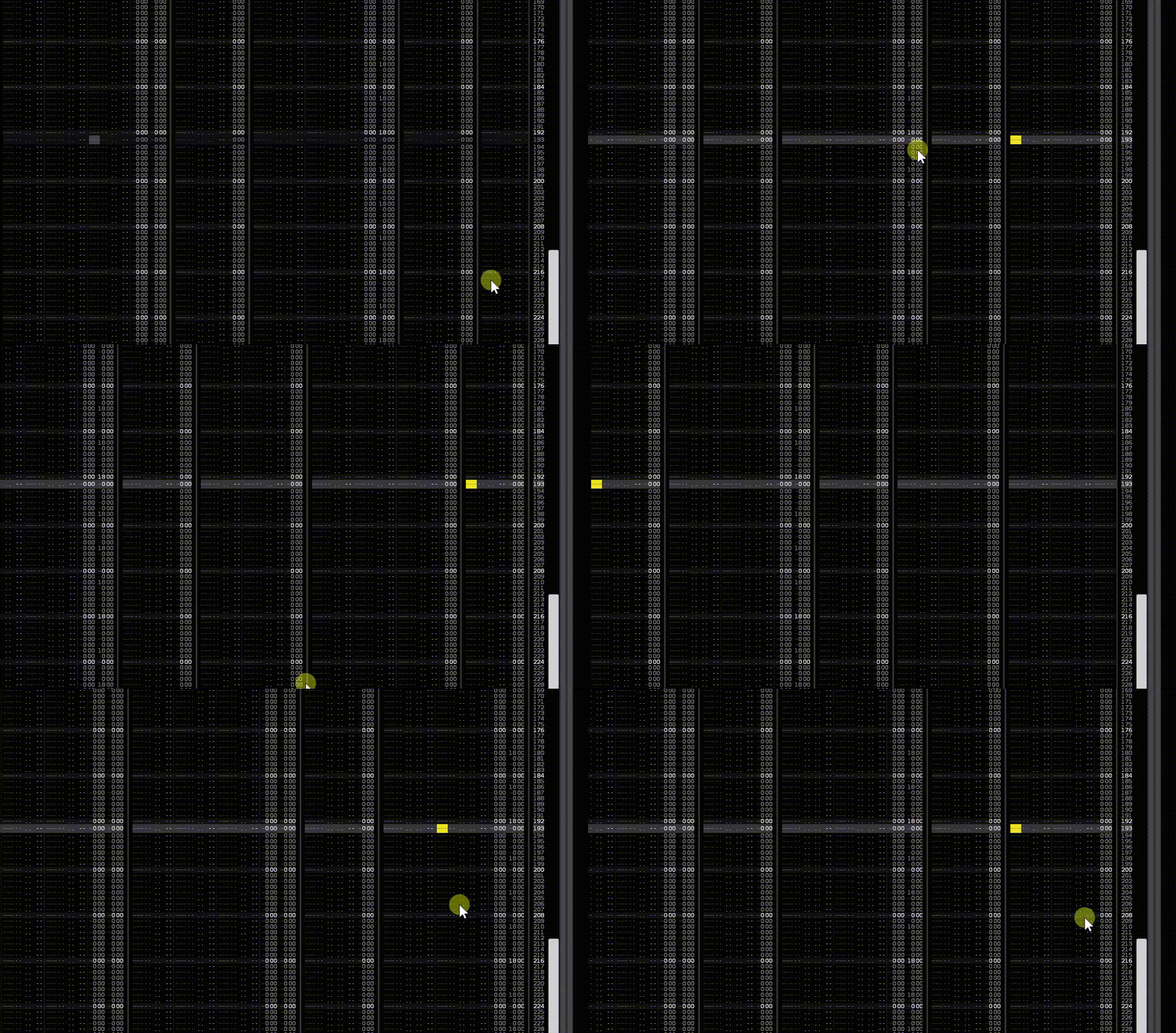
A tiny, tiny thing. Some of the last fx digit sometimes disappear. See video. It looks more like a C than a 0.

Resolution: 3840 x 2160. Windows 10.
I just noticed that today after changing from “huge font” to “big font”
Interesting. I’m using small font.
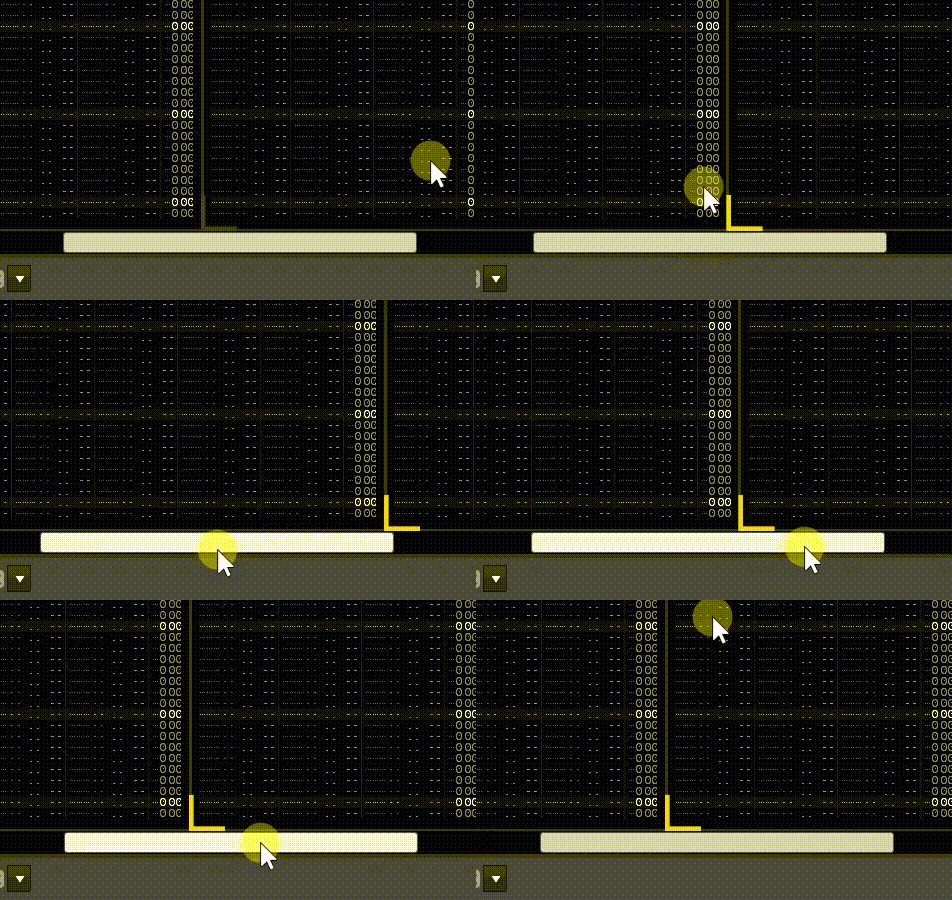
A little more info:
H-Spacing has to be 0.
Here it only happens with normal and small font.

I think this problem is interface scaling. What scaling are you using? 125%, 150%? If you use 100%, 200% or 300% everything should be fine.
Apparently these scalings are harder for Renoise to scale. They are a bunch of problems.
Did you know that 125% do not have their own icons? Use the same ones as 100%. In fact, scaling is an issue that has to be taken into account when creating windowed Lua tools, with many elements. Above all, problems can arise with the texts and their containers, in addition to the icons themselves.
In fact, Renoise doesn’t perfectly scale your windows. Every time you change the scale, some elements are dislodged and do not reposition themselves until you close and reopen said window. It happens with child windows, for example, and it’s a well-known issue that you don’t get any priority to fix. For me, this issue detracts from Renoise. All of this should work as fine as possible. That is to say, there are problems of reloading elements that are not well treated.
The scaling interface has always been a headache for any programmer.
Yeah you are right in my case where I use 125% interface scaling together with the big font size, works fine in fullscreen but when I Restore down Renoise the pattern line numbers gets squeezed which it doesn’t when scaling is set at 100%. I usually use fullscreen so not a big deal for me.
Thanks for clearing this up, Raul. I use 150% scaling. Everything looks fine with 100% or 200% scaling. Anyway, this is a tiny issue for me. Sorry to hear it can be a big problem for tool creators such as you.
I mean that when building window tools, the programmer has to pay attention to certain details when programming, so that the interface scaling looks correct. I assume the same thing will happen internally at Renoise.
In this case it looks like a simple setting of a width value for the boxing of that text. The scaling at 100, 200, 300, is exact, round. However, at 125, 150, 175, 225, etc. the scaling is not exact, a readjustment is made so that the images and other elements are rendered clearly, sharp.
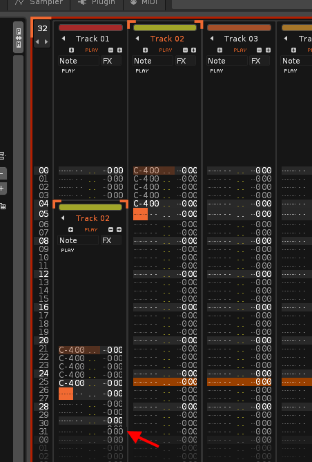
The best example to understand this is a grid. At 100 or 200% all squares in a grid will be exactly the same. However, at 125, 150, or 175, there will be various sizes of square that are alternately distributed to occupy the original space due to scaling. This may return these issues. That is why in some tracks the zeros look good and others are cut off. In theory, this should follow a pattern from left to right: one good track, one bad track, one good track, one bad track, and so on.
If track 2 looks bad, the programmer will have to enlarge it 2-3 pixels more, but for all tracks. So track 2 will look fine, but track 1 will look a bit wider (more empty space on the right side, that 2-3 pixels).
You can try changing the “Font size” value with the scaling at 125%, and you’ll see that each “Font size” follows a different repeat pattern from left to right.
These are internal programming details that the user is not supposed to notice…
Interface Scaling: 125%, Font size: Normal.


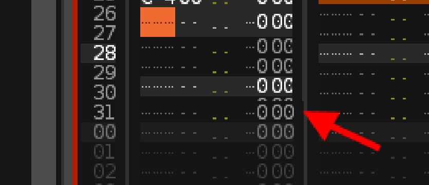
The visual bug is only “one pixel” wide. In fact, the right frame is 2 pixels on the second track, versus 1 pixel on the first track.
Solution for user
Since the error is so small, I recommend that you use H-Spacing = 1 or higher. I assume you are using H-Spacing = 0 to hold more space horizontally.
Solution for Renoise
This problem is probably very easy to solve under the hood of Renoise. It should only add a +1 to some value (track width), so that the width would be greater when H-Spacing=0. But this is just guesswork.