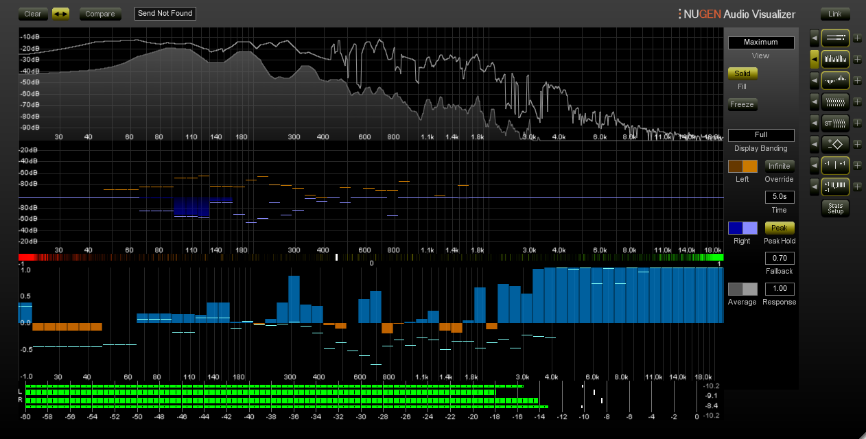
This is something awesome that I’ve just come across, and I think a visualizer like this would fit perfectly in the master spectrum area of Renoise. It’s the orange/blue bars in the picture below (from Nugen visualizer). What it does is that it displays phase correlation per frequency, as opposed to the standard one value scale which I guess only displays the total correlation. Often times you may find yourself having exaggerated problems only at certain frequency areas, which won’t show up in the normal correlation meter. So… just wanted to post this here as a suggestion.
This could work well in conjunction with some kind of new phase manipulation device. My initial idea is a device looking like the current EQ graphs, the line representing the amount of narrowing/widening per frequency across the spectrum. Very narrow “bands” (Q’s) can then be used to correct very localized phase problems, and wide bands for the classic effect of making lower frequencies more narrow.