Hello everyone, I am Raul Planelles, from Spain. I am new to the forum, but spent years using Renoise (with two monitors together). I would like to offer some suggestions for Renoise 3.0.1 and next releases. Excuse my English!
I am aware that Renoise 3.1 is about to launch. Also it is very easy to change the work already done, the difficult thing is programming from scratch. Therefore, all my respects to Renoise Team. They do a great job all. Thanks!!!
Here’s my constructive opinion, for future versions of Renoise…
SUGGESTIONS THAT ARE NOT DESIRABLE
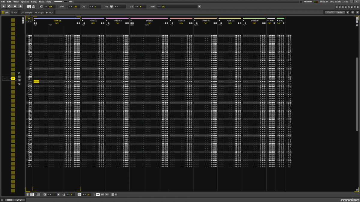
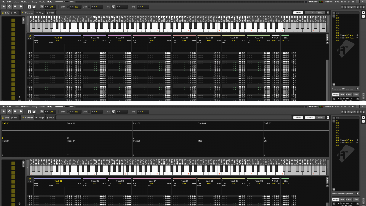
1 - Not to further separate windows. Renoise allows spreading in up to 3 windows full screen, already it is more than enough. It should continue as it is, all unified. This is the essence of Renoise, because so every thing is always in the same place. As much, separate “Matrix” as the “Sampler”, nothing more.
2 - Not to the Pianoroll , something as respondent. Renoise not must have a Pianoroll, FLS style or similar. You can create better alternatives to Renoise.
SUGGESTIONS THAT IF ARE DESIRABLE
Internal or Global
1 - Optimization of resources in XRNI instrument load: Allow to use an instrument XRNI (formed by many samples,… a complex piano, a complex percussion kit) multi tracks without problems or sound cuts. This is the most serious of Renoise 3.0.1. (Priority: 10)
For example, a piano .XRNI occupying 300MB of RAM (many samples), that is not necessary to load it 4 times in order to play well if you want to use it in 4 different tracks, each with its effects of track separately. In version 3.0.1 is necessary to load an instrument for each track, swallowing a lot of RAM in heavy instruments (4x300MB = 1200MB!!!).
Note: In VSTi instruments there is the “VST alias” to avoid this (do optimize resources), which is supposed to works by routing otherwise and thus use a same load to an infinity of tracks (at least 5).
As alternative is charging piano XRNI that 300MB on the Redux VSTi, and then use the “VST alias” bonded with this Redux VSTi, but swallows a lot RAM also, lots!
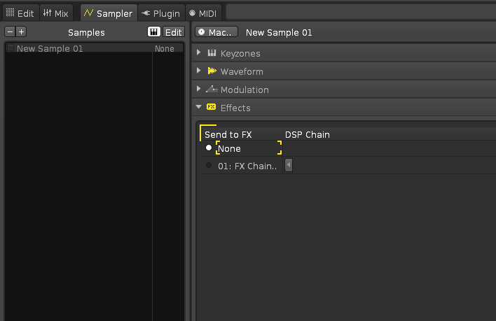
New1: The particularly problem is FX Chain in position “None”, is the cause of sounds cut in multiple tracks, also. “None” not save this problem in multiple tracks. Force to remove FX Chain in Instrument XRNI. In “None”,It should not be a problem.
New2: this is solved fully in Renoise 3.1! [SOLVED]
2 - Text font size. Improve the treatment of the size of the sources, at least allowing the possibility of doubling the size of all the texts of all the menus, for high resolution screens, avoiding problems in boxes containing each text. (Priority: 8)
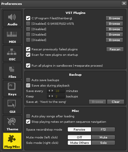
3 - More routes of load VST. Add and allow you to select or not at least 5 different routes to load VST/VSTi, instead of only 2. (Priority: 7)
4 - Allow translate Renoise into several languages by The Community. This implies setting Renoise so any user can translate English as a base to any language, just edit a text file, similar to like Wordpress, for example. Example of files: renoise-3.0.1-es_ES.xml (Spanish), renoise-3.0.1-de_DE.xml (German), placed inside a folder with path “C:\Program Files\renoise 3.0. 1\ Resources\Languages” and that there is a Languages section Renoise options menu to select the language. These files can share through the web of Renoise Community. Something like this I’m sure it would work. (Priority: 5)
Menu - Pattern Editor - Instrument Box
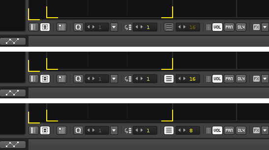
5 - Additional Divider on Pattern Editor: Add another layer of color configurable separation to divide the ranks of the pattern (similar to Impulse Tracker). It is an addition to the LPB. Range of 0 to 32, with button to activate / deactivate. (Priority: 7)(Priority: 9)
For example, in a pattern of 64 rows, marked rows:
- 00, 16, 32, 48; (value 16) or…
- 00, 08, 16, 24, 32, 40, 48 and 56; (value 8). Things as well.
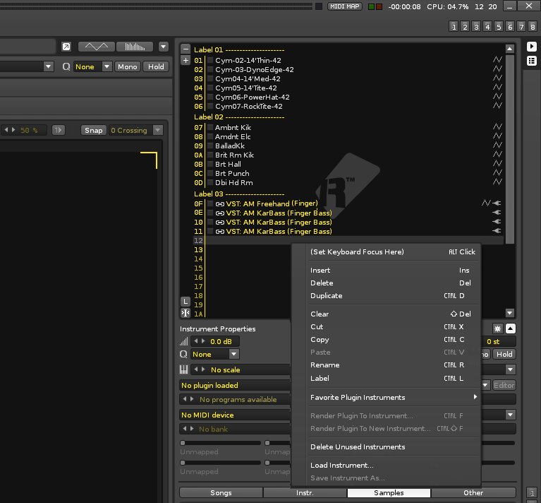
6 - Instruments Box Label : Add “Insert tag” (or “Insert Label” or “Label”) in case of instruments, to name and split into groups of instruments. Renoise 3.0.1 you can use a box of vacuum instrument as a label, but subtract you the instrument itself. 10 added tags are 10 less than the total instruments, which are 256. The same for the Samples Box (in Sampler) in each instrument. (Priority: 6)
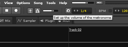
7 - Add Bar Volume Metronome: smaller than the main volume control. In the file Config.xml is the value < MetronomeVolume > in order to change it manually. (Priority: 4)
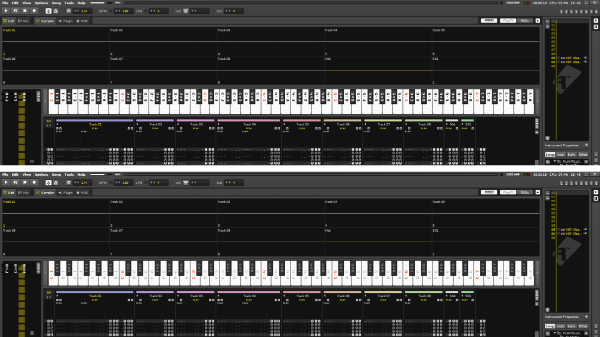
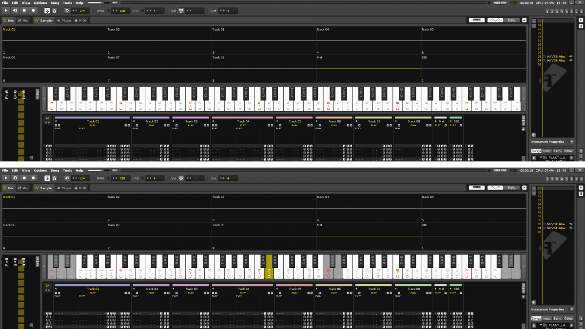
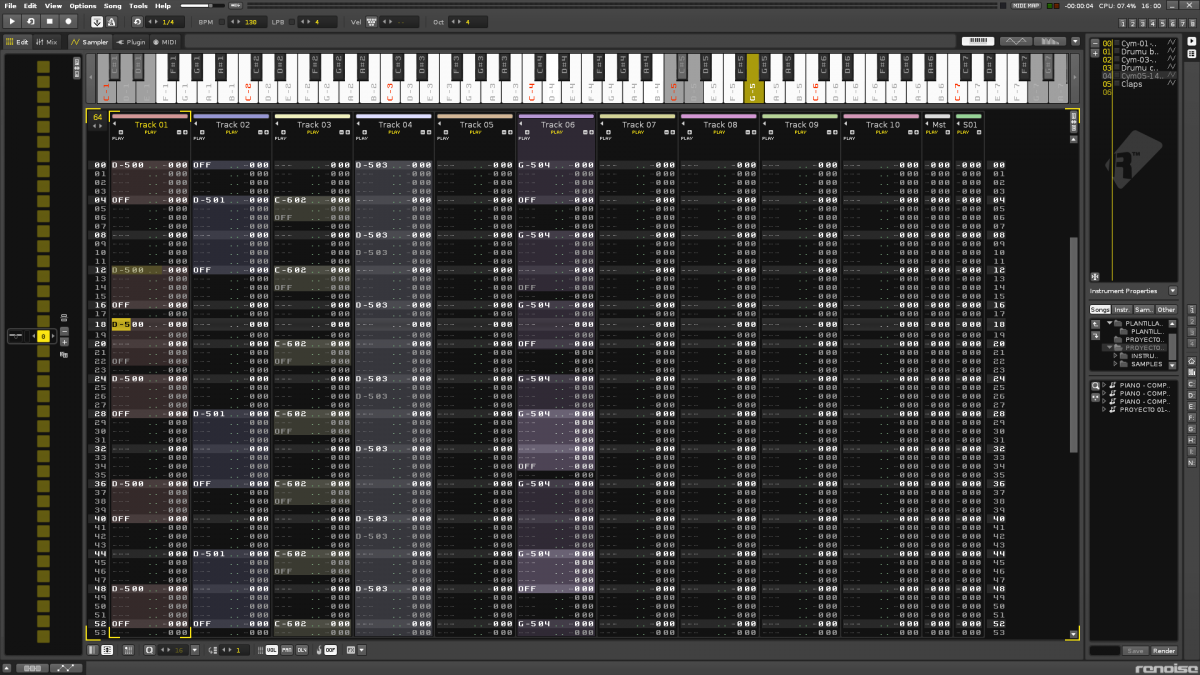
8 - Functional Piano in the Pattern Editor + Note-OFF Mouse. A possible alternative to real simple and serious, that the pianoroll would be better integrated into the Pattern Editor; piano Add the ability to deploy the Piano up the Pattern Editor (accompanied by the annotation of the 12 notes of the 10 octaves, above the Piano), and record each note on the pattern by clicking with the mouse on the keys on the piano (thus with the mouse also could play and record)… I know that Renoise is made to work with the alphanumeric keyboard and keyboard MIDI. Mouse + Virtual Piano would be a useful additional tool. (Priority: 2)
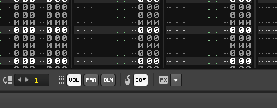
Also add a button under "Note-OFF Mouse", so once activated, be able to record “Note-OFF” of each note in the Pattern Editor (this is a very useful) with left-click of the mouse. The set would be resembling a Pianoroll horizontally, but perfectly integrated in Renoise, without adding too much.
All this would help enormously to compose the new people and also to the most senior. And it would not be anything if there is another piano under the Keyzones.
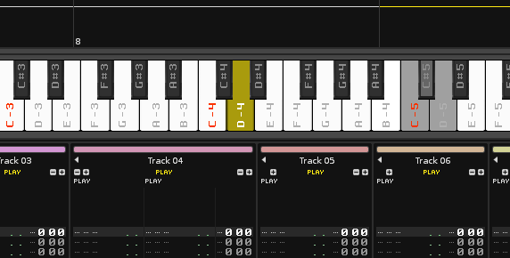
The piano is always associated with the selected instrument and mark the note that sounds. In addition, marked in dark the keys that are not associated with any sample in the instrument .XRNI.
Note : the concept of “Pianoroll” as it is known, I think that it is not the most adequate to Renoise, and “Note-OFF” function is required because it is more versatile than the famous Pianoroll functions.
With this simple solution, people already not would you miss the Pianoroll.
New: this has been better developed here (based in Renoise 3.1):https://forum.renoise.com/t/keyboard-in-edit-mix-tab/44501
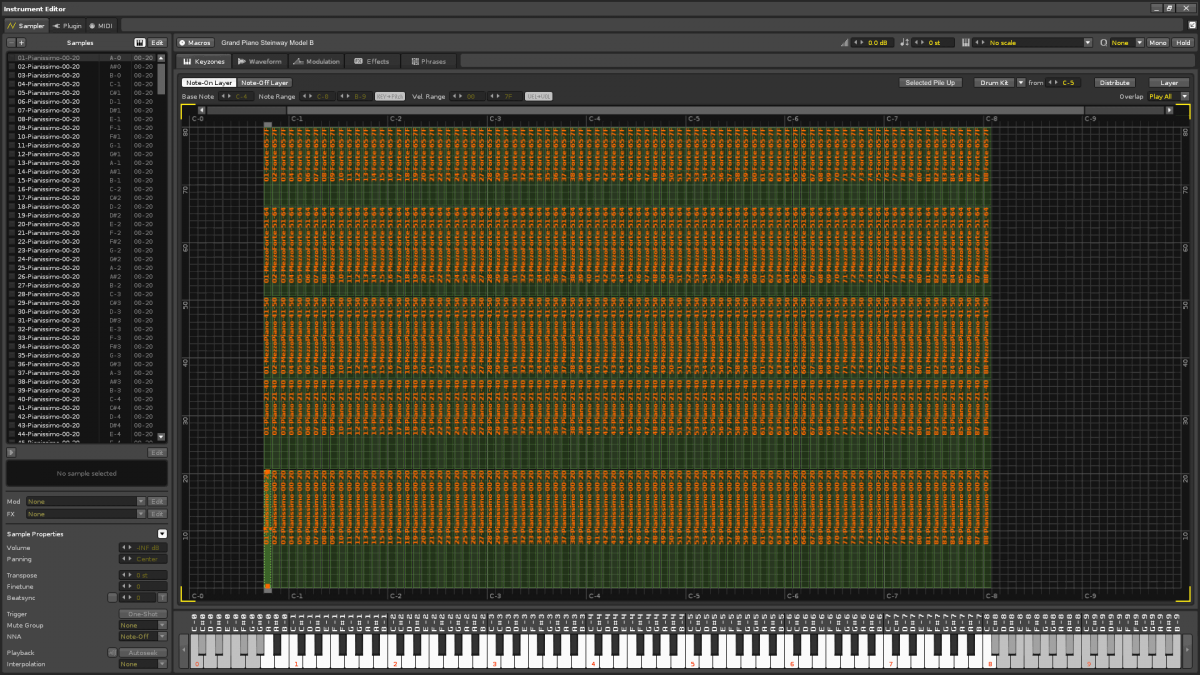
Instrument Editor, Keyzones + Piano
9 - Sampler : put all the tabs above (Keyzones, Waveform, Modulation, Effects and Phrases). Similar to Redux. Get more free vertical space. (Priority: 9)
10 - Keyzones : Add button ‘Selected Pile Up’ for stacking the selected samples (each holding a note), without changing the set speed. (Priority: 8)
11 - Keyzones : match vertically the notes of the Keyzones with the keys of the Piano, including the Keyzones with the Piano of Zoom +, Zoom - . This is fundamental (Priority: 8)
12 - Piano: Add all the notes (12) above the piano, C, C#, D, D #, E, F, F #, G, G #, A, A #, B (including the number of octave). It seems silly, but it helps a lot to composing. (Priority: 7)
13 - Piano: Darken the keys will not. Any key that is not associated with any sample. (Priority: 7)
I guess some things are already doing, others have already been discussed. I hope your opinion!
I keep following the Renoise forum a while. I hope to participate more from now.
I love Renoise!!! I hope that continues to evolve…
A greeting!!
