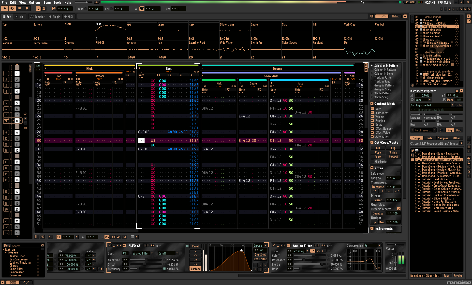
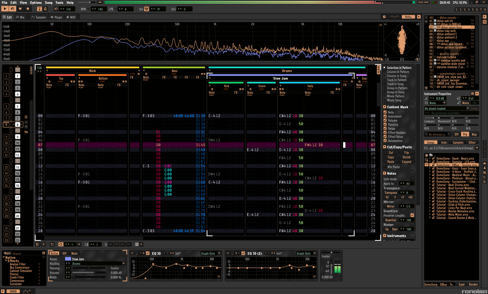
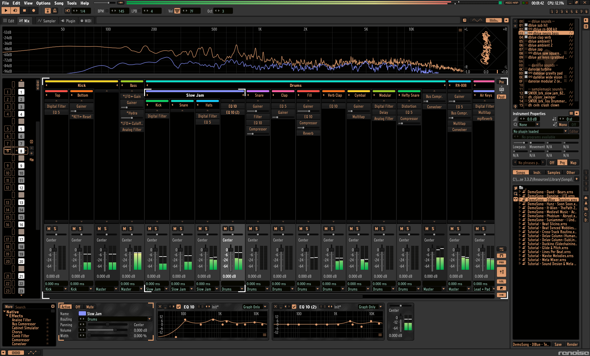
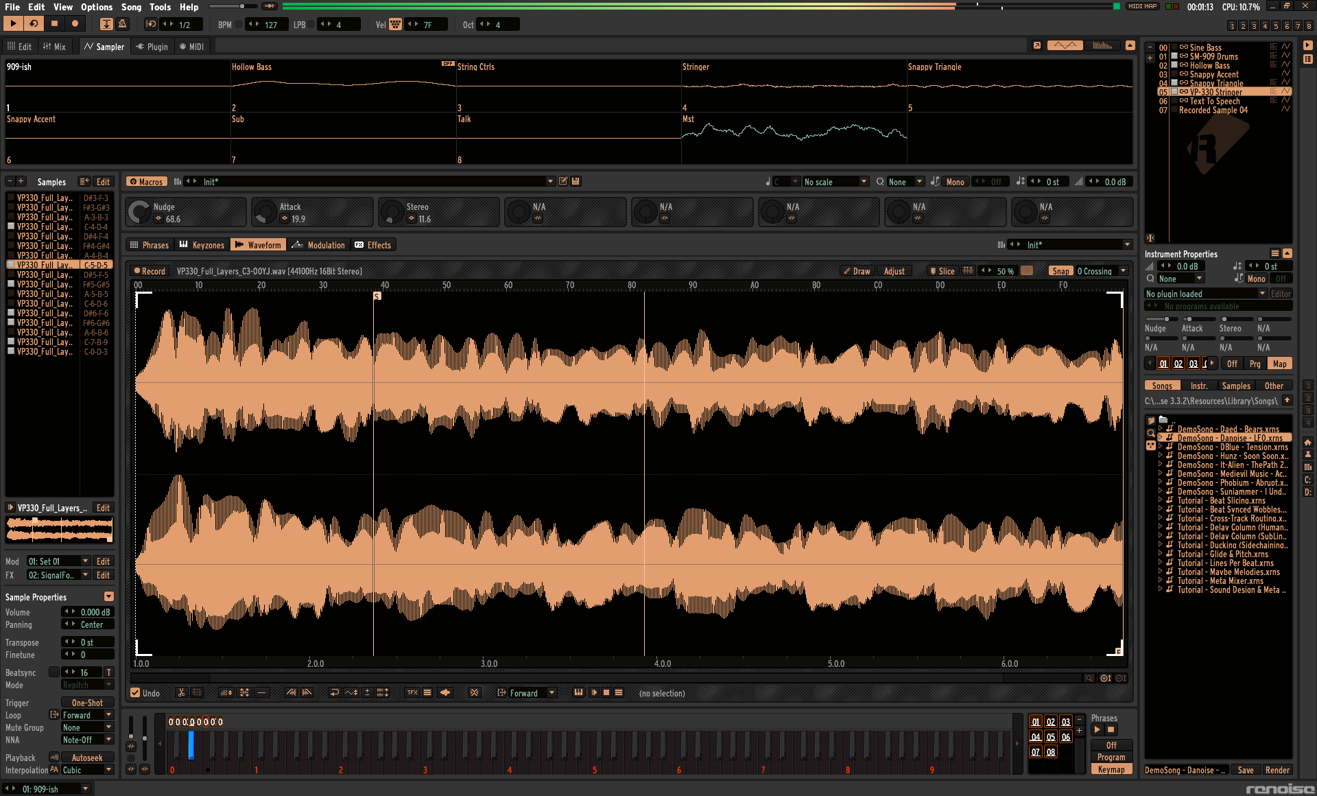
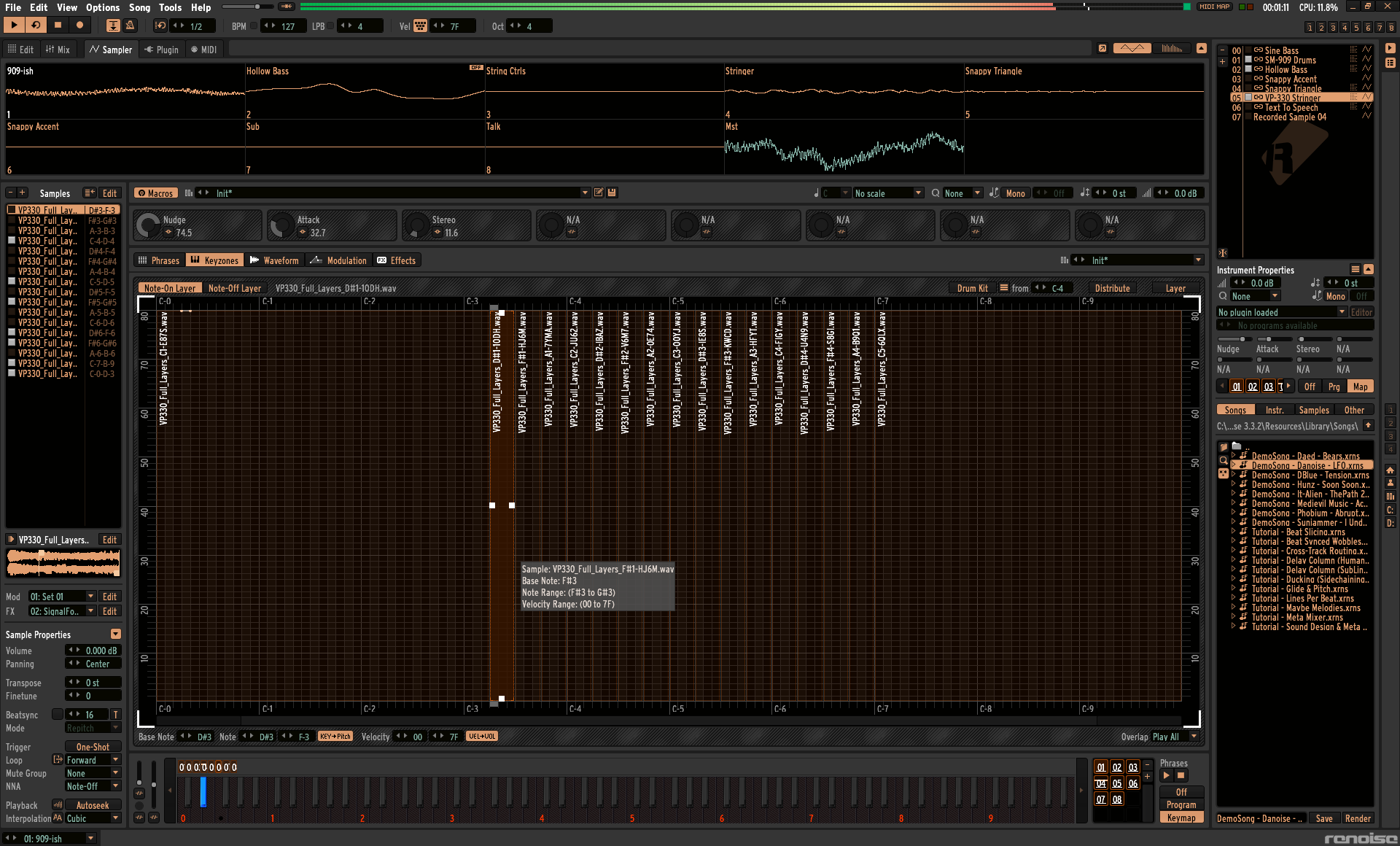
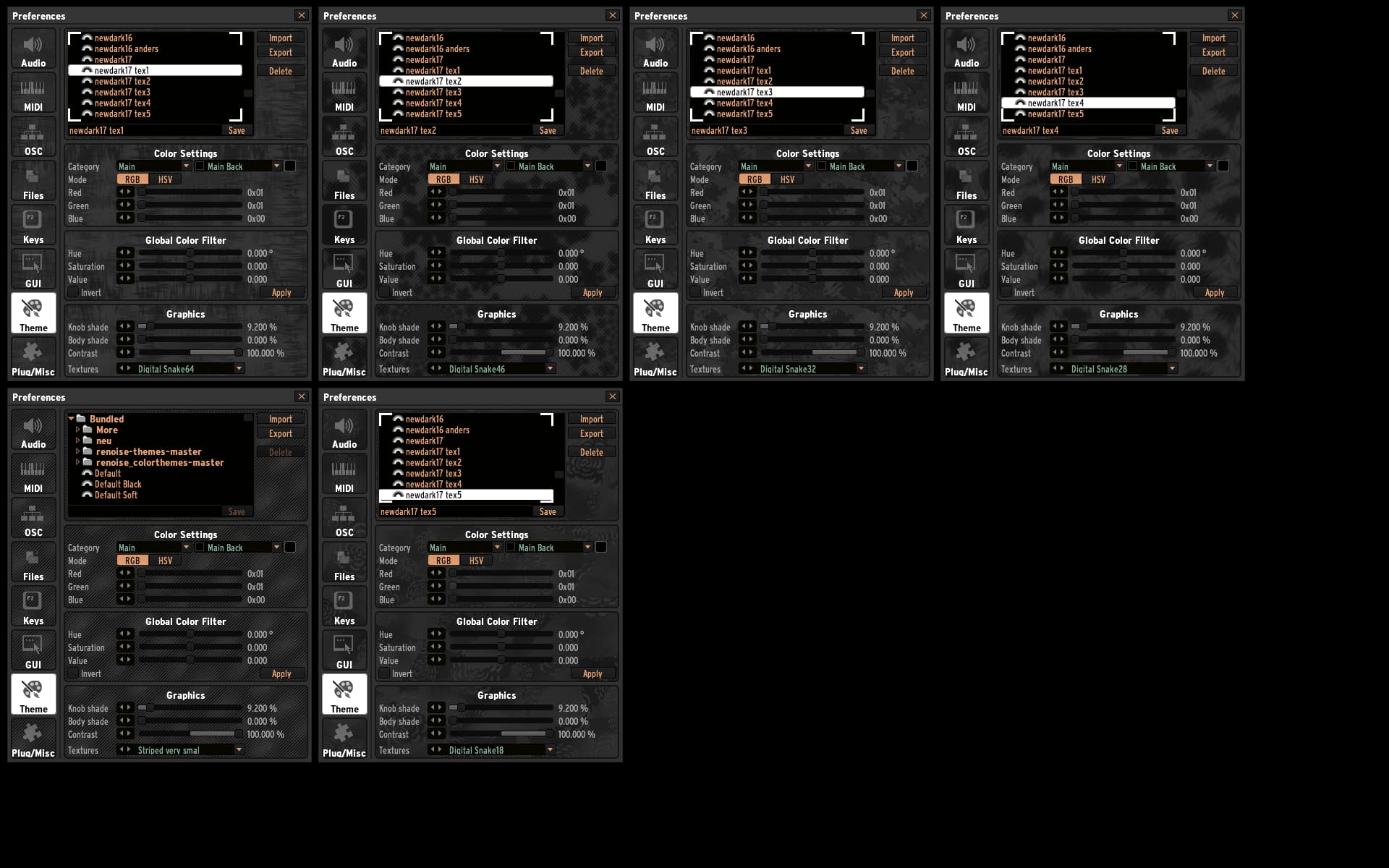
I try to preserve good contrast between all controls, but i must make some compromises because Renoise connected the Colorsettings for some different controls in unfavorably. So for Instance the Mainbackground/Mainfont, the selection backgrounds & textes, the buttons colors . So some colors or colorshadings are not my first choose. This maybe Cool & Tricky for year 2000 maybe, but we have 2021! RENOISE DEVS PLZ CHANGE THAT !!! Renoise could look so much better without this, and all what needs are some more Colorvalues in config. The EQ Background i fucking want not same Color as the Mainback!
So back on topic…
Theme creation & testing Time was 21 hours!
Important Notice!
In the Archive is the Fontconfig file and a Link to the Google font i used. Download the Fontfamily and copy it to your Skin/Fonts Directory. Then rename your original Fontconfig file or copy it to your backuplocation. Then copy the archive Fontconfig to your skinfolder. !Warning! → this change your global Renoise config!
Before I forget… This Theme was designed on a matte display. So if some Colorvalue Contrasts make exploding your eyes on you glare Display, you on your own. Using at own Risk!
Here a smal Bugfix for my Colorful-Beauty Theme. The special VU-Meter’s which used by some songs and in a few FX like Compressors or LFO’s was black on black. i have fixed this to yellow color. You can tested it self with the Demosong “Hunz - Soon Soon” here a screen’s
I found a weak in visibling the channel Mute/Solo state what is unfixable, because if i change this colorsetting the normal Buttons and the FX Tabs color change to. For a little more visibility you can lowering the brightness of the normal button colorshade in some limited range.
I found 2 Font Drawing Bugs in Renoise. One in Mst Mastering Channel options and one in LFO FX Addon. Here some screen’s. I have marked the positions. For me it looks that the vertical Labelsize not fits the fontsize, so that some part of the Labeltext is cutted away. Maybe too, that the fontsize of configured font not really measured. It would be nice if some official could report this to dev team and we get fixed this in next Renoise version.
I made some modified Dark keys fits to Colorful-Beauty Theme. Copy the Content of the rar archive to skin\icons and restart Renoise. Thats it. Like the fontchange this mod is global.
pressed halfnotes are now neon-lightblue
pressed fullnotes are neon-orange
Here is the Discord invite for Theming Server. Renoise Themes & Stuff
The server is still under construction. Some channels may not accessable at this moment or some download channels may empty till i have maked some theme screenshots for it.
Sorry for the late review. I have checked your theme now. Very clear in contrast and ergonomics. Nice coloring on background and pattern organiser. Very good readability on the controls. Great Work Mate. Check out a few impressions with my fontmod. Do you give me the permission to host your theme on Theming Discord Server for permanent avaiability?