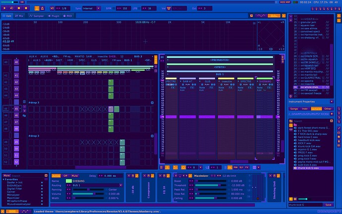
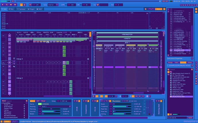
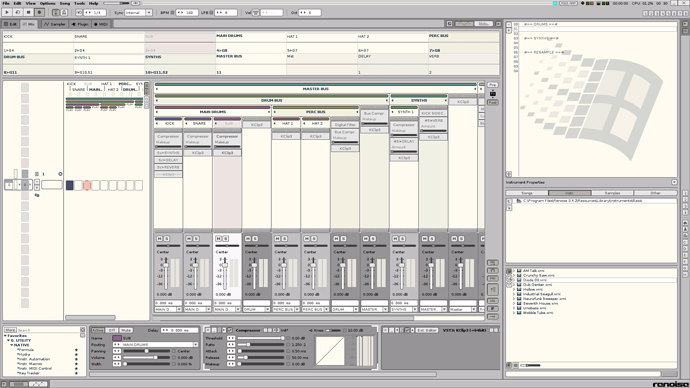
Is the same theme like “Outdoors” from Danoise, it is not yours
Never heard of that but guess he/she/them/whatever likes the MPC2000 colour scheme too.
It’s one of the built-in themes. Perhaps you started with it as a base.
I started from the default theme so perhaps not. If I had ever seen a theme similar to mine, do you seriously think I would’ve even bothered to post it here. But I do love the hand holding, you guys could perhaps get a room.
Next I will probably post a track which has many, many notes and chords that have all been already used many, many times before and then we can, perhaps, figure out where I stole those, too.
You speak bullshit, is a one to one Outdoors” from Danoise, it’s easy to test, so go away liar and thief!
If you say so, it must be so. Do test it all you please, not my problem. As per requested, I’ll leave and never come back because that’s the only way people like you can ever be anything, anywhere; living on a small island with your idiotic small views of the small world you live in, praised by the rest of the idiots who have never seen the rest of the world either. Oh look, a rainbow. Perhaps it’s the same rainbow as the previous one because they all look the same to you. Now, every time you see a rainbow, you remember me but I won’t even remember your name.
Fairwell.
![]() bye!!!
bye!!!
My comment wasn’t meant to be insulting. It’s unlikely you would have landed on the exact same color codes as “Outdoors,” so I was suggesting that you might have started from it as a base. Here’s a comparison.
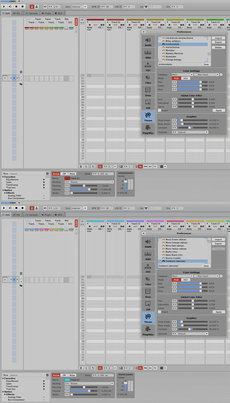
Unlike the comment by the other user above yours, I didn’t feel yours was insulting, negative, and combative. It’s unfortunate it had to resort to that.
I’ve made a theme from scratch to later find out that other very similar themes already exist. If it happened to me, and maybe that’s what happened to @m2n2l2, then I am sure it could happen to anyone because @m2n2l2 and I are not unique.
I hope people can continue to share themes in here without being accused and attack.
It’s not similar it’s the same. Everything is the same in both themes, it can’t be a coincidence, it’s theft. What’s wrong with you people, you try defend thiefs, liars, agressors, killers, it’s the end of humanity!
I guess the only thing wrong with me is that I try not to be rude and attack people, especially when it is not worth it. If I had felt offended by the similarities, it would have made me suspicious, and quickly move on, instead of calling attention to myself. If I couldn’t keep my mouth shut, then I would have made the observation public in a kind way.
That’s quite a statement. Is that really how you see it? I am honestly curious because it seems that nuance may have been missed.
I have no desire to start an empty discussion.
Compare Renoise Color Themes
Hello. There is a more accurate way to test this. Renoise’s color theme “.XRNC” files are actually text “.XML” files, all about 93 lines long. It is possible to use text programs like Notepad++ and use the “Compare” plugin to compare the text of both documents. There you can see the results. Leaving aside the colors of the tracks (which are variable), if the vast majority of lines match exactly, there’s no more to say.
That being said, creating a color theme from scratch and making it all look good and pretty is not easy, and it is expensive work (I guess that’s why some people take it very seriously). For example, the official theme for “Redux (renoise)” has issues with a background and text, which don’t mix well, and it’s an official theme! Things like that have to be watched.
By the way, the song “DemoSong - DBlue - Tension.xrns” uses great colors for the tracks (I guess thoroughly edited when creating the song). It is a good reference.
Another Way for Edit Renoise Color Themes
In the case of wanting to cheat, it is better to go directly to the text file (just change the extension by adding “.xml” to the file name) and slightly modify the numbers there, without paying attention to the colors of the tracks (variables), which should be the final change, after adjusting everything else. It’s just another way of editing.
Request:
A Microsoft Windows '95 - '98 inspired theme to use at work.
This is not a joke, it’s a CALL FOR HELP.
I’m trying to build the perfect stealth setup to make beats at work without my boss noticing. I already have Renoise setup in a USB drive, a samples folder, admin permission to install VSTs, etc… now I need the ugliest and most boring theme ever to avoid dragging attention.
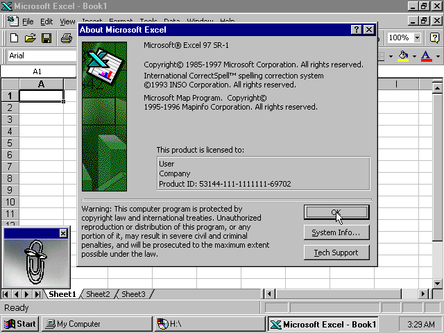
I’ve looked around but no luck. I also started my own theme, but it quickly got confusing, since I don’t have much experience dealing with color palettes and making themes.
If anyone wants to build this theme together, I can try to help.

This is probably the best response I read here in a while, I truly hope you can accomplish this honorable task
The color picker is your friend here ![]()
Just have your MS windoze open and grab what you need
Try searching for a color picker tool and copy the hex values for each individual palette/swatch.
I’m also pretty inexperienced with making a theme, been wanting to make an OctaMED theme for the longest since nobody has done one.
Or better yet, write them down by hand and punch them in once when you’re in the color editor.
Sidenote: would be nice if the sampler’s piano could be toggled on and off, at least the UI element of it, I find it kinda embarrassing working on a tune in a public spot then having the long row of keys go edge to edge.
But enough of that ![]()
windows.xrnc (5.0 KB)
just4fun
Thanks a lot for starting this.
I’ve made changes to it, to my taste, though. Here it is:
I ended up changing the color, cuz I really like that alternative blue tone.
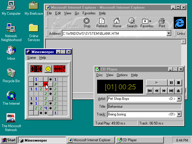
Feel free to keep changing it!
windows1.1.xrnc (5.0 KB)
Edit:
The logo was provided by slujr:
Thanks @slujr!
