s-n-s +1
I don’t know if reorganizing or resizing the frames’ disposition will totally make it. Because there are 3 problems with the GUI : maximizing every frames, customizing fonts size, drag&drop in listviews.
(1) to be able to quicky and easily maximize some zones or frames in the GUI interface. For exemple, I got 2 computers dedicated to music, the desktop and the laptop. On the laptop, I don’t have enough screen size, - the sample keyzone feature is difficult to use for me on the small screen, I really need to hide the top and the bottom frames to get a “maximum workspace”. I have to use the horizontal scroll bar on the bottom, to enlarge and zoom on the keyzones, but anyway there isn’t any vertical scrollbar. A maximize button with horizontal/vertical scrollbars on the right side of some frames should help.
(2) Even if you get the maximum workspace, you can’t redefine the font size for the sample / instruments / track dsps listviews (excepted inside the pattern, where you can for example define a HUGE font size). Some zones of GUI have become too small, whatever the size of frames… It should be able to be customized.
(3) The VST/VSTis listviews boxes NEED to be more flexible. For now, you can drag VSTs and drop them on a rack. Ok. But you can’t organize internally your hundreds of free VSTs you’ve downloaded on KVR with drag & drops. You can’t drag and drop items inside VSTis listviews and quickly reorganise the listview trees. For example, you’ve got 90 VSTis that have been listed by default in the “Synthedit” node, ok. One of them has a name like for example GTG 14.2 L ok, but you know the true editor’s name of this kind of VSTi, this is Mikael Sybrandt, so since you’ve got allready a node for this author, you try to drag and drop it on his nam … and nothing happens. It’s simply impossible. You have to “manually” assign VSTis to another place, and rewrite it… This is simply boring.
Thanx for reading
i’m a big fan of organizing your shit on the harddisk. i cannot understand people who have for example a total mess of badly-named MP3’s and who make everything neat solely through ID3 tags in their favorite music player. i simply organize the files in their folders and make the music player pick up the filenames, and do away with shitty ID3 tags.
the same goes for VSTs. i have them organized on my harddisk, so i kinda expected to load up Renoise and have my VSTs organized in their folders, but this was not the case. they are organized by their own kind of ‘tags’. i would like an option for this to change. slightly different from your point though.
imho “maximize” is a bit extreme… additionally the fact that yous specify “some” zones is indicative that the sizes or what takes up how much space is subjective (indeed, it is) therefore I still think it’d be a more successful treatment to allow both the top and bottom zones to be resizable by the user… not maximized. . . if you want to maximize a zone with the way I’m proposing… you’d select it’s tab, drag closed the other area and drag your desired zone to full screen, save it as a preset and also serve those who just want to show a little bit more of the automation envelope, for instance.
interesting idea but probably deserves it’s own thread. Again, imho the lack of font size control is not an issue with Renoise’s GUI… but that could be subjective but is a whole other discussion.
I can’t sympathize as like one of the other people who replied to this I tend to keep my stuff pretty clean… but as far as renaming what a VST is named in your list of plug-ins… I can’t say it’s not an interesting idea, cause it is…
Maybe this could be similarly to creating instrument definition txt files for devices at the other ends of those MIDI ports… another suggestion that (note to self) belongs on a separate thread…
After reconsidering sometimes, I’ve tried to make a mockup again (a graffiti spammer again ![]() ).
).
Let me explain about it a little.
-
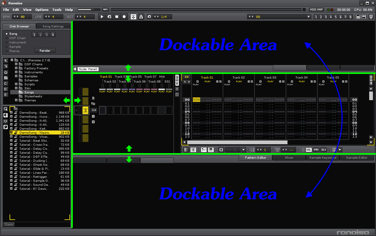
Imho, the Disk Browser should be placed in the side panel.
Current layout of the Disk Browser is not good because there is big waste of horizontal space if you are using the big display.
Also, the operation flow (Browser >> Instrument Selector[at upper right] >> Split Sample Selector[at lower left]) is not smooth. They are too away. I think that they should be linked closely.
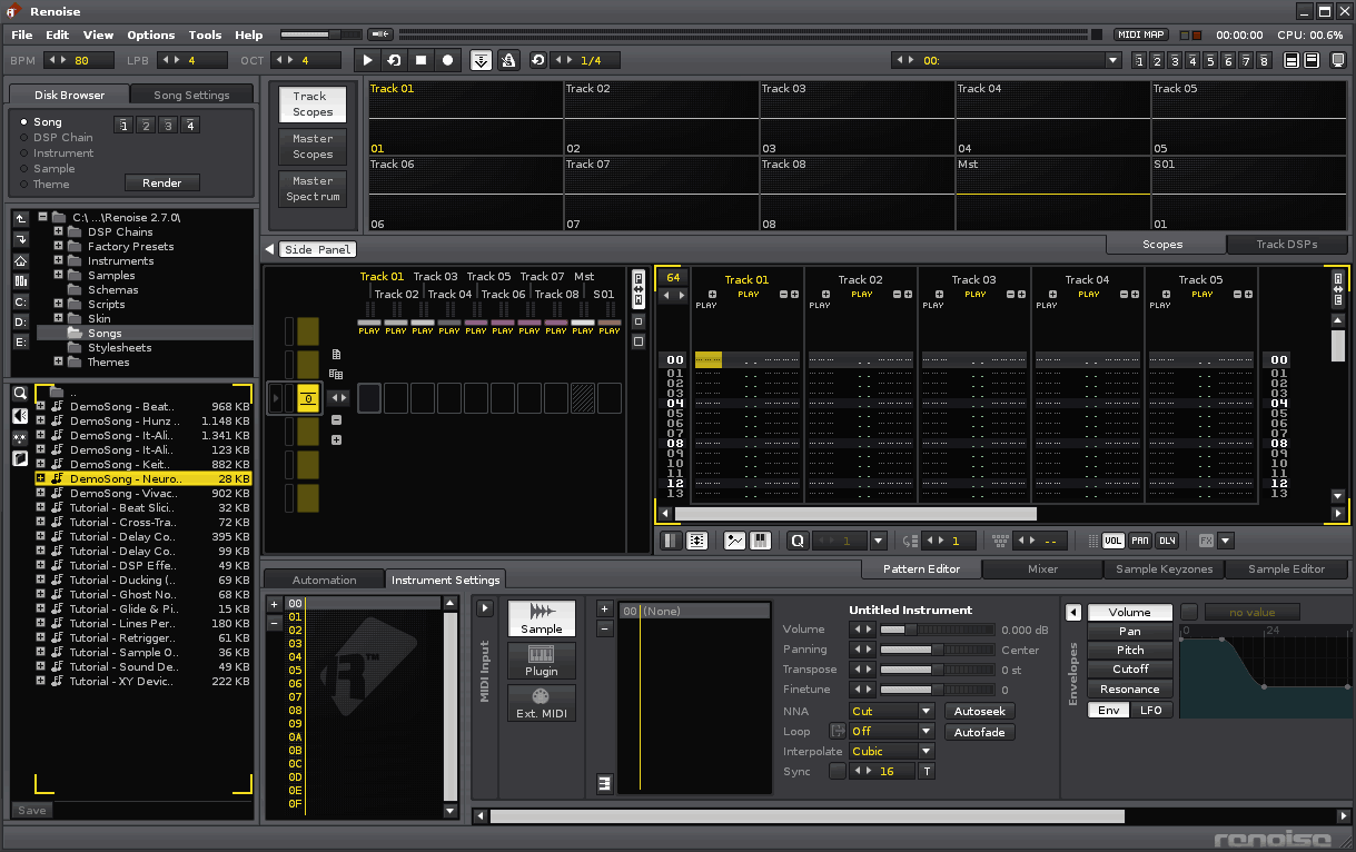
If the Disk Browser is placed on the side panel, these problem will be solved (please refer the second image below).
Additionally, we can manage Plugins in the Disk Browser too, maybe. -
As s-n-s said above, we should adopt “userdefinable upper and lower parts”. As far as I know, the first person who advocated such idea in this forum is Pysj. I fully agree with them. Such a structure is necessary to answer various demands of various users.
If the layout like below can be realized, Renoise can support various display size more naturally than now, I believe.
And this second image is just one layout example. You can place these 4 parts to where you want (upper or lower).
- Scopes
- Track DSPs
- Automation
- Instrument Settings (include Instr. Selector)
At sleepless night. thanks!! ![]()
EDIT: Nothing constructive here …
Let’s rationalize this.
What would need to be “vectorized” that isn’t already resizable? Im not suggesting that dragging down the top border would scale everything in that zone, just allow for more screen space as this UI has gotten cluttered.
From top down, lets look at what’s there beyond just list boxes, buttons and the usual UI elements:
TOP ZONE:
- Track scopes - they already resize, expand, contract vertically based on how many tracks you add. really no fundamental change, just allow more rows to display more scopes if top zone is expanded down.
- Master scopes - don’t yet resize vertically - but would the manhours needed to allow this really be that drastic as obviously it is possible to resize item 1??
- Master spectrum - same as 1 & 2
MIDDLE ZONE:
4. Sample Keyzones- well… this already is resizable depending on whether you close or open the top or bottom zones.
5. Sample Editor - same as 4.
BOTTOM ZONE:
6. Automation - doesn’t currently resize but who wouldn’t want this bigger anyway… this part of the GUI is severely handicapped due to being restricted to such a small vertical space.
wow… that’s it.
The rest of the GUI items in either the top or bottom zones would just fill out to make better use of the space when dragged open or closed…
i’d like to add that it is also possible (with a bit of trickery) to make the scopes+spectrum+phasemeter very large, essentially resizing them even more. so, this functionality exists as well.
(if someone can please point me to the explanation of how to get the mega-huge scopes etc, please, because i want it and cannot find it anymore)
THANK YOU!
please!!!
I would also like to see this feature added…similar to the resizable border between the pattern matrix and pattern view. I’m wondering if vectorizing the GUI will increase cpu usage though? I’d hate for Renoise to start using a ton of cpu just for the gui like most other DAWs.
I am resurrecting this thread. Is this something we might see realized soon in renoise?
Thanks!
ping
i’d like this.
it would be really nice to be able to do this. scrolling throug samples/etc is kind of tedious right now.
THANK YOU Devs for making this request a reality. I’m sure this was no trivial task.
You just got a well deserved license renewal from me, and I couldn’t have been more happy to pay for it.

