I do not know if possible by LUAor modifying the preferences file.Note-OFF is a special note.What if you paint another color?
Of course, it would be easier to visually identify.
I do not know if possible by LUAor modifying the preferences file.Note-OFF is a special note.What if you paint another color?
Of course, it would be easier to visually identify.
I would love more syntax highlighting! or even highlighting sections in editor similar to what you did with your piano roll concept, would be very useful to mentally keep track of parts in need of revision
I would love more syntax highlighting! or even highlighting sections in editor similar to what you did with your piano roll concept, would be very useful to mentally keep track of parts in need of revision
Hi emhere. Renoise has improved with the use of colors, even within the Pattern Editor or Phrases Editor.However, it seems that is about half way.At least differentiate Note of the Note-OFF color would be great.
Look how easy it is visually locate the Note-OFFs:
===============
C-4 3F 40 0A20
…
…
…
…
…
…
…
OFF
…
…
…
D#5** 3F400A20**
…
…
…
OFF
…
…
…
===============
OFF in red or other color,with configurationfrom Menu Preferences / theme / Pattern.
We can propose very advanced things or very light things. ![]()
Probably it’s the theme I’m using combined with color blindness, but the thing I often miss at first glance is on which track the cursor resides when looking at the pattern matrix. Note off’s are pretty clear imo.
Probably it’s the theme I’m using combined with color blindness
Nope, it IS hard to spot…
If you can choose the color i’d be ok with it, but i do not want more colors in my pattern myself, because personally i’d find it distracting. I don’t find OFF commands hard to spot at all, as a matter of fact i think it’s the one thing that is easy to spot. I noticed i score pretty high on those recognition tests that hides faces and such in an artwork, so i imagine it’s a lot harder for someone with dyslexia or something.
If you can choose the color that would make everyone happy i guess.
The other day I have seen a old TV in black and white, gathering dust in my garage.They told me that, still works !!!But I do not miss this TV!!!I prefer to enjoy the colors. ^_^However, current TVs and cinemas continue to evolve, also improving colors.Curiously some current TVs can also work in black and white, changing the configuration.It is good practice to see a current movie, and it may seem old.This I have not tried it yet.  Maybe someday do the test, if permitted my multicolor TV…
This would be really nice, but I think we could even go further, by also having an option to replace the text “OFF” with a symbol instead.
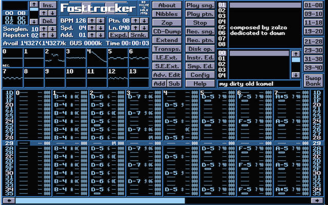
I grew up with Fasttracker II, so I’ve always missed this feature. FT2 had this “box” thing for denoting note offs.


I’ve even thought about modifying the font file and hex editing the “OFF” string, replacing it with an unused character, but I’m lazy.
…
I’ve even thought about modifying the font file and hex editing the “OFF” string, replacing it with an unused character, but I’m lazy.
I do not know if it’s possible.I think not.I have been discussing in other topics, about the note-OFF and the problems it brings to the Pattern Editor evolve.Note-OFF is used for other effect parameters, not only to cut the note, and that in itself is a mess.Perhaps other symbols would be suitable. For example, ===… (3 equal) or you propose… Note: in “Impulse Tracker” was similar…
Anything that helps you see better note-OFF.
Note-OFF is special, deserves something special.
Look it’s stupid this topic!
Impulse Tracker:
the double line is seen immediately!
Yes please additional color for note-offs, since I doubt the team is willing to implement block views (which I would prefer). Also wouldn’t hurt too much and could be quickly done. People who don’t like can still setup same color. Thanks.