I’m sure I’m not the first one to point it out but let’s face it : in all our patterns, we’re working and following a vertical logic. We edit songs and pattern commands both visually and vertically. But some important editing tools (sample editor and automation envelopes), still stay horizontal and are still displayed separately. I would really be pleased to use “vertical” editors directly inside the pattern editor.
Note : this edition mode is directly inspired by the Sk@ale Trackers’ “track editor” button. Ska@le is an unfinished work for now but let’s say that Baktery (sk@le’s coder) knows how to make pretty cool tracker interfaces. It’s probably not as precise as the horizontal zoomable automation envelope system, but (1) it’s vertical, and (2) it could be handy to “visually” and “graphically” align those parameters to recorded notes. However it takes too much space for just a cell, and it’s not as precise / smooth as linear or curved envelopes.
I’m just trying to imagine how it could look and behave when directly placed inside the pattern editor view and how it could become “vertical”.
Sorry if it’s not perfectly designed, or too ‘tiny’, it’s just a quick done job, some of you will probably be able to draw it better than me or make it bigger.
One issue may be that some commands (eg retrigger) don’t lend themselves to this. Also the precision with the graphical interface isn’t going to be as accurate. But there are advantages.
Interesting idea, I like it! Workflow with the automation curves still feels a bit clunky, as it is totally separate from the pattern editor. But if I had to choose, I would rather have audio tracks, followed by piano rolls. But if this is lower hanging fruit for the developers I would say go for it
I guess that you’d like some “vertical” audio tracks, in the pattern editor right ? It’s probably not that easy for the devTeam to combine the typical tracker pattern design with the typical audio tracks design, and make both work together without harming the overall GUI efficiency. I’ve got a first idea about it.
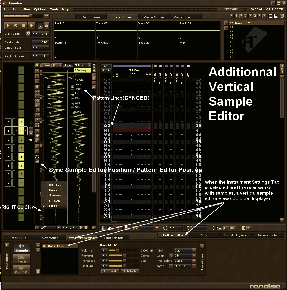
What follows is not exactly an example of “vertical audio track”, but just an alternative sample editor, that could be displayed only if needed instead of the matrix view. (Maybe that this alternative editor don’t need all those buttons around, just the necessary ones for quick access). Anyway. What’s important is that it’s able to detect the instrument / sample related to the edit block position, and display it for a quick vertical edition. The synchronisation of the instrument and the sample editor is defined by a “Sync” button. You could also see another kind of item in the sample timeline : “Lines” (next to the Beats/Samples/Minutes/0S effect).
I’ve decided to hide the matrix view in this configuration, because working with the matrix view implies that you want to play / clone / populate larger structures than individual samples, and when you focus your attention on samples, the matrix view isn’t that relevant then. And of course if you don’t want to use this vertical editor, no problem, Renoise could allow you to work with the usual horizontal sample editor still available through the right side sample editor tab.
Pretty good idea, that’s basically what Buzz and Sunvox have. I rarely even use them, only because they are so primitive compared to the Renoise modern automation curves. I actually stopped using Buzz because that style of automation just isn’t good enough for my needs. I’d rather see the option to have the Renoise style automation, but vertical. Everything else seems really great though!!!
The vertical sample editor would help me a great deal right now. I have an old Render that I’ve lost the source file for and I’m trying to rebuild the drum track in Renoise. It’s bloody hard because there’s all these intricate syncopations that’s really hard to place by ear (or at least very slow). Having the render lined up left of the pattern would make it so easy to just look at where things are and line them up in the pattern.
I suppose this and the automation idea would help greatly in speedy alignment of things using visual feedback. I’d like the automation idea to be transparently under-laid the track in question - although you’d need some what of selecting what curve displays per track. Do note however there is a ‘cursor’ in the current automation window that aligns with where ever you cursor is in the pattern.
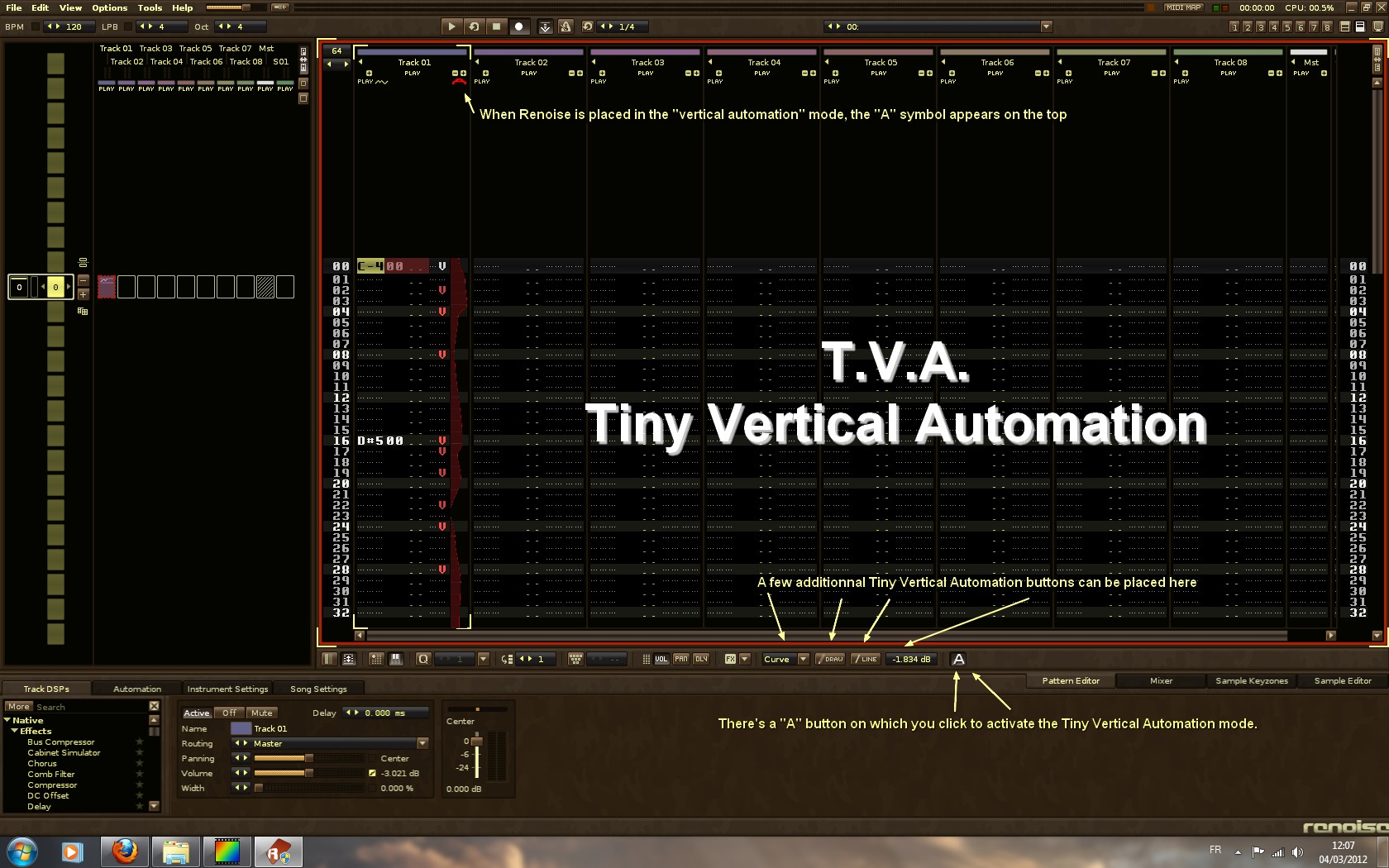
The big strenght of this vertical editor also relies on 2 things :
using (pattern) Lines reference in the editor instead of Beats, or 0Sxx, will allow users to precisely trim paste crop, insert silences, and all the modifications will perfectly be in phase with pattern events.
the “sample auto-focus” feature. Imagine that the vertical sample editor displays in realtime, (even during the playback), the “underlying instrument/sample” in the default track. For example, you work with 30 multisampled instruments and you’ve got to quickly find and edit the sample that doesn’t make it. In this situation, for now, you’ve got to loose sight on the DSPs, and click on the “Instruments settings” tab, then replay the last note “manually” with your keyboard, then double-click on the highlighted zone in the Instrument settings tab… So you can see the horizontal sample editor and you loose sight on your whole pattern… Frankly, all this could be faster, with a “sample auto-focus” feature.
It’s been my first mockup. I naturally didn’t wanted to use a “tiny” thing at first, and imagined to use something bigger, like an underlying semi-transparent automation curve. But unfortunately, I had to drop the idea.
Because I realised that my DSP chains are complex, and that they sometimes need lots of “stacked” automation curves. So if semi-transparent curves are drawn alltogether it’ll be quickly messy - so we’ll need another “automation selector” somewhere. And you see, selecting 1 curve, is another big problem, with the actual horizontal automation editor. When you have 4 stacked automations, you have to “choose” one of them, if you want to edit it. But then, you loose sight all on the others.
That gave me the idea of “tiny curves”. When you need more parameters in the pattern editor, you click on the “+” button what adds a new parameter column. Same thing with tiny curves here : when clicking on the “+” button you can add other tiny vertical curves on the righ side, and directly “see” all of the others, and quickly align your points with the other points.
Hopefully. I think it could be also usefull to get a better and more precise “horizontal playback line”, especially because Renoise has greatly improved the pattern definition with the new LPB mechanism and new zoomable automation editor. I’m not against the actual way of displaying the pattern line playback position. However, it could be far more precise to also “see” a “horizontal” tiny line. With this kind of “tiny playback line” you can get rid of all your troubles when placing the points and drawing the curves. And if you’re working with a vertical sample editor, you can fix all kinds of problems with slicing, cutting, creating spaces, perfectly at the right time.
I’m against anything that vertical. If anything the features in Renoise should be more geared to horizontal. The pattern editor is fine as it is but please, no more (especially not vertical visual waveforms within the pattern editor).
I like the vertical automation a lot! But I (guess what) don’t like pattern borders in general . Your feature will perfectly fit in the zoomable endless pattern approach.
-1000 for vertical automation, those screenshots look horrible and disastrous. The proper solution is to have a horizontal arranger along with the pattern editor and ability to show notes and automation there, and it also provides a good way to represent audio waveforms. I think the idea proposed in the thread would be a huge step back and anything even close to it should never be implemented.
I never said a horizontal tracker, but an arranger similar to what you can find on say Cubase or Ableton, along side with the pattern editor. And I actually have made a mock-up of that (it’s somewhere in the arranger sticky), but it’s a bit outdated and unfinished. In any case I don’t think this approach solves anything and would only make the interface more more cluttered and unusable. I agree there is a problem in the current setup (albeit not an awfully big problem) but this is the worst possible “solution” to it.
Sorry but that’s not so clear, how the Cubase or Ableton - like arranger would work well with the Renoise pattern editor, I would be pleased to see YOUR mockup and not a capture of an external software. I’m sure you’re able to draw something that’s not horrible and distrastrous. Thanx.
@kurtz I don’t understand how being vertical in the pattern editor implies that everything should be vertical? A horizontal automation is great and very intuitive to me and I would love to see a horizontal arranger as another tab, like the sampler or the zones editor (and the intruments tab to be back). However, I like the idea of a tiny vertical automation and effect values as columns as long as both are collapsable and optional. On the other hand I can’t stand mockups with vertical audiotracks, I just don’t get it, it’s counter intuitive to me.
The other thing I don’t understand is what’s wrong with current setup? I see those mockups more as an expansion to existing features than a bugfix. Renoise is useful and handy in it’s current form. At least for me.
1 - it’s a question of axis, when I’m tracking in the pattern editor I follow a Y axis, and when I’m defining automations, I follow a X axis, this is not a big problem, just a bit “unnatural” ; then the automation editor only displays one automation, I’d like to be able to SEE all the automations for a track, and not be obliged to select just one, all this gave me the idea to get some tiny parallel views in the pattern editor, of course if you want to edit very precisely the automation, the classic horizontal view stays available at the bottom of the screen in the automation tab
2 - there’s nothing wrong with the current setup, it’s quite good & efficient as it is, like you, I’d like to keep the horizontal automations, and horizontal sample editor/slicer as is, especially for doing very precise things, but concerning the general workflow, the pattern editor is the main core area, expanding it with tiny automation views, could help me to go even faster
Guys don’t misunderstand this thread, I never wrote I’d like to change every kind of horizontal tool by vertical tools or vertical views. I’d just like to think about ways to improve the renoise workflow, and detected some few things that in my humble opinion would help to optimize it a bit. If I ask mockups, this is because I need visuals, to think better. When I don’t “see” exactly things I can’t really think about how it could behave exactly. It’s very easy to imagine things in my head but when I try to draw a mockup I realise that finally things are not so easy and some unexpected problems would happen.