I like the idea of a vertical waveform and vertical automation, but i don’t think it looks too good in the screenshots to be honest.
I would rather have a button that easily turns the visual waveform and automation on and off in the pattern track and i would like it to fill the whole track with only a faint backdrop of the original pattern editor when on.
Then you could see the pattern track in the background while you edit the automation, then turn it off and back to normal.
Ah yes, a “switch” … with a switch we could decide witch enveloppes have to be displayed or not. We should define a color for each automation curve that has to be displayed…
An on/off button for each curve could be displayed, but also, maybe a button that “cycle through” all available automations…
I got new ideas, I’m going to try a new mockup. See ya. ![]()
ok, I see your point now and I agree with you ![]()
Okay here’s another ugly and disastrous mockup.
Usage :
- each vertical automation curve has its own [b]opacity /b, it’s own line color, background editor color, and filled curve color.
- those parameters can be wisely edited under the automations selector box
- those parameters are turned off by default, and turned off colors are represented by “X”
- when you right click on a "X"a color picker’s available, you choose a color, the “X” disappears, and the opacity is automatically defined as 70%.
- very different colors and various configurations can be defined here, I recommend to define very different colors
- when you right click on the wavelet (automation symbol) on the top of each track, it’s drawn in RED and activates/unactivates the vertical automation view
- each vertical view is automatically adapted to the tracks’s width, if you’ve got a big size track you’ll get a big size vertical automation
- you can precisely edit curves, by default you edit the last selected curve in the automation selector
- but maybe a “keyboard shortcut” would allow you to quickly cycle through editable curves
- the vertical curves editor has a “tiny playback line”, more precise, ready for the future (zoomable patterns)
- when transparency is wisely defined, you can precisely and visually align pattern events and vertical curves
- you can even stack lots of colored curves, but warning, to many visible curves would simply create a messy view
Still no good. Better idea would be to impose the notation upon the horizontal automation curves, but a separate arranger is still the proper solution imo.
we’re still waiting your perfectly designed mockups man ![]()
Well that’s a silly thing to say since seemingly that’s only you waiting for them, and I never said I had “perfect” mock-ups, but only that I had made a mock-up of an arranger that could solve most of the problems I see with Renoise at the moment.
The way I see it is that the pattern editor should be treated as a note editor mainly. It should be our equivalent of pianoroll, and there shouldn’t be anything that doesn’t deal with the notes. Hell, vertical automation along with the Pattern Matrix would be a better idea even, or this. But please, let’s not try to incorporate every feature of the program to that one section and by that make it a goddamn mess. Verticality just doesn’t work since it’s a standard that time is represented horizontally pretty much always. The pattern editor works because it’s text-based and we’re used to reading from top to bottom, and it’s practical to edit that sort of information and short segments that way. Plus it becomes difficult because these days our screens tend to be a lot more wide while they are rather limited horizontally.
Ps. The post to the arranger I listed above is not a very good representation what I’m after but it shows the idea if you didn’t understand it yet. It would solve: the ability to have a good representation of the song overall, ability to zoom very close to the track (no need for zoomable pattern editor?), ability to incorporate audio-tracks fluently (multitrack recording editing!), automation and notation on top of each other, incorporate piano-roll(?!), and maybe even more. ![]()
okay thanx I though it would never come in the end, so here come your suggestions…
(1) the horizontal arranger itself, with horizontal tracks, and still horizontal automation curves, it allows audiotracks, it shows one automation it’s a very classic & proven concept, it looks like lots of other DAWs, globally those DAWS are good at dealing with audiotracks, but they don’t have a pattern based sequencer but pianorolls instead.

note : your automation curves look undefined. Where do you select them ? How much automation curves can you put in a track ? Now the notes editor : where is it ?
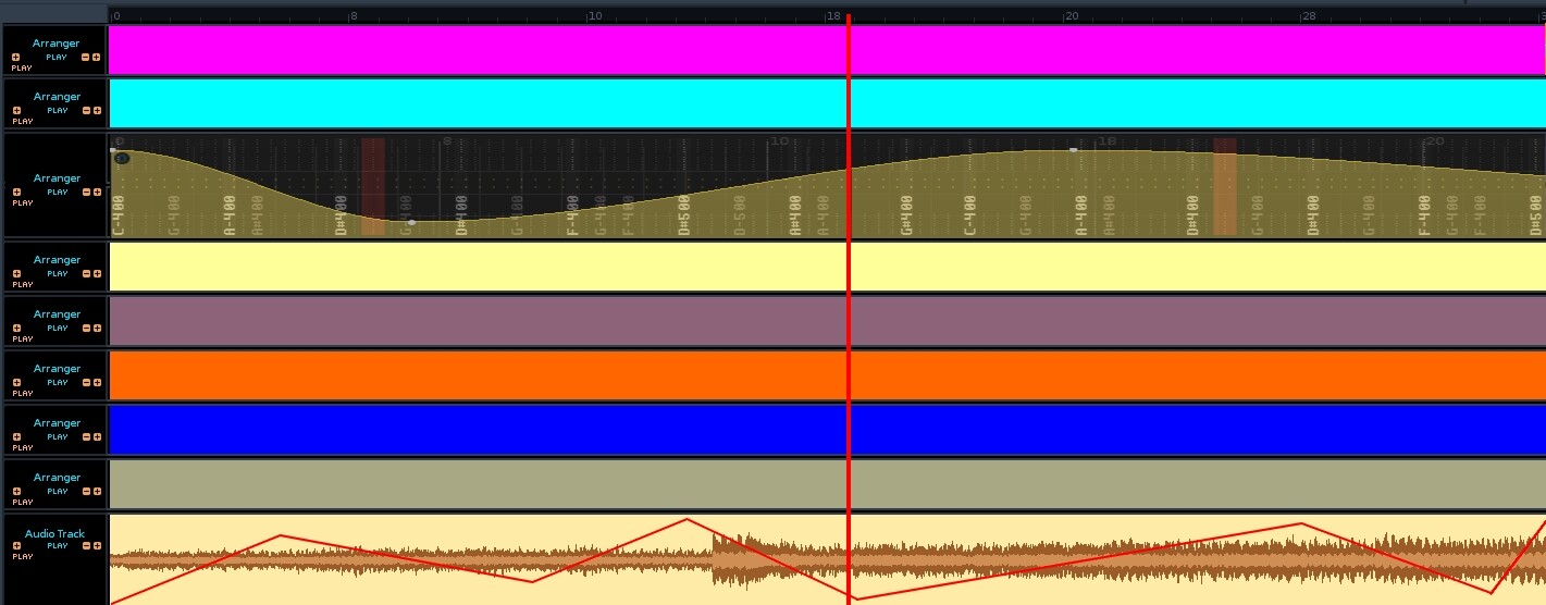
now… (2) the horizontally scrolling pattern-track … ![]()

heeeee, ![]() it’s not ugly,
it’s not ugly, ![]() and disastrous, hopefully. However, something I don’t clearly understand with those 2 pictures, do you mean that when users would click on a non-audiotrack, they could “see” a horizontal sequence of notes, and they would have to edit everything with their heads turned counterclockise… ?
and disastrous, hopefully. However, something I don’t clearly understand with those 2 pictures, do you mean that when users would click on a non-audiotrack, they could “see” a horizontal sequence of notes, and they would have to edit everything with their heads turned counterclockise… ?
I would never support making that bottom picture into reality but just wanted to use that as an example of what I think would be a better approach, but honestly I think even that would be a better choice. I also didn’t mean the note data in there would be editable there, but just bind the notes and automation more closely together, which I think was goal here in the first place(?). The arranger pic indeed is anything but finished, and once it (some time, maybe) is it will make a lot more sense. But, I think my job here is done. I just wanted to express my views on this since I can’t even begin to understand how integrating everything to the pattern editor would be even remotely good idea. It’s always good to have all of the different opinions represented ![]() .
.
I’m trying to see how I could enter my notes in a horizontal scrolling cell-editor like that… Maybe… If I join the 2 pictures it would help… let’s try :
Everything could be fine excepted that the notes editor’s cells should be somehow displayed horizontally so that they could still be readable. If you display notes in a horizontal queue, the timeline at the top of the screen (i.e. pattern lines) should be logically enlarged. Now notes edition : would a track be able to get more rows ? For example, in the previous picture, ther’s only one row, and so one sequence, but in the actual vertical track arranger you can add lots of other columns and build chords in the same track. Should this be preserved ? But if it’s perserved : how could it look ? Do we still need to keep the pattern commands cells or should we simply zap them forever ? If we don’t zap them, each pattern line step would be bigger and the timeline would also be larger. Asimple pattern sequence could have to scroll even faster from left to right. Now we need to define how automations could work precisely. How the automation curve selection works ? Yes your mockup looks like an answer, but it immediately raises other new questions and new problems.
I like the idea of seeing automation and sample information in the pattern editor, but I just rotated my laptop on it’s side and it’s pretty awkward to draw automation vertically.
I think integrating the sample editor would work better, especially with key commands to copy, paste, convert to new instrument, etc.
When working with long samples or synths with a long release or sustain time it can be hard to get your bearings and this would help with long samples. It’d be good to find a way to make this work with long synth sounds too.