I’m note sure, if this was already suggested, but it would be great when the notes length would be more visible in pattern editor. I attached a screenshot comparing sunvox vs renoise.
Nice idea. how do you think it should look in Renoise?
There are different possibilities. Maybe simply darker colors or change it to a symbol similar like in sunvox.
+1
maybe with some kind of gradient to show volume changes, but then whats stopping the devs for showing a vertical waveform display in or next to the tracks?  Better keep it simple like sunvox.
Here`s a couple of rough mock-ups I suggested for this issue before:
The first with dashes was my neatest attempt:
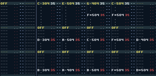
this next two more piano-rollish (but not pretty) allows you to drag the note-offs via the handles on the corners of the boxes:
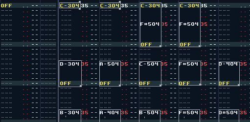
Now with waveform:
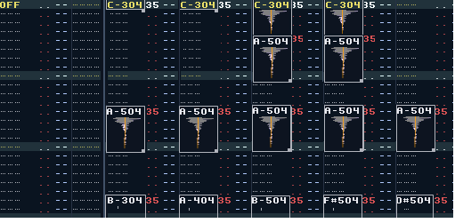
The last one with waveform display would be great, when you doing some 0Sxx stuff, but its also quite complicate to implement when this is combined with 0Bxx and other fx parameters and looping. The waveform needs to be prerendered for this. I think this would be too much. The dash concept would be good enough and simple, but it should fill the 3 chars.
I think this is the most practical one aswell, though having one dash is better IMO as it makes the note space immediatly recognisable.
it’s a cool idea.
i’m wondering: does the block length appear when you put a note-off in a column below an entry, or do all entries automatically have this?
if it’s the latter, it sounds like kind of a complicated undertaking. how do plugins behave? most samples wouldn’t be of a length that makes them neatly end on a new line, is this information relevant to be displayed somehow, or does the block just go to the end of the current line where a sample ends?
WOW this is awesome. Although personally i would like to see waveform display as an option as it kinda goes against the whole tracker timeline.
Draggable handles on selected notes would be awesome - i think it would help in being able to see more clearly note structure and help in faster
note data entry. I wonder if it would work on the whole timeline for any sort of data? SHIFT + DRAG interpolates to dragged selection etc…
- coloured by its frequency like

Hm, I would prefer just blocks drawn using some custom color and maybe a bit alpha blending. IMO dashes and also line dashes — result in an unsettled view for the eyes. Blocks and filled solids are much faster to conceive while work than dashes, outlines etc. Drawing waveforms would require a lot of precalculations and I doubt this is possible for 3.0.
I would prefer something like this:

Or this:

I`d guess when you put a note-off in.
Blocks could work like this too though they would need to be separable from pattern selection.
+1 for blocks, slightly translucent. Also, 1 or 2px inset and 1 or 2px rounded, to visually distinguish them from block selections (cause you need to be able to see both a selection and a note-region simultaneously)
The blocks should also stop though when the sample stops - this should not be too much calculations I think and it helps a lot if you’re able to see where in time your samples start and stop.
And if we’re doing this the pattern matrix blocks can also be a lot better detailed (instead of just meh lines ‘___’ where a note on is, such that even an empty block where a looped samples plays on with autoseek, can still generate sound ![]() )
)
Would be cool if you had the option to have different background colours for the notes in an octave and also have this with the same pattern effect commands.
Just like this:
https://www.youtube.com/watch?v=Kwy71PuojXg
Note length is displayed as block. Zoom don’t have to be (of course would be nice).
Advantages:
-
No more ugly note-off command
-
Mouse length control
-
Length can be shorter than one line
-
Much better in visibility
-
Launch into future
I like the idea to be able to show the note-length. So far, the slight transparent block is the most appealing suggestion.
However, if ever implemented, PLEASE make it optional / toggable. So that you can chose if you want it the way it looks now or the new UI.
I also like the idea to click & draw directly on the pattern to define how long the note should be (instead or scrolling down to where the “Off” should be and set it there). Maybe not too easy to implement, but would help workflow a bit.
KTHXBAI,