More GUI Textures (Please)

PRISM

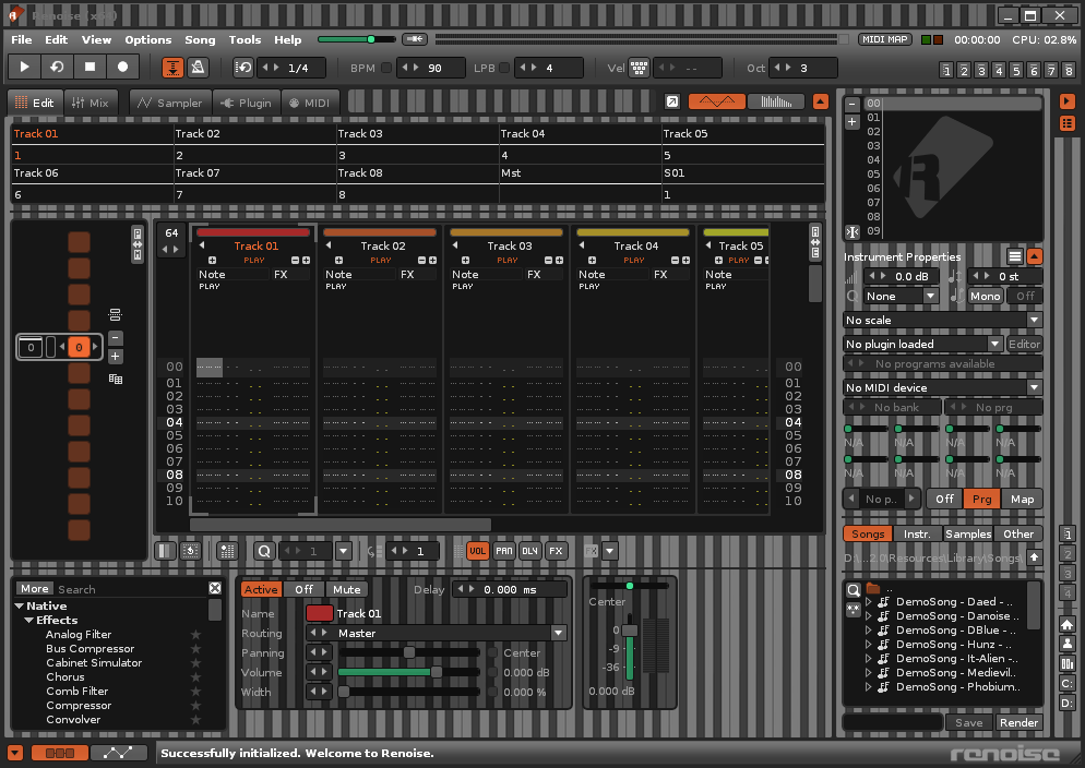
I already did a RAINBOW texture so I called this new one PRISM. Again it is a texture with all colors. But this time with a vertical direction which streches perfectly under RENOISE. With same texture for panels and for background. Here with the Body Shade parameter pushed to 100%. You can obtain something a bit less flashy with Body Shade set to 50%.

image

1 Like

I did a couple of themes with new skins back in 2007, but it looks like the odd stretching issue that only appeared on the Advanced Edit panel is now part of the main interface body. I wanted to port them over to Renoise 3 and also create a new theme and skin, but the ugliness of this has put me off.

There’s been a lot of calls for customisation options for fonts, so perhaps that and a proper user-friendly solution for custom skins might be a good idea for v3.3?

renoise-textures

4 Likes

Some cool features would be to have:

  • Specific window to choose source images
  • Stretched or repeated option for X axis
  • Stretched or repeated option for Y axis
  • Transparency setting for windows & panels

All that for Christmas 2019, of course… :santa:

1 Like

COLORS

Yes, right, I didn’t have many inspiration for the name of this one. Diagonal textures, inverted (rotated) between Panels and Background to make something that crosses.

image

1 Like

WORK

If you work in a warehouse, or on a construction site, this texture will help you not to be fired too much quickly by your angry boss. Here with Body Shade set to 50% and Contrast set to 100%. Ajust it to shape of your environment as close as possible.

image

2 Likes

PIANO

PIANO is a set of 2 textures based on the very good artwork from @EatMe for the MBC#12. In the ZIP file, you will find PIANO1 the bigger one and PIANO2 the smaller one. For those who need to be as close as possible of the MBC#12 theme, even when composing.

image

image

3 Likes

What a piano roll texture for renoise, …

2 Likes

image

Yo this is cool!

1 Like

RUSTY

This rusted texture will make you feel as if you were composing your track outdoor on a very old Renoise that would have taken rains over years.

image

3 Likes

RANDOM

No need the help of Captain Obvious to see that this Renoise GUI Texture is based on the same random pixelart pattern that the one I used in my track for the MBC#12. As always, unzip the file below in your “\Resources\Skin\Textures” folder if you want to use it in real life.

image

2 Likes

VERTICAL

Yes, again a random pattern, but this time, it has not been done in Basic 512 on DCMOTO Emulator with TO9+ ROM. No this time it has been done in HTML5 & JavaScript on a simple Canvas. The result gives something not too much agressive. If you like vertical lines with random colors, you will like this texture.

image

2 Likes

AMERICA

To use this texture, you need to love the USA. I mean… REALLY!! I used stripes pattern for background, stars pattern for panels, and add a bluish Body Back color to increase the flag reference.

image

3 Likes

FRANCE

To use this texture, you need to love France. I mean… REALLY!! Hehe, OK, I won’t do all countries, even if, technically, it is easy to make textures for all flags that have horizontal or vertical strips. But no! This time the ZIP contains 2 versions of the texture. One with the classic french flag and true colors. The other with gradients on primary RGB colors. Both textures also use the lily flower pattern witch makes reference to the royal symbols that kings were using in the past in France.

image

image

1 Like

VUITTON

First of all, note that this texture is inspired by the one @qwerno did in 2015 for Renoise 2.8 and that you can find here:

Now, here is my own version, for Renoise 3.1. I used quite the same pattern, and did a reduction of 50%, not on the price of the french luxury handbags, no, but on the pattern dimensions used for the small panels. I also changed a bit the colors for Body Back settings to match even better with the handbag colors. Like this, you will use Renoise as a VIP, yes, because…

…those handbags have the price of 20 to 40 licences for Renoise. :scream_cat:

5 Likes

Apologies for bumping an old thread here, but can you explain how you’re creating your own textures here? Very good stuff. Would like to make some of my own.

I wanna change the renoise logo to a greyscale silhouette of my profile picture hehe

2 Likes

This is awesome

1 Like

OK, I try to make it short:

  1. Find the texture folder (for example: “C:\Program Files\Renoise 3.2.0\Resources\Skin\Textures”)
  2. Duplicate one of the subfolders (for example: “Default”) and give a super-hyper-mega-cool name
  3. Change only 3 pictures (BodyTexture.bmp, InnerBodyTexture.bmp, PanelBlending.bmp)

Now there are a bunch of issues to consider at…

  1. If you have problems with Windows rights on the new subfolder you just created, there are tutorials the web and videos on YouTube but it is a bit painful to do
  2. BodyTexture and InnerBodyTexture can be identical, it is for the background of the small panels, they are always repeated on both X and Y axis
  3. PanelBlending is the Renoise main window background, and is repeated on X axis but stretched on Y axis, it also makes strange things on menus, on mixer, on all other Renoise windows

Now have fun! I feel a bit alone here. :joy_cat:

2 Likes

renoise just crashes when trying to load the one I tested with,

@PirkoAaro

Do you have an error message? Are you on Windows / Linux / Apple? Which version of Renoise do you use? My textures only work with Renoise 3.x and you must have maximum rights on the Texture folder…

If you want to create your own textures, several things to check…

1°) Create your folders by copying existing ones

image

2°) Replace only the 3 bitmaps (BodyTexture.bmp, InnerBodyTexture.bmp, PanelBlending.bmp) and with exactly the same names and extensions

image

I hope Renoise 3.3 will drastically improve the texture management.
But I’m afraid I’m dreaming. :yum: :innocent: