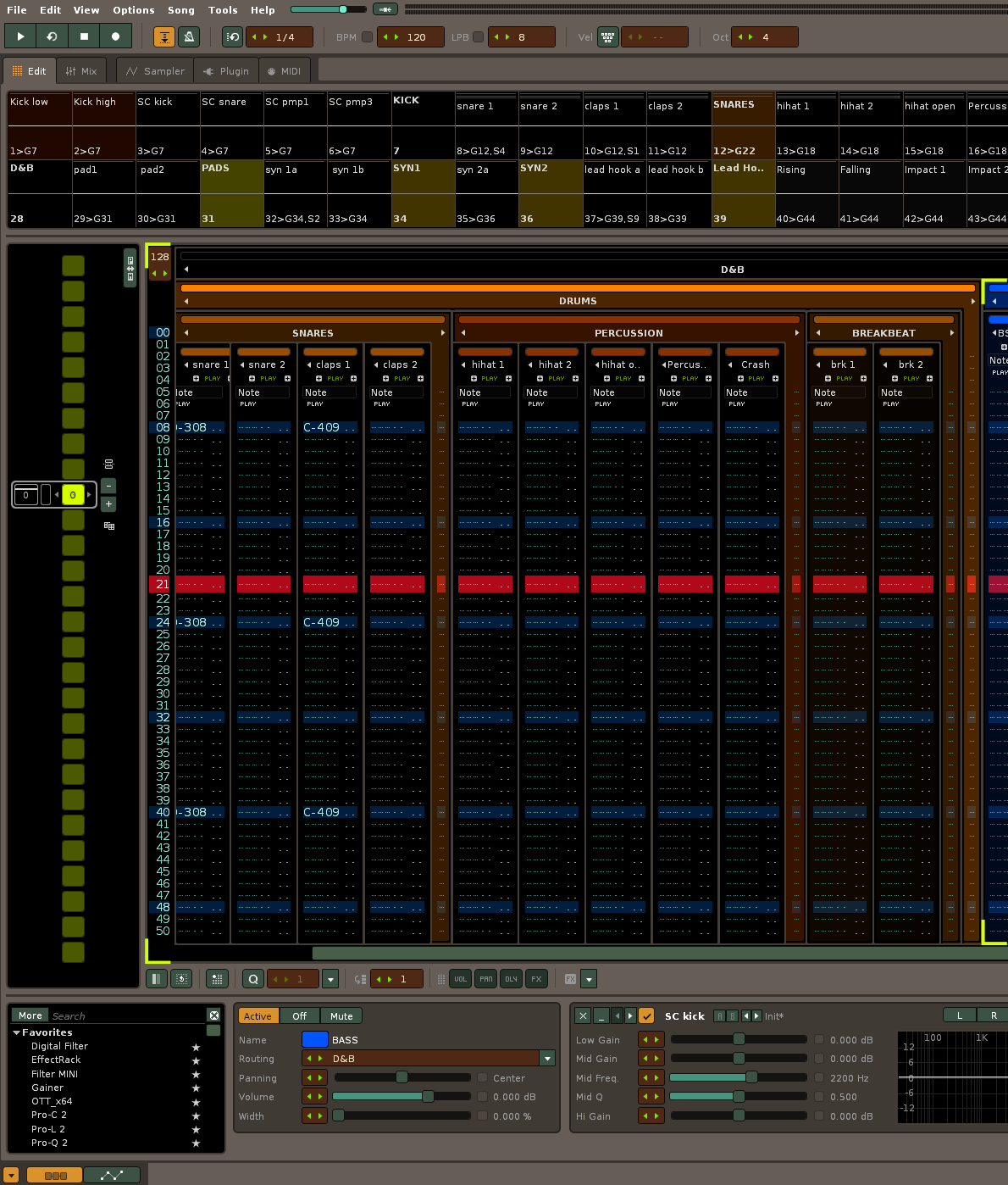
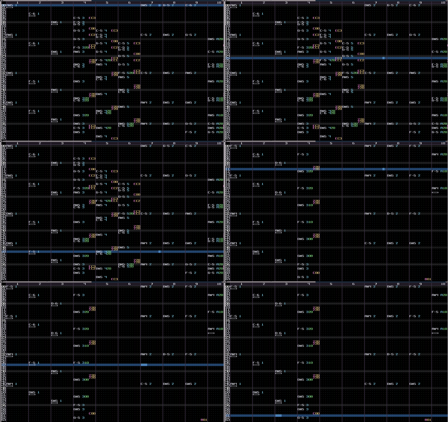
yeah I run Renoise in 2560x1440, 8 lines per beat, 128 lines per pattern. 125% gui scaling, big font and have four groups nested for drums that takes up space as well. I can’t view all the lines in the default view.

yeah I run Renoise in 2560x1440, 8 lines per beat, 128 lines per pattern. 125% gui scaling, big font and have four groups nested for drums that takes up space as well. I can’t view all the lines in the default view.

well you don’t always need to display all the gui you have enabled now. I also think being able to view 2 bars is enough, if you can simply paginate to display other bars.
chuckle guys, I know, I could set the GUI scaling to 400% and use 16 lines per beat, so that I can’t even fit a bar on the screen. That’s not the point.
The point is, with todays screen resolutions (and maybe even a font and font size that could be freely defined?) scrolling can be an option.
And imho it would be a great option. A tracker working like every other data entry app. Imagine pages scrolling only when the bottom of the screen is reached. Screen refresh only every X bars.
Maybe, probably I’m getting old. I spent countless hours on the Amiga Protracker, and its 8(!) lines of note data didn’t bother me the slightest. But that was 30 years ago. A lot of things have changed since then. And I’m not a teenager anymore, and couldn’t bear sitting in front of a flickering TV screen with doubled up 25 Hz refresh rate, so that the next day after a session I would be blinking like I had dust in the eyes.
When something works totally different than what you are used to and on the top of that give you real headaches while at the same time would be pretty easily solvable, you just develop some wishes. That’s all.
Peace out.
I take offense, what you showed was a barebone minimum template for noobs, my example is what i use and I bet that most use something in between so don’t chuckle just because someone add balance to the mix ![]()
Anyway I agree with you ![]()
![]()
That’s true and a good point, I have made four custom global view presets and have a full pattern editor view on F4 but I keep forgetting it.
edit: the more I think about it I’d use this feature, I would use a 64 pattern length and the full screen pattern view above.
maybe this feature is just not implementable by @taktik due to the code base or whatever? I think this has been requested a lot over the years and I can hardly think of a reason why to not make this an option, if people want to have it.
I also like to have an option for scrolling corsor in Renoise. It is one of main thing for me(right after functional Jeskola Buzz plugin bridge, that probably will never be…))
Cursor and playback be one. Amen.

Milkytracker has three modes:
A fourth mode with some sort of pagination might be nice also, but it would almost be confused with normal patterns during >127 lines, kinda.
Exactly! That is it.
I actually find that very ugly, and I am pretty sure Buzz and Milkytracker only work that way, because it is less effort to implement a simple page flip than a scrolling. Also I think Renoise’s stationary mode is intended to edit decoupled from song play.
In the above very basic pageflip, I neither can see any context, nor edit stationary while playing. I don’t geddit.
Maybe better would be a scrolling mode only for editing, so you can scroll the pattern for editing like the song was stopped (with enabled scrollmode), but then the song still is playing!
The current mode already provides split edit/playback.
I don’t understand what you mean by not seeing the context. My experience is that the overview is better and more comfortable without scrolling both in regards to stutter and navigation.
PS Milkytracker provides scrolling just like most trackers. Read post.
Well, maybe I still don’t geddit, but also can’t find a benefiting argument in here…
In the middle of the post you just responded to. I think you need to scroll while reading the forum.
A stationary scrolling is way superior over a mixed solution or pageflip. That was my point.
Mixed solution = brain explodes
Pageflip = epilepsy
See my convincing arguments here.
eh… tbh I like the current way much better, I have to focus on the center of the screen and I always know where the cursor is, no need to follow around with my eyes.
The current way already exists. The feature cited would be “an option”.
PLEEEAAAAASEEEE @taktik
I really need this feature!!
the fourth (noneexistent) option would be my prefered way, so that you just jump to the next page instead of scrolling when you hit the end of the screen.
When i bought renoise, in 2010, this was my first and last feature request.
I started in fasttracker2, which works like renoise, later on i moved to impulse tracker which had a non scrolling pattern. it was amazing. super workflow enhancement. So sad to come here 14 years later, see people asking for this feature, and not even a response from the developer. guess he could at least say: the code is mess, to implement that feature renoise gui would have to be rewritten.
in the meantime i have droped renoise for ableton live.
I still have many renoise projects to finish though ![]()
I feel the same, incredibly greatful for the great work done by @taktik, but I would also rather hear that the gui would need a major rewrite for this to happen and that’s why it#s not being implemented etc. than people just guessing in the dark.