@taktik
Allow me some constructive criticism…
I’ve tested only Linux x64 version, so don’t know if others are affected (but assume that yes).
It would be really cool to see bugfix release soon 
P.S. Note that i’ve checked all 667 icons and absolute most of other ones not mentioned here are 100% perfectly done, my criticism comes only from deepest love & personal connection for Renoise and it’s design 
P.P.S. Also there’s places where i write Too thin weight? mainly for 1.5x size - that’s i’m not 100% sure, it’s hard to judge outside of context for different displays, but worth to note.
Small things
-
Installer script has mime associations only for songs, unlike Windows which have all those new types like instruments, presets, FX chains etc
-
Readme.txt have no history anymore

I think that was handy to have offline sometimes.
Call me old-school!
Icons
Resources/Skin/Icons/
Wrong font / Glyphs
Show details
KeyZones_VelToVol@4x.bmp
| 1x | 4x |
|---|---|
 |
 |
| V, E |
Mixer_ShowVol@1.5x.bmp
Mixer_ShowVol@4x.bmp
| 1x | 1.5x | 4x |
|---|---|---|
 |
 |
 |
| V / Too thin weight? | V, O |
Transport_ViewVolumeColumn@1.5x.bmp
Transport_ViewVolumeColumn@4x.bmp
| 1x | 1.5x | 4x |
|---|---|---|
 |
 |
 |
| V, O / Too thin weight? | V |
ViewMapped@4x.bmp
| 1x | 4x |
|---|---|
 |
 |
| M |
Transport_ViewPanColumn@1.5x.bmp
Transport_ViewPanColumn@4x.bmp
| 1x | 1.5x | 4x |
|---|---|---|
 |
 |
 |
| N / Too thin weight? | N |
TrackIsOff@1.5x.bmp
Transport_NoteColumnOff@1.5x
| 1x | 1.5x | 4x |
|---|---|---|
 |
 |
 |
| O, F / Too thin weight? |
MiddleFrame_SampleEffects@1.5x.bmp
| 1x | 1.5x | 4x |
|---|---|---|
 |
 |
 |
| F / Too thin weight? |
Transport_PatternFX@1.5x.bmp
| 1x | 1.5x | 4x |
|---|---|---|
 |
 |
 |
| F / Too thin weight? |
SampleEd_SampleFX@4x.bmp
| 1x | 4x |
|---|---|
 |
 |
| S |
Mixer_ShowMute@4x.bmp
| 1x | 4x |
|---|---|
 |
 |
| M |
Browser_RenoiseDeviceChainFile@4x.bmp
| 1x | 4x |
|---|---|
 |
 |
| x size |
Transport_NoteColumnPlay@1.5x.bmp
| 1x | 1.5x | 4x |
|---|---|---|
 |
 |
 |
| L, A / Too thin weight? |
Different
Show details
Browser_RenoiseSongFile@4x.bmp
| 1x | 4x |
|---|---|
 |
 |
| Aesthetics is very different |
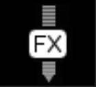
Mixer_PrePostIcon@1.5x.bmp
Mixer_PrePostIcon@4x.bmp
| 1x | 1.5x | 4x |
|---|---|---|
 |
 |
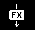 |
| Arrow should be like 4x / F, X / Too thin weight? |
Browser_RootDir@4x.bmp
| 1x | 4x |
|---|---|
 |
 |
| Arrow head is different |
Browser_ShowDirectories@4x.bmp
| 1x | 4x |
|---|---|
 |
 |
| Perspective is different 1x is way better |
Node_Expanded@4x.bmp
| 1x | 4x |
|---|---|
 |
 |
| Triangle proportions are different |
Node_Collapsed@4x.bmp
| 1x | 1.5x | 4x |
|---|---|---|
 |
 |
 |
| Triangle proportions are different |
Transport_Sync@4x.bmp
| 1x | 4x |
|---|---|
 |
 |
Rhombus, not circle! 
|
Prehear@4x.bmp
Browser_AudioFile@4x.bmp
Browser_PrehearOn@4x.bmp
| 1x | 4x |
|---|---|
 |
 |
| Waves aesthetics are very different |
Clear@4x.bmp
| 1x | 4x |
|---|---|
 |
 |
| Cut angles little more? |
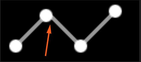
LowerFrame_Automation@4x.bmp
| 4x |
|---|
!
|
| This connection is a little off |
Aliased icons
Show details
Transport_LoopBlock@1.5x.bmp
| 1.5x | 4x |
|---|---|
 |
 |
| Visibly jagged edge of arrow |
Dialog_Alert.bmp
| 1x |
|---|
 |
| Visibly jagged edge of both circle and ! |
Pattern font / spacing
Show details
-
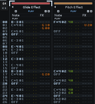
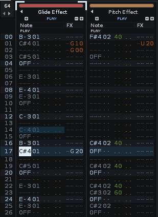
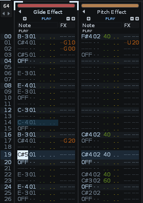
Just wanted to point that spacing has much more breathing room than 3.1 (In fact as you can see H-Spacing = 1 / V-Spacing = 2 now almost equal to H-Spacing = 0 / V-Spacing = 1), which is fine (i imagine it’s good to 4k+ screens, and you still can dial it back)
-
Personally i really dig bold font at 3.1, it drives my mojo, again i imagine probably lighter font was deliberately picked for 4k+ screens, but i would love to get an ability to choose bold variant like on 3.1.
| Renoise 3.1.1 (H-Spacing = 1 / V-Spacing = 2) |
Renoise 3.2 (H-Spacing = 1 / V-Spacing = 2) |
Renoise 3.2 (H-Spacing = 0 / V-Spacing = 1) |
|---|---|---|
 |
 |
 |
 Solved archive
Show details
Small things
-
Show comments after loading - still doesn’t work, please fix it!
-
Installer script links 48x48 icon. which is pretty small for modern DEs, especially on 4k (i think now Linux can safely use either 256x256+ or even svg)
High dpi scaling
-
Splash screen is still 1x scale
-
Mouse cursor is still 1x scale
Icons
Resources/Skin/Icons/
Wrong icons
Show details
SampleEd_XReverse@4x.bmp
| 1x | 4x |
|---|---|
 |
 |
| Upscaled & pixelated |
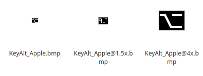
KeyAlt_Apple@1.5x.bmp
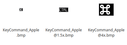
KeyCommand_Apple@1.5x.bmp
Aliased icons
Show details
KeyAlt_Apple@1.5x.bmp
KeyAlt_Apple@4x.bmp
| 1.5x | 4x |
|---|---|
 |
 |
| Visibly jagged edge of sloping line | Visibly jagged edge of sloping line |
Resources/Skin/Logos/
Logo@4x.png
Aliased Renoise logo, and slightly different from original Logo.png (for example no mirror on bottom)