I think having this as an option would be a wonderful feature. If it were configurable per track that would be ideal. Being able to adjust the transparency level would be nice too. Just a thought, thanks for reading.
I remember some old school trackers where you could see, behind the main tracks, some realtime spectrums or some realtime vu-meters. And where you could define the transparency of those visualisations. So what about realtime audio-tracks ? Why not, that’s “pretty”. But, let’s be realistic. Some people allready complained about the new GUI that has slowdowns. So eye candy features that don’t bring much creativity will net be considered like something that has to be done ASAP. We’re in the beta phase, and during the beta phase, the devs are trying to fix first the main crashes, then, they could maybe “slightly” modify some features if - really - it can be done without implying the re-coding of the whole thing from scratch.
So an eye candy feature like what you suggested, is probably a feature that could not be “added” for the release of the 3.0 version, but maybe let’s hope it will be tooken in consideration for the the 3.1, who knows ?
Saying that : I have some doubts about the efficiency of some transparent waveforms displayed on the top of tracks for building my music with samples. I imagine that I would have some difficulties to read well my instruments notes, and pattern colums with hex. data, because of those graphical audiotracks on the top of important infos. I see why you suggest to define some “Transparency” factor. But it will not really change the fact that this waveform view would make the whole visuals more confuse - and let’s face it : a tracker allready looks confusing especially for newbies. Imagine : a sample view on the top of 3 hex pattern commands - very confusing.
So : wouldn’t those audio waveform views be more usefull first “next to” the tracks ?
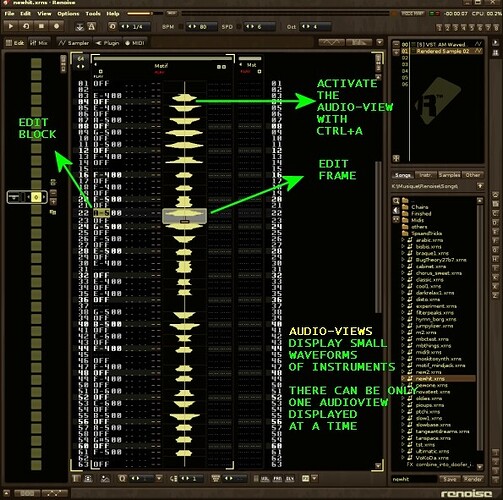
Then if they are transparent, how could you “edit” them ? When they’re transparent : they’re not editable : so they’re pretty, but not very usefull. Wouldn’t it be wonderfull, if you could simply see “solid audio-views”, next to your usual pattern track ? Those audio views would display small vertical waveforms, surrounded by a draggable frame, that are drawn on the fly, corresponding to the result of triggered notes in the associated pattern track.
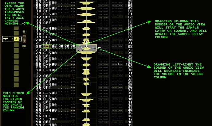
Edit mode. Interaction between audio tracks and columns.
Then, imagine : if you edit the pattern track notes and effects, it changes the associated audio-view. And if you graphically edit the audio-view, (slightly move it upside, downside, on the left, on the right), and it could modify on the fly what’s going on in the associated pattern track : by changing the note delay precisely, or by transposing the note lower or higher. If you reduce the width of the audio-view, it will modify the volume, in the volume column. If you move a small a slider, in the audio view, it will modify the panning in the panning column. You see ? Audio-views would be the graphical alternative to the typical keyboard edition into the tracker.
But once again, this kind of insteresting features won’t be ready for the 3.0 final release.
Absolutely what you worked out. Beyond my creative capabilities, but the ability to move/slice the samples in the hex editor would be sick.
There have been similar threads about this in the general suggestion subforum, I don’t expect this to happen during beta time. Maybe Joule is working on his tool idea? Tool idea: Audio tracks

