Here is a FL Studio theme. Sorry for the screen, we troll FL Studio community members with this in vk(dot)com ![]()
![]()
theme: http://ge.tt/6UgnSpK1/v/0
Here’s some from me:
Bright Brown

Bronze

Under Water

Easy Blue

Isn’t this pretty much the same as your Outdoors theme?
i made some simple grey themes. - maybe some of you like them.
preview images can be found in the google drive folder
https://drive.google…OXM&usp=sharing
edit: i just found out, that by accident i created something which looks quite similar to the energyXT 2.X default skin.
Sorry there are no screenshots but I figured I would share my Super Nintendo inspired theme as well as a Purple/Black theme that is easy on the eyes (for me at least).
https://drive.google.com/folderview?id=0B342WdqUJOcdbnY1d1N3SXpfNE0&usp=sharing
Stylish theme inspired by instagram filters.Compatible with 2.5.1 and more
Also it’s good with camo texture
download http://ge.tt/9v8pe1p1/v/0
really love these dark jenoki themes but the bright borders on the pattern matrix cells look awful. wish there was a way to control that color aside from bringing up the body back color (or bringing down the body font color).
Anyone got Theme27 laying around?
Seems like the download link don’t work anymore.
New year, new theme, taking yours this time rhan.
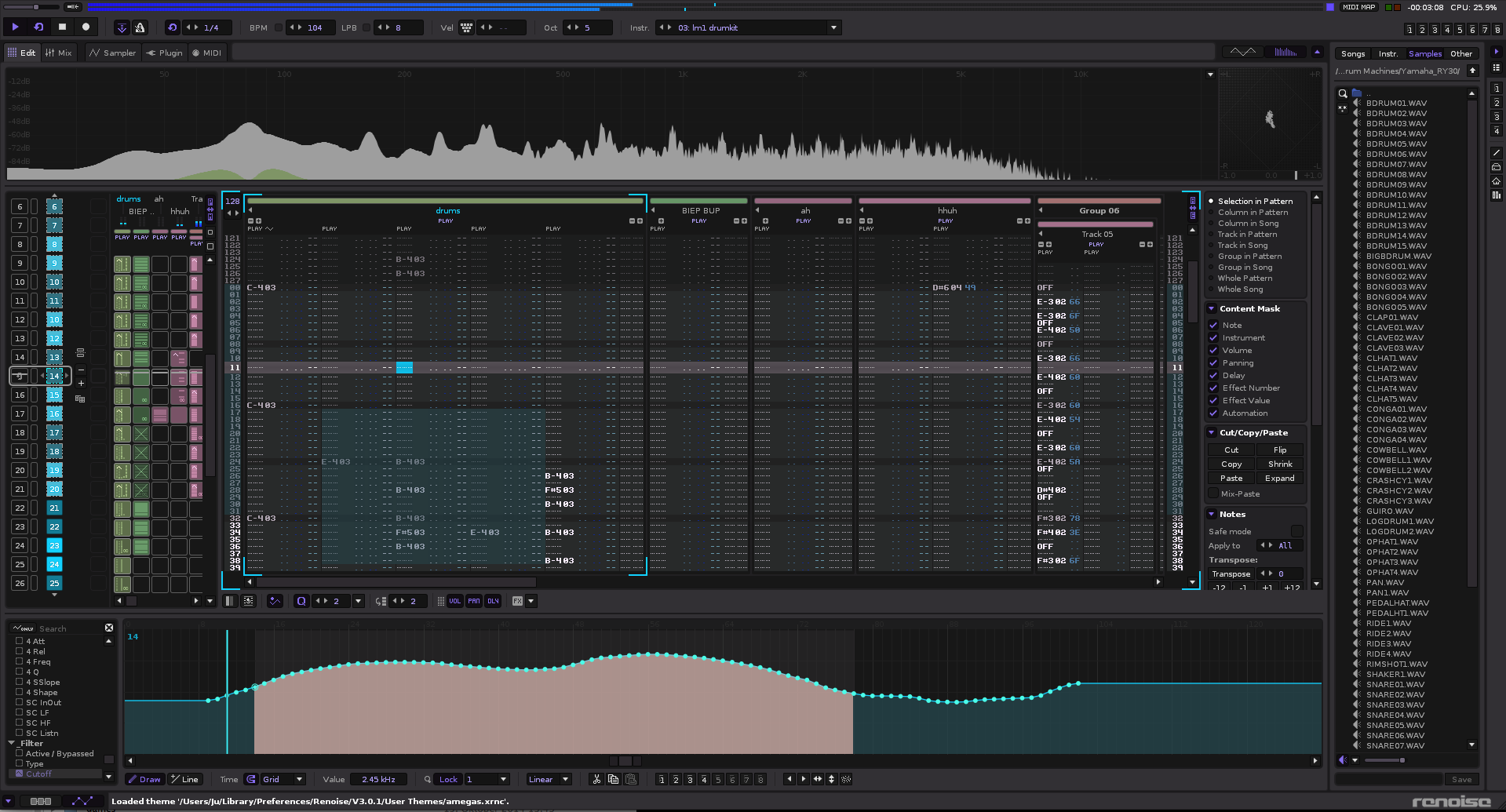
Some new themes, tried to maximize simplicity and smoothness. No textures, plain surfaces etc. Wish I could control outlines better (e.g. removing it). Inside zip also some good ones from others slightly modified…
http://tstlab.virtualcreations.de/renoise_forum/r3_themes_26jan15.zip

Jurek, thank you for those, they are very nice indeed. I noticed with the Pro Master 9000 (mod-inv) that the pan column colour is very difficult to read though.
![]()
Thanks, if you fix it, can you upload?
hi guys. so i decided to learn renoise and in order to make my learning curve as easy as possible i created a theme that i could work in and enjoy working and learning in. this theme is not tweaked from any other theme. its designed from init default theme that comes with renoise. every single color from the init patch was changed and no shortcuts were taken in creating it. i feel that if one is trying to learn renoise this would be a great way to have fun in doing so.
i was hoping the developers could please add it to the renoise themes in the actual software so my work is never lost.
the theme is based on a softsynth by an industry standard audio software company which i will not mention which has imo and the majority of others the the most beautiful gui ever designed.
til it gets added:
im glad to be here 
best,
native instruments polyplex designed by twisted tools. the colors are an exact match picked using a color dropper, quadruple checked, for an exact 1/1 match :)polyplex has imo and the majority of others the the most beautiful gui ever designed.
Looks really nice. I’d like to know what the softsynth-that-shall-not-be-named is though. I use linux so hints like this are lost on me but I am curious.
Looks really nice. I’d like to know what the softsynth-that-shall-not-be-named is though. I use linux so hints like this are lost on me but I am curious.
atarix posted a color picked ableton 9 so i don’t see why there should be a problem. native instruments polyplex designed by twisted tools. the colors are an exact match picked using a color dropper, quadruple checked, for an exact 1/1 match ![]()
atarix posted a color picked ableton 9 so i don’t see why there should be a problem. native instruments polyplex designed by twisted tools. the colors are an exact match picked using a color dropper, quadruple checked, for an exact 1/1 match
No problem, thanks for the insight. There was another skin based on this recently, seems like different approaches were taken though for both. I can rarely find one that I’m happy with so I appreciate you sharing yours!
No problem, thanks for the insight. There was another skin based on this recently, seems like different approaches were taken though for both. I can rarely find one that I’m happy with so I appreciate you sharing yours!
beatslaughter made a really dark version. i wanted to make my own from scratch. beatslaughters version looks quite different then mine. i guess he prefers very dark colors though.
I can rarely find one that I’m happy with so I appreciate you sharing yours!
i do like atarix and beatslaughters work. but you must remember though that no theme is ‘wrong’ it just depends on the artist and or user of said themes. one persons trash is another persons treasure ![]()


