hi guys. so i decided to learn renoise and in order to make my learning curve as easy as possible i created a theme that i could work in and enjoy working and learning in. this theme is not tweaked from any other theme. its designed from init default theme that comes with renoise. every single color from the init patch was changed and no shortcuts were taken in creating it. i feel that if one is trying to learn renoise this would be a great way to have fun in doing so.
i was hoping the developers could please add it to the renoise themes in the actual software so my work is never lost.
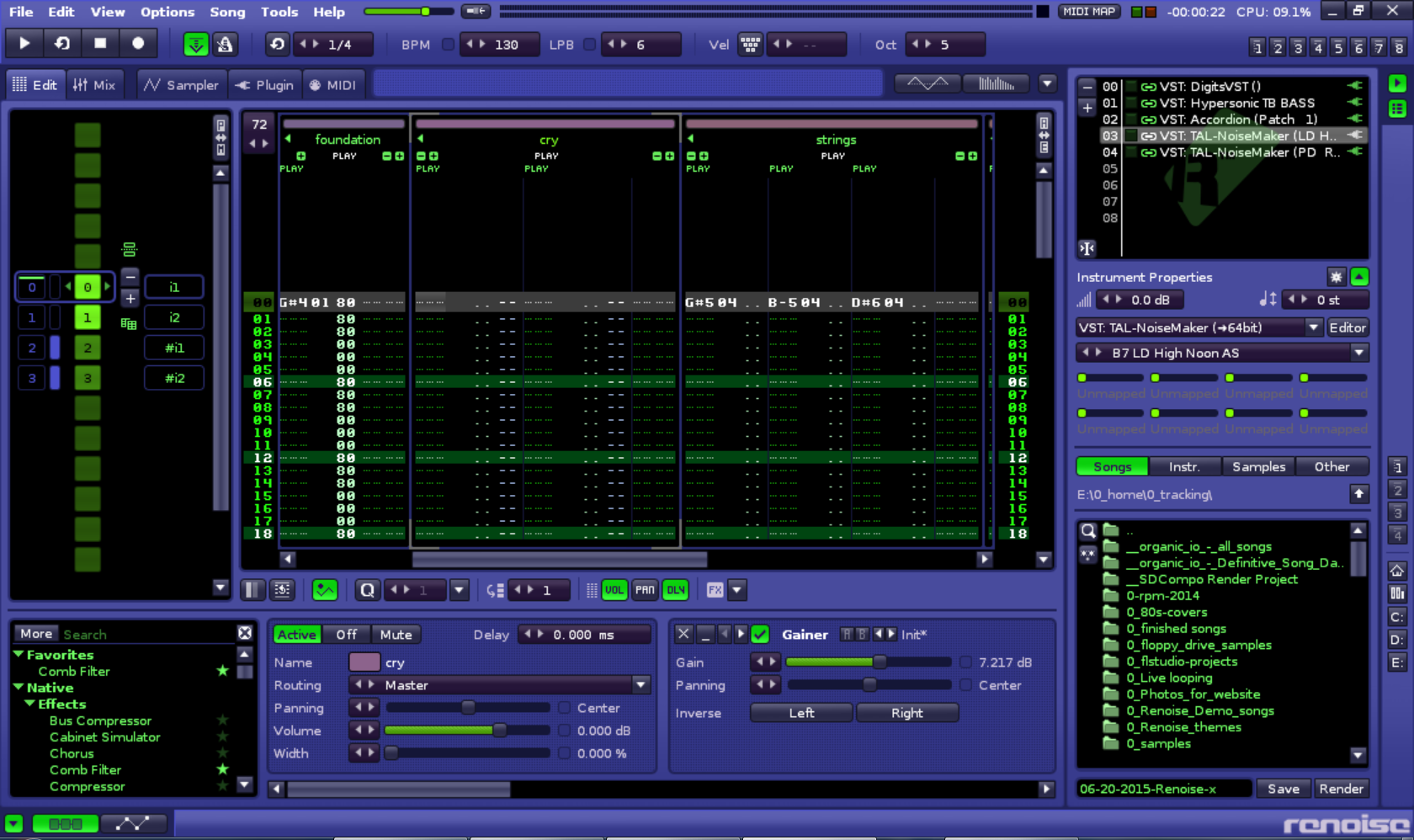
the theme is based on a softsynth by an industry standard audio software company which i will not mention which has imo and the majority of others the the most beautiful gui ever designed.
til it gets added:
im glad to be here
best,
So, are you going to upload this, or just tease us and wait til the next release of renoise?
k guys, this is the final theme for me and the one i will be using from now on. my eyes are exhausted and tired as hell and sore from all this work. i realize that having an interface/ui that is productive and inspiring is priceless so that what ive been seeking to create exhausting and boring as it is to do so. i really want to start making music with renoise, whats kept me going in finishing this project to completion is knowing that i will love working in renoise and my gui interface as i plan to switch to renoise forever and in the long run, its a small price to pay for a daw that i feel 100 percent comfortable in using.
of all the themes i created, (i have done more then i have shared) but this is the third theme i have posted and they always say that the third times a charm. this is my favorite. the theme im sharing is from the init default renoise theme (and takes no parts from the first artificial intelligence theme) and is the second and for me, final version of my of my goal to turn twisted tools gorgeous poly plex into a daw interface. i feel that i have reached this goal now. no changes will be made in its implementation, and all colors were checked 2 numerous times for consistency to the real polyplex colors.
Just a slight modification to robert’s “monkey jam” theme. Changing that purple to blue really did it for me. Something about that blue makes this whole thing so eerily familiar to me, and I can’t figure out why
well, uh, i guess that’s it. it been my ultimate goal to make the ultimate theme. ive done it. it took me many tries and in that learning process, the creation of many themes. to get my theme to this level of professional. polish, and ultimate self satisfaction. this theme is perfect in every way. its a flat design, it not too dark but also not to light, its very easy on the eyes, be it used in a light or dark environment, the palette is gorgeous, modern, uniform through out, and the colors, and fonts very readable. i guess now, its just a matter of creating music. in a way, i feel a bit lost, and its a bit scary now that i have no excuse to not use renoise or write a song. i hope that the developers add this theme to the next version of factory renoise themes. nothing more to say.
Contains 2 different theme files, one is slightly brighter. Adjust the global color value to your liking.
edit fixed a pattern editor centerbar focus issue - it was nearly impossible to figure out where the cursor was before. So I changed the center bar to use black background and white text, which sits nicely.
I am currently setting up a theme based on drafting tables (used by architects).
Apparently the green used was scientifically tested as the most suitable colour to reduce eye strain. I will be using other colours to complement this idea and what I have been recommended by an architect.
I will post here when finished and would be interested to see if it does in fact reduce eyestrain.