Thank you, i use VIM daily!
(not nano, nor emacs :PPP)
Finally singed up for the forums to post this.
Gruvbox-ish:
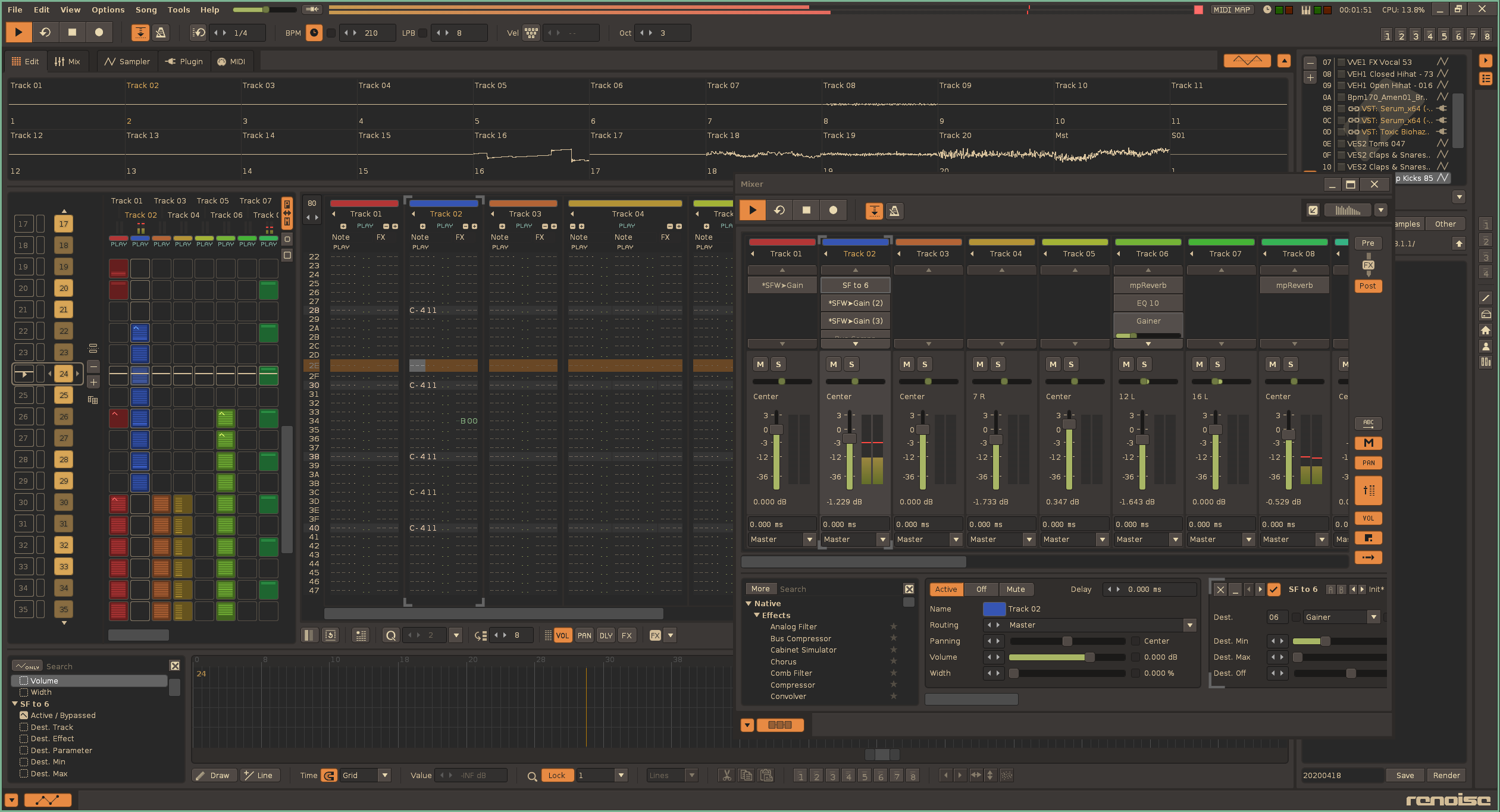
That means a lot, thank you! I made it because my laptop screen is bad, I hope everyone benefits from the contrast 
The Dracula theme is definitely working now! Good job guys, this theme is awesome!
Hello Renoise Community!
Here are 2 Themes from me, to give something back to our beloved Renoise Community.
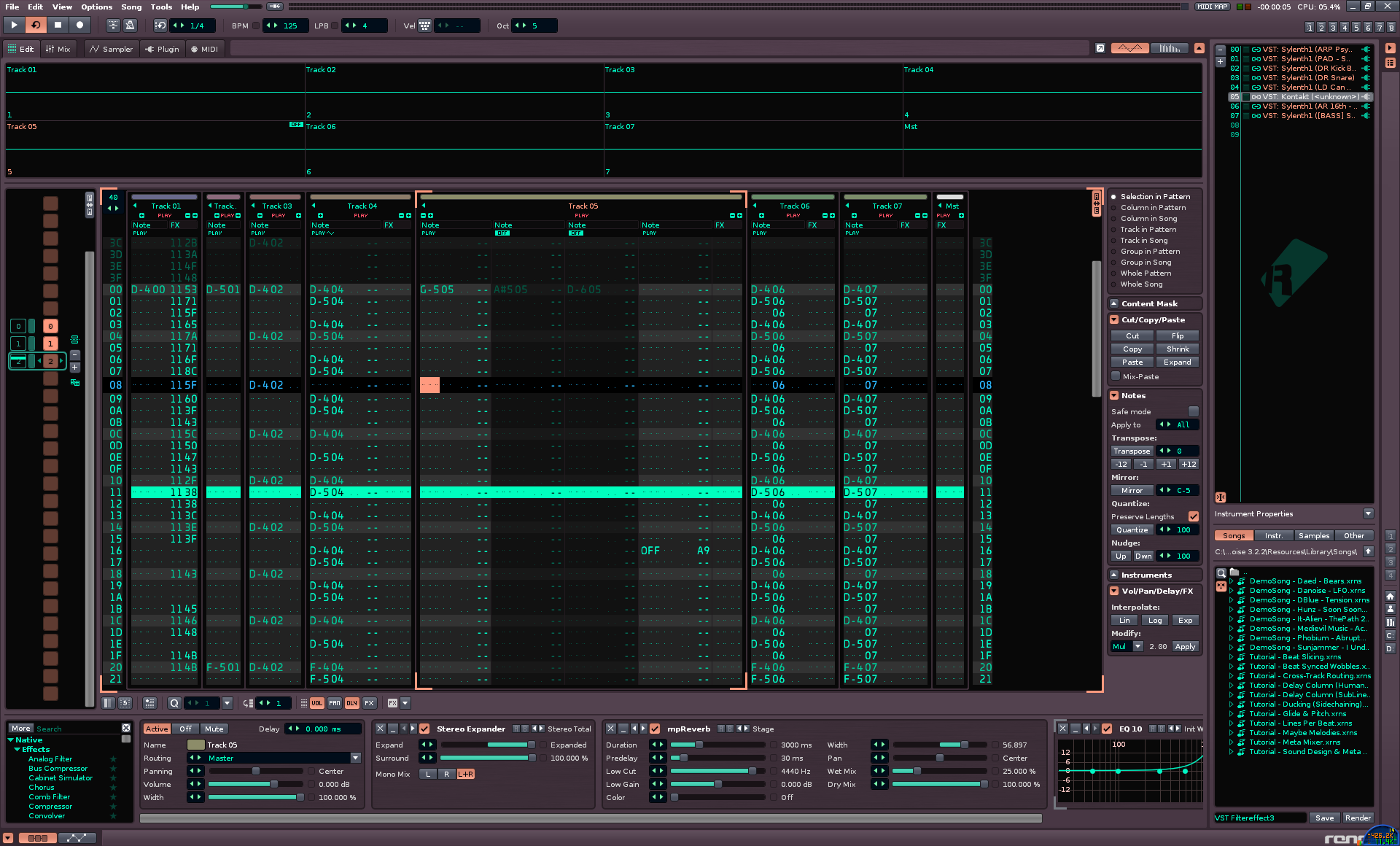
The “Digital Camo” Theme and “LED Style” Theme. Both are primary optimized for optical ergonomic and good visibility. “Digital Camo” Theme is on maximal Contrast for better visibility of actual selected Channel in the Mixerwindow. LED Style Theme is inspired on 80’ LED Displays with some more moderat Contrast. Test it out, maybe you will love it! 
Digital Camo Theme
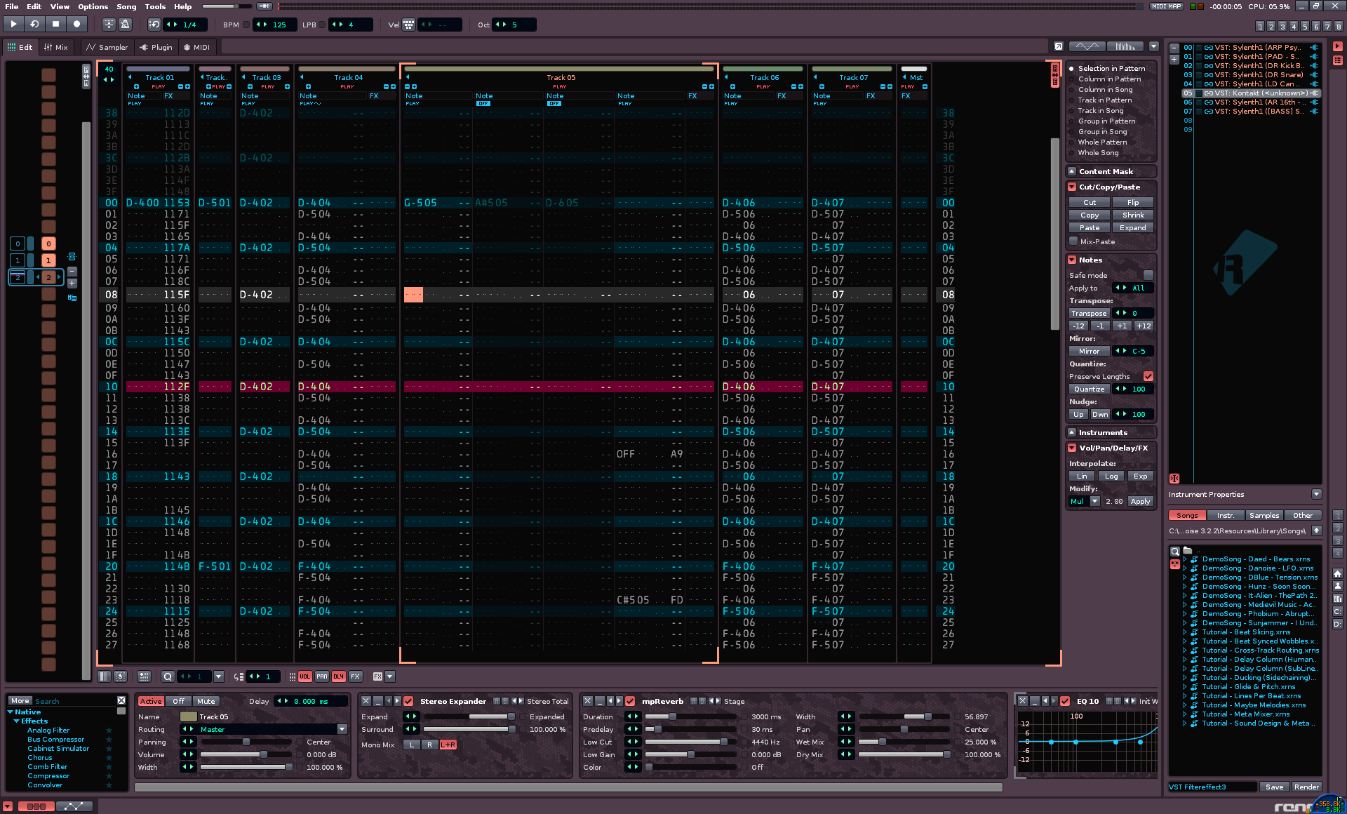
and
LED Style Theme
Glad you dig it. I made a small adjustment here recently when doing the redux version & noticed some ui text could be more distinct. It’s on GitHub now. Anyhow, thanks for like. 
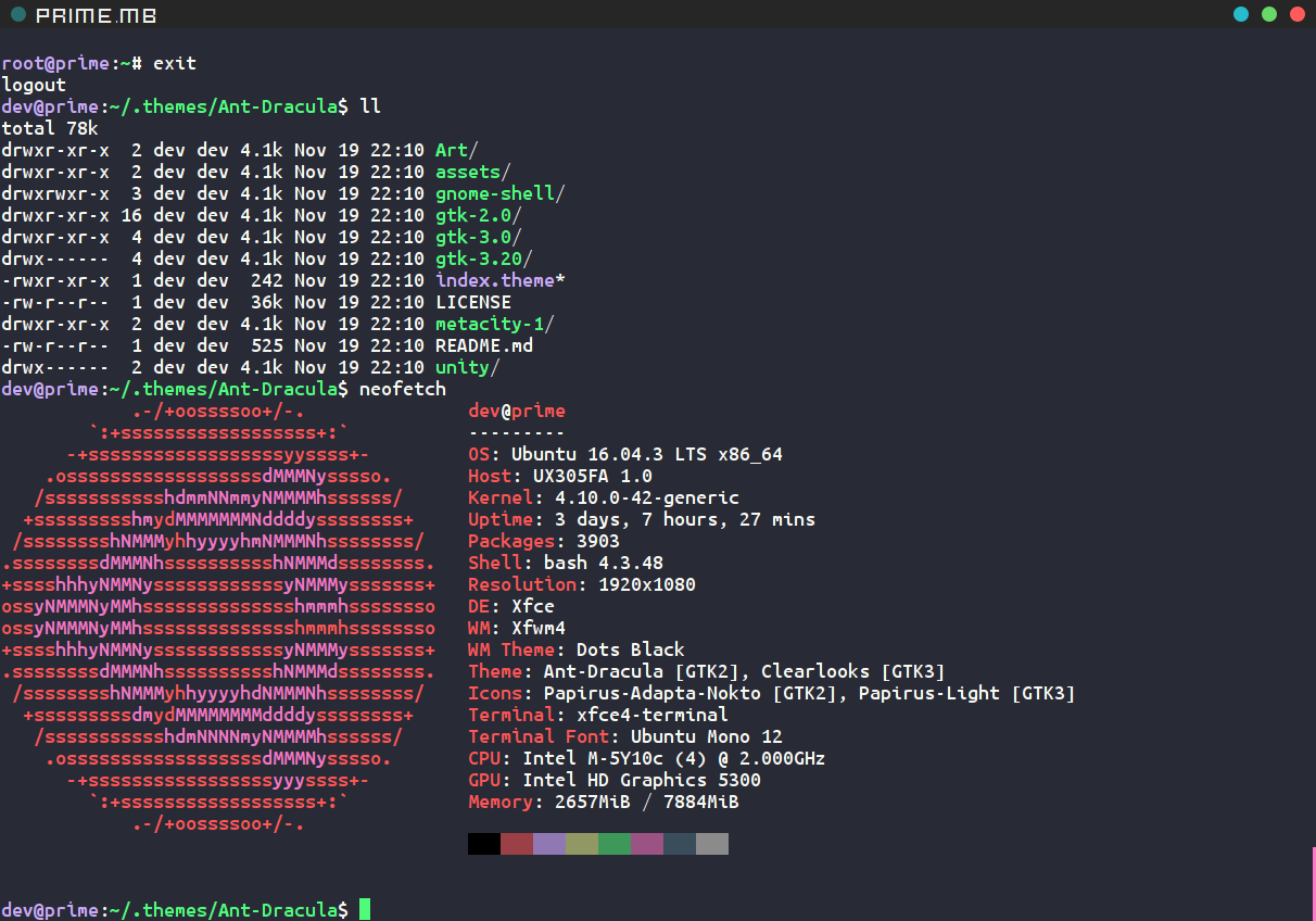
I’ve got an XFCE4 terminal Dracula adaption too, use it with almost everything so figure would look good in ReNoise.
This is really nice and clean, thanks for taking the time to post this. I really dig the pattern editor portion in contrast to the other sections. 
that looks painful to me, it’s too bright
this is my version

nonetheless - thank you a lot for your effort!
Different strokes for different folks  that looks to be Solaris theme in htop?
yes, solarized dark, p10k…vim(neovim  )
)
Ok mates, i made a slightly improved Version of my Digital Camo Theme. Visibility and
readability of Mainfont is better now. Here Some impressions.
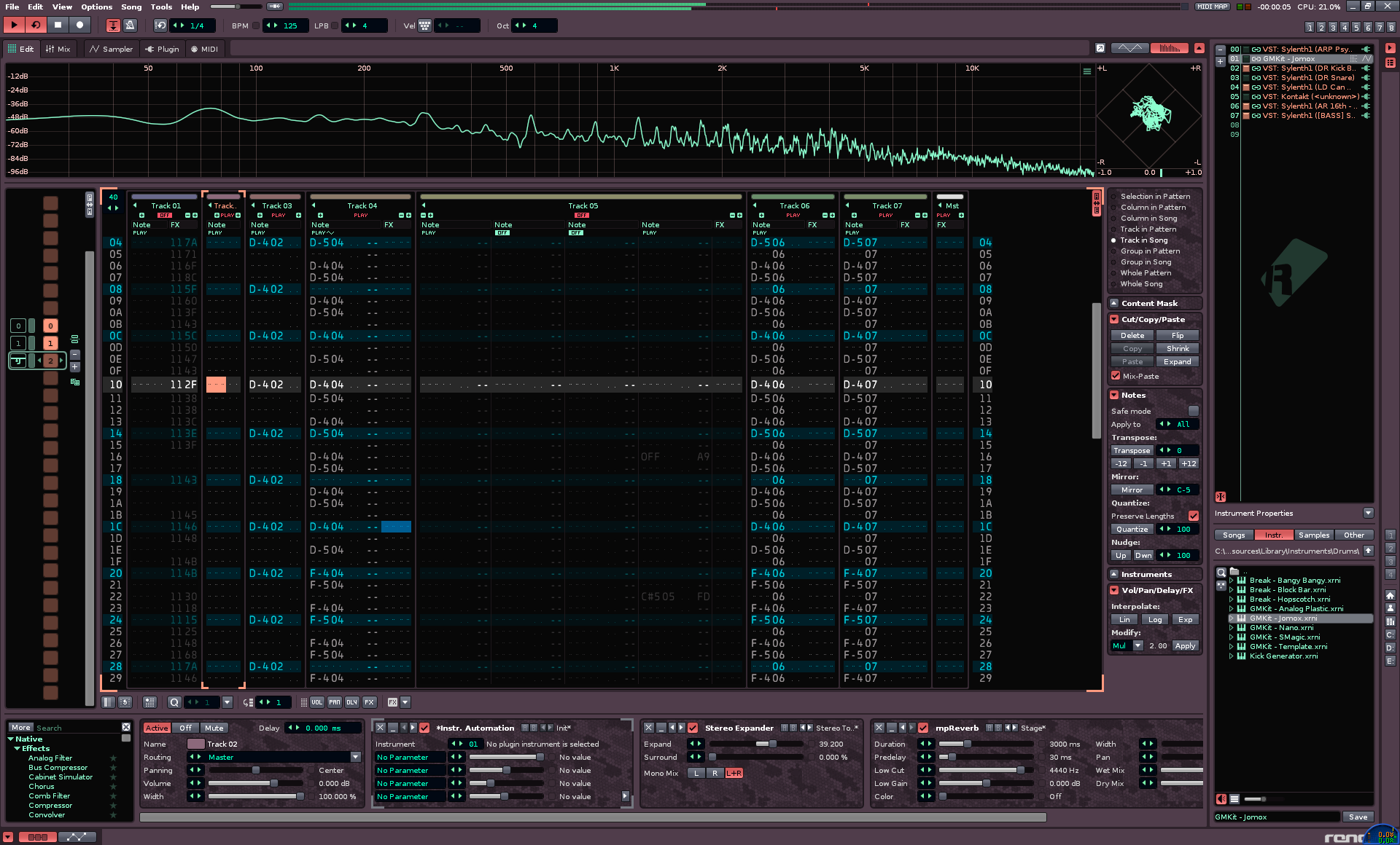
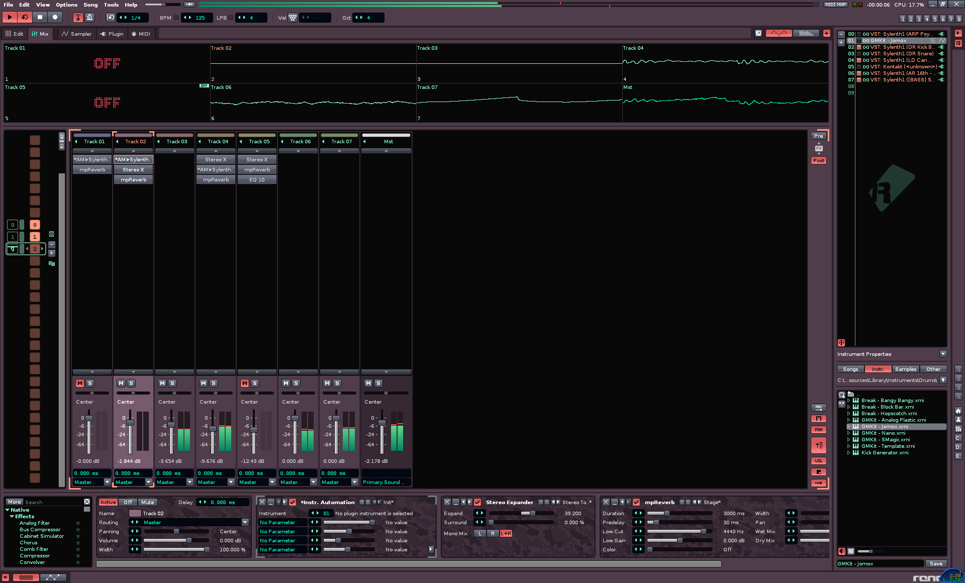
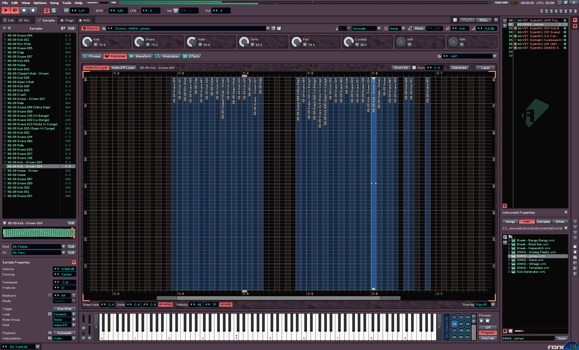
Enjoy it!
PS. An Ableton Monocrom Style Theme follow next 
Ok Mates, here it comes! 
Yesterday i made my “Ableton “Monochrome” Theme” Final.
Some Remarks first.
Not 100% Monochrome Theme. but approximately 90 %! I tryed to save all ergonomic visibility and readability. This was not easy, because human eyes have a significant lowered contrast perception on monochrome Visuality. But i think the result become fairly good. Track Colors i not switch to Monocrome because they are depending from loaded song, and i set a few Color accents on Patternwindow, Samplerslicer and Automation curves. After some testing i decide to make the monochrome VU-Meter View red, if it Oversteer because of better visibility. The First one inverted method was not so good to capture.
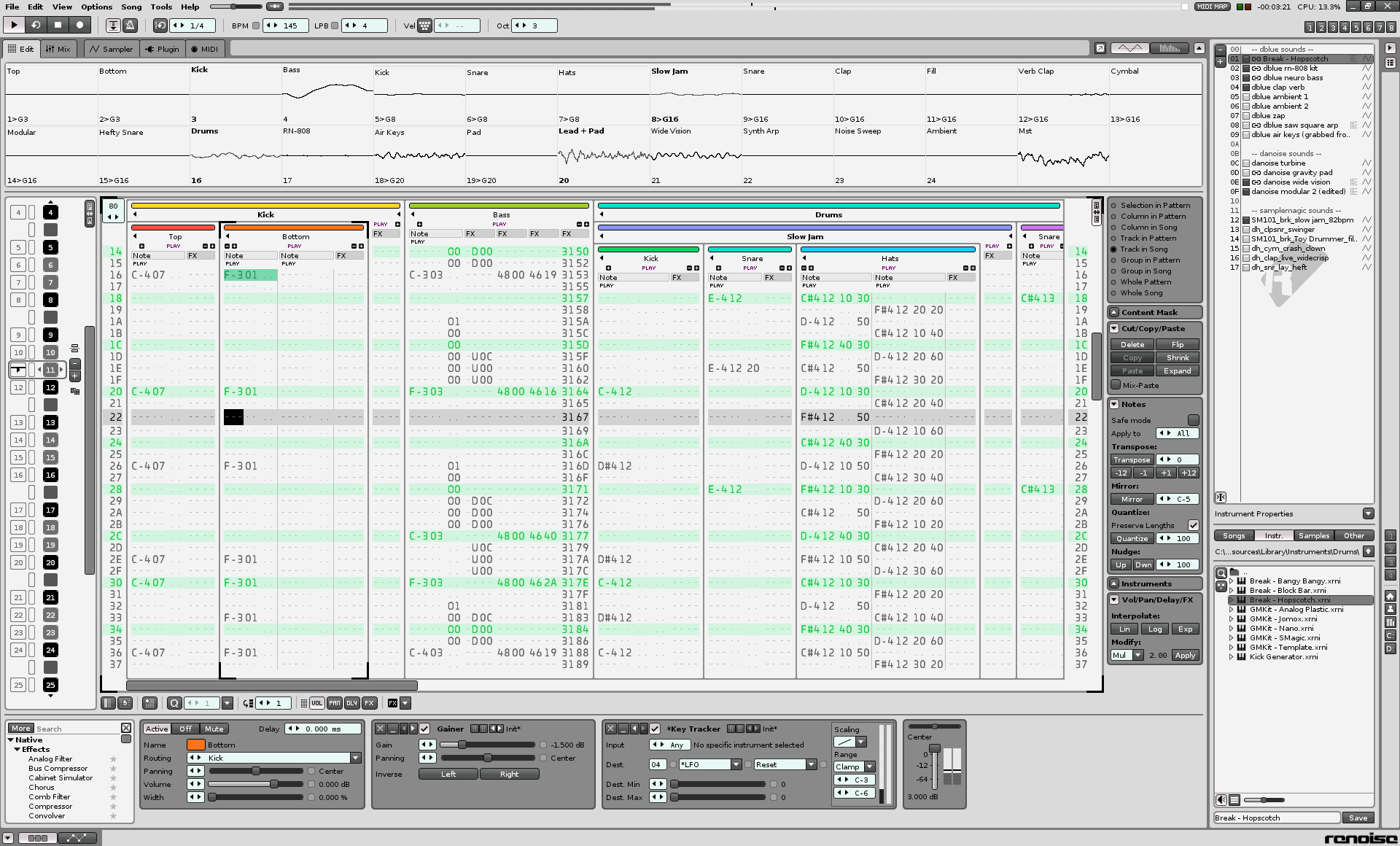
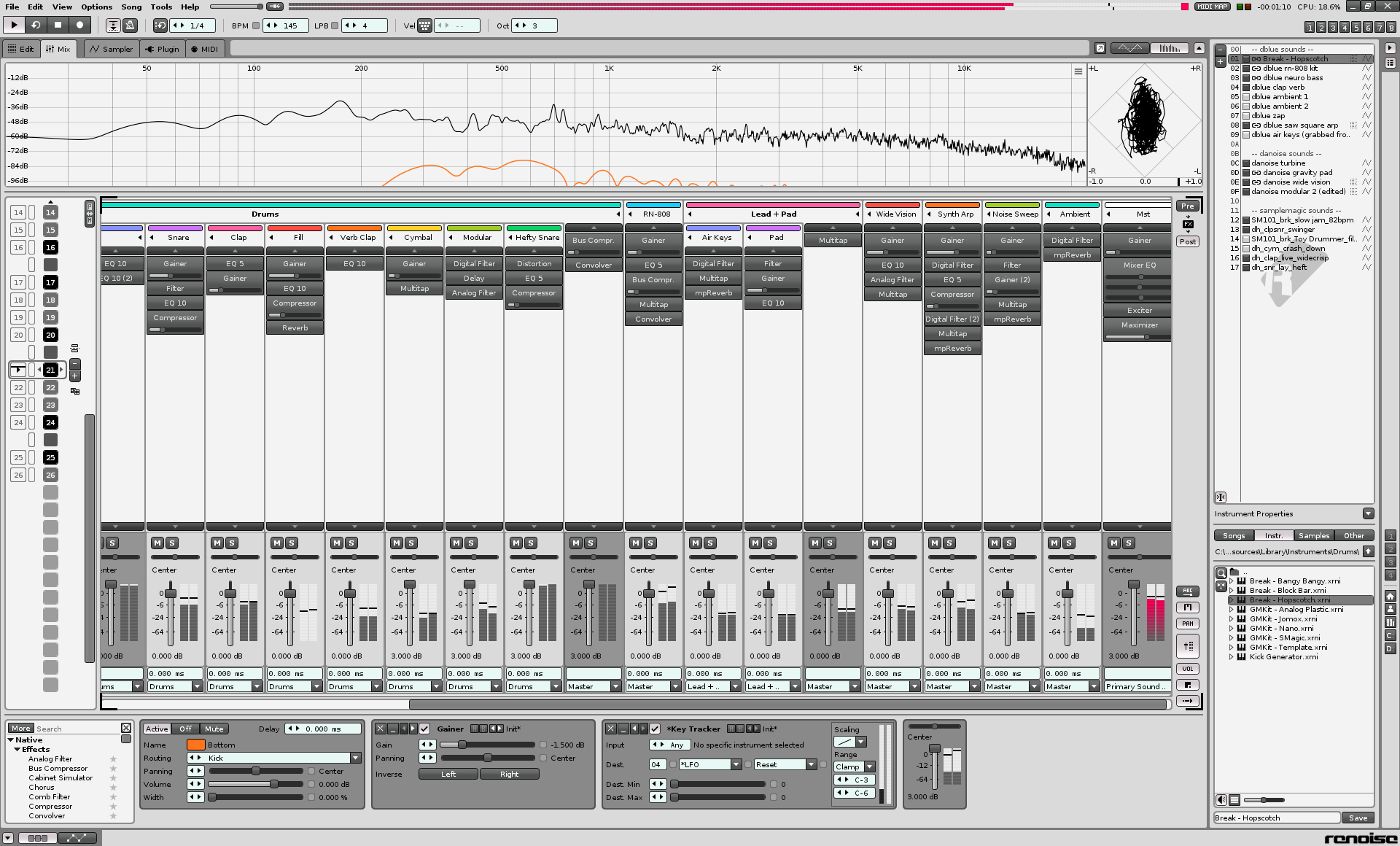
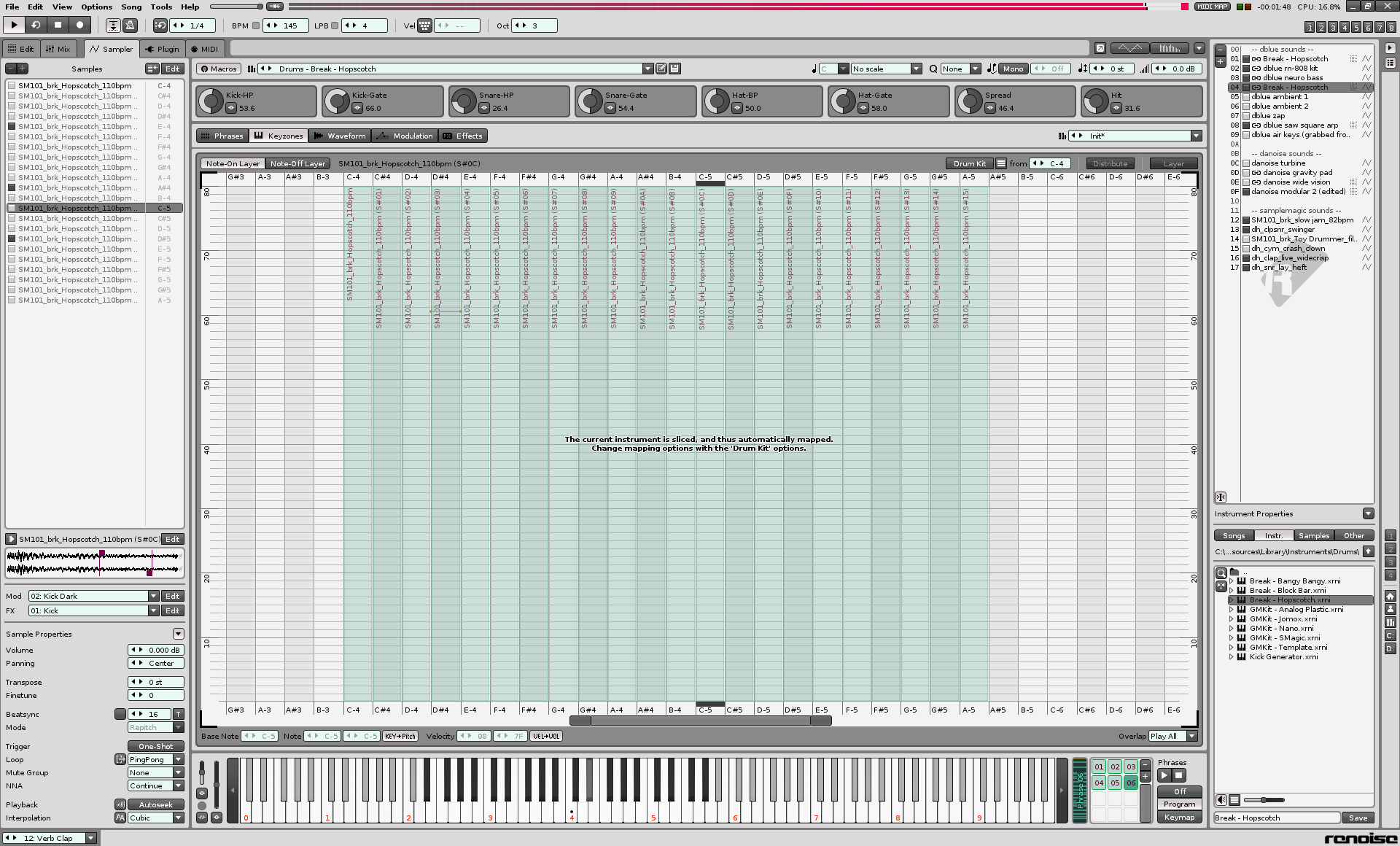
Yesterday i forget to post Download link for Digital Camo Them Mk.2. So her it is.
Last i want say, that i would be very happy if there where a central Github archiv for the Themes because the FileHoster Links are gone in one week. I spend my scant free time with the work and testing on these Themes and it would be very nice if this work not get lost in digital nirvana at the end. I have not the time to reupload this again and again. Keep it on/share it …and happy tracking! 
Ps. Sorry for my imperfect english
@NPC1 that cammo theme improvement looks awesome, i will use it for a couple of days to see how i react to it 
i think there was some reply/post about customizing panels with bitmap-custome images, can someone reshare or create a separate ‘document’ page where it is explained how one should approach modding the interface theme?
Thank you in advance
@dspasic
Hi mate, all you need is in the Theme archiv. Simply copy the folder “Digital” in your Renoise “Texture” Directory and then choose under Preferenes -> Gui -> Textures “Digital”. That’s it! 
happy tracking
What do you think about it? Cool? Good? Bad? Not needed? Crap? 
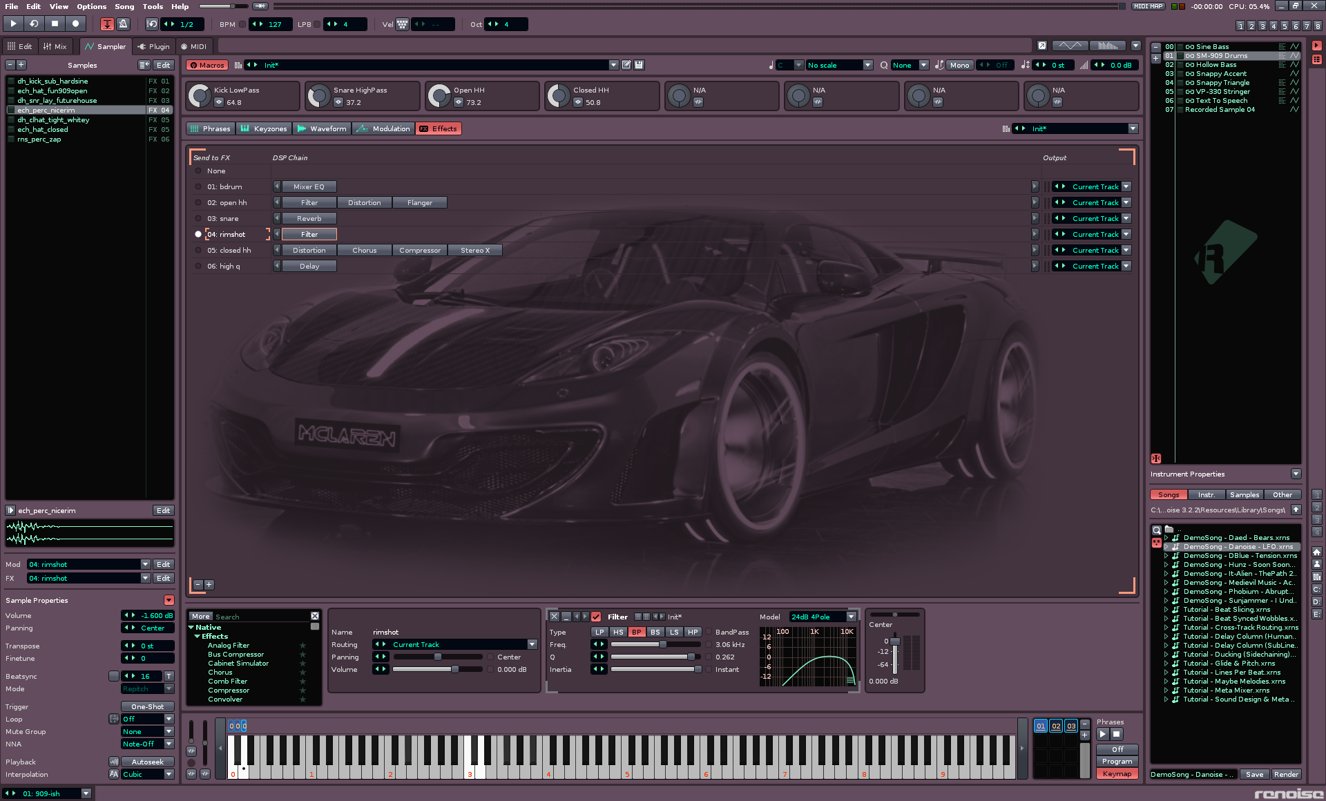
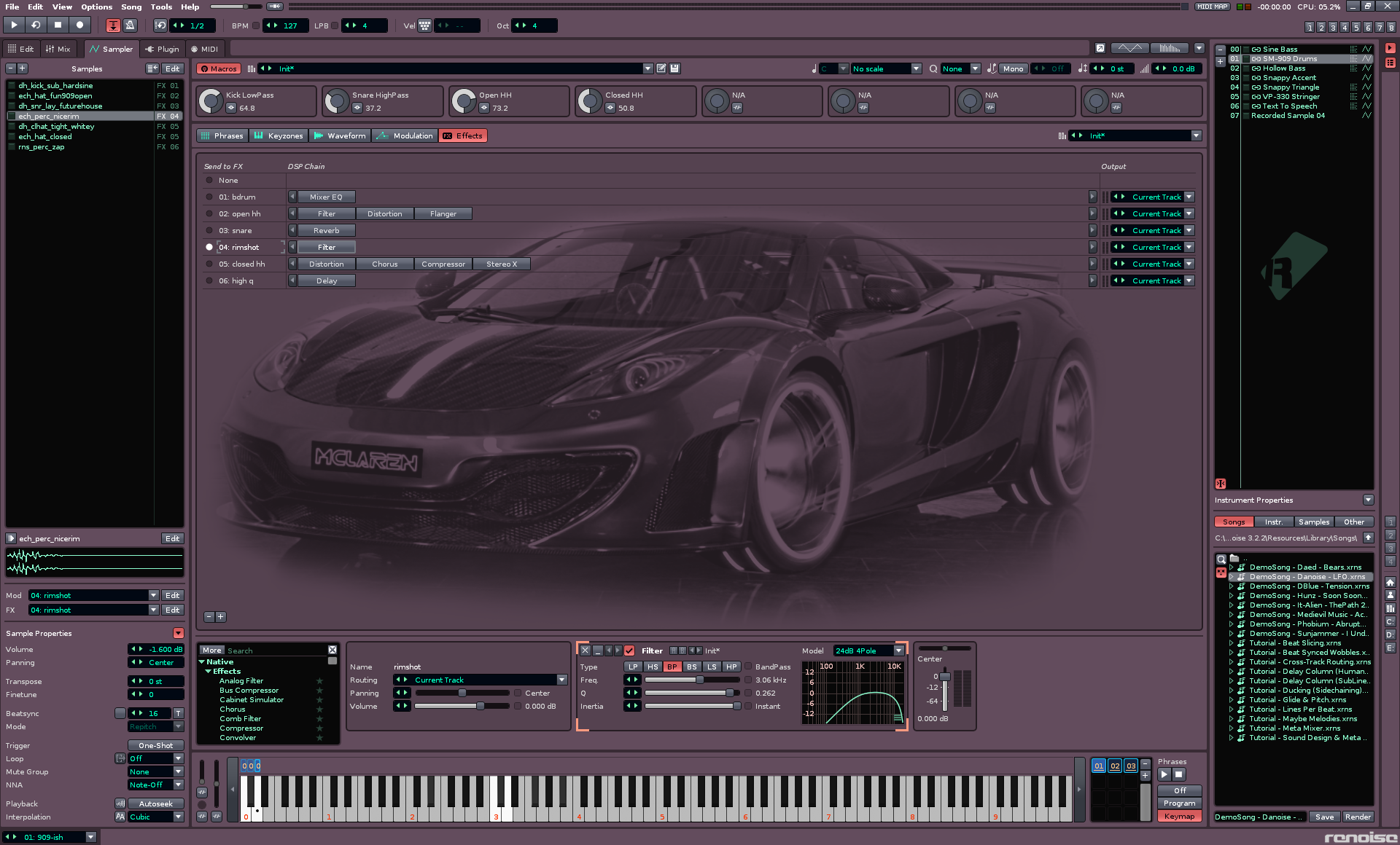
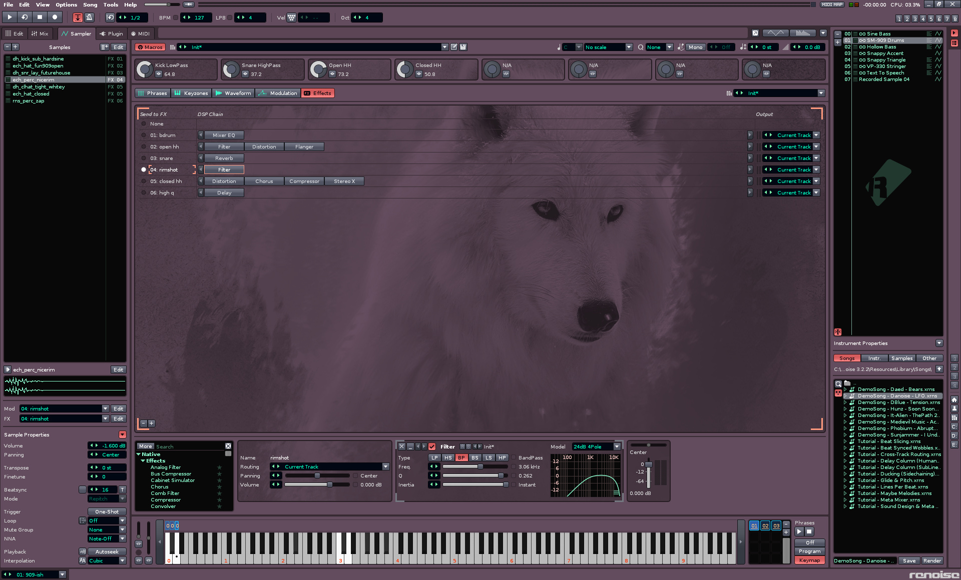
Themes, colors, skins, patterns, textures, backgrounds, wallpapers, widgets, fonts… I like all features that allow a user to customize a tool! So for me it’s a big YES!
Here’s a few of my themes. I usually use the Brownie theme as it’s nice on my aging eyes.
Retro Grey Vivid:
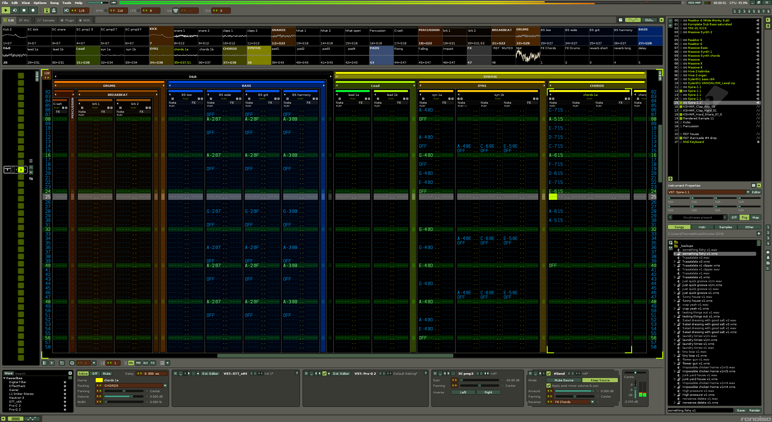
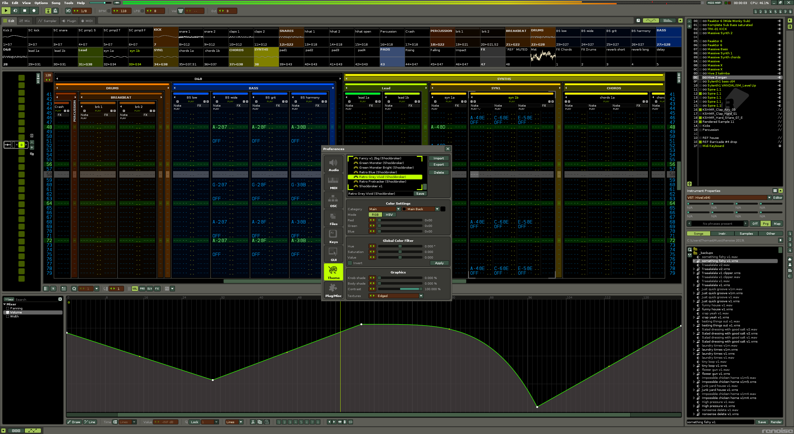
Retro Grey Vivid (Shockbroker).xrnc (4.9 KB)
Brownie Night:
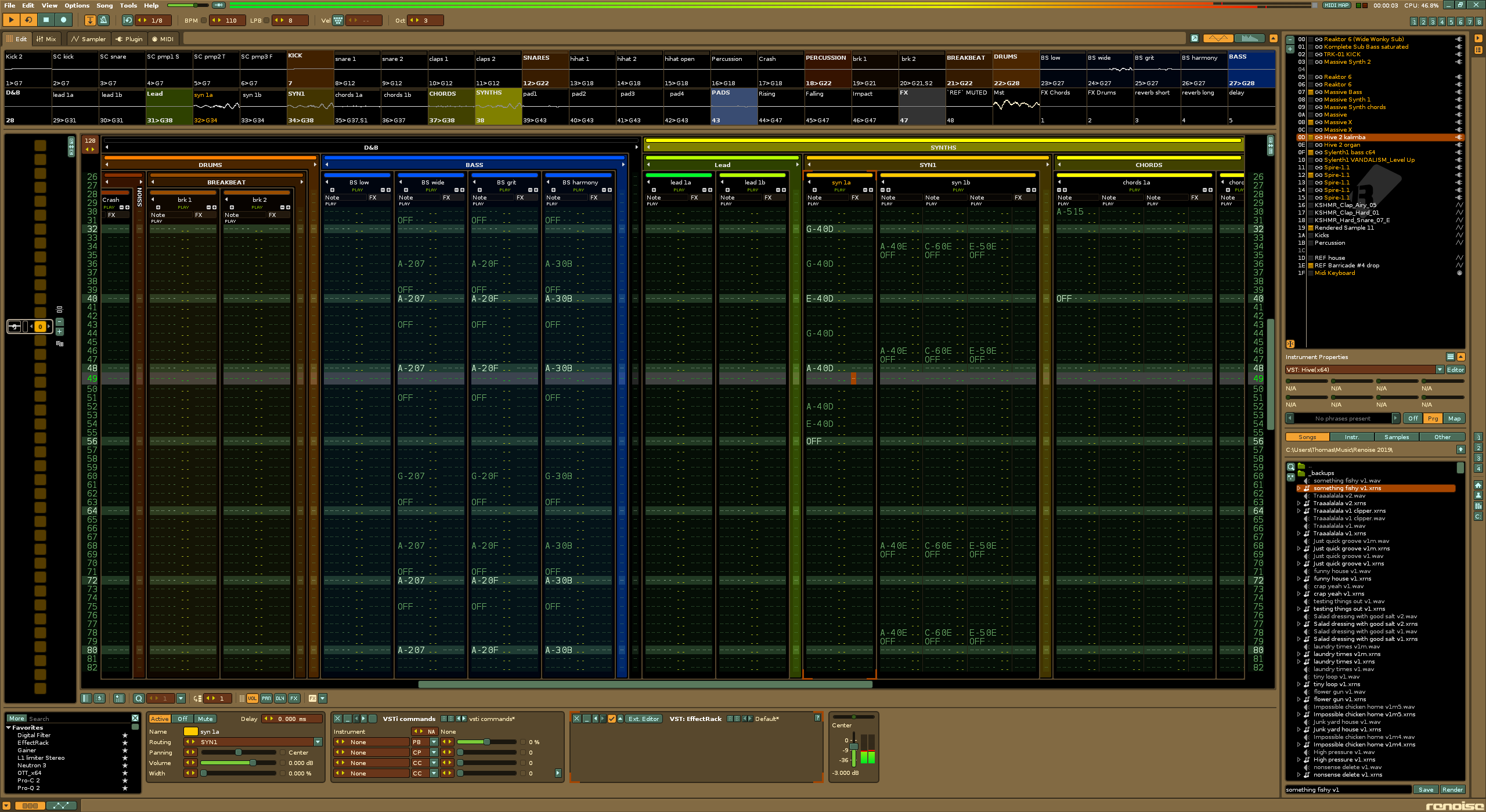
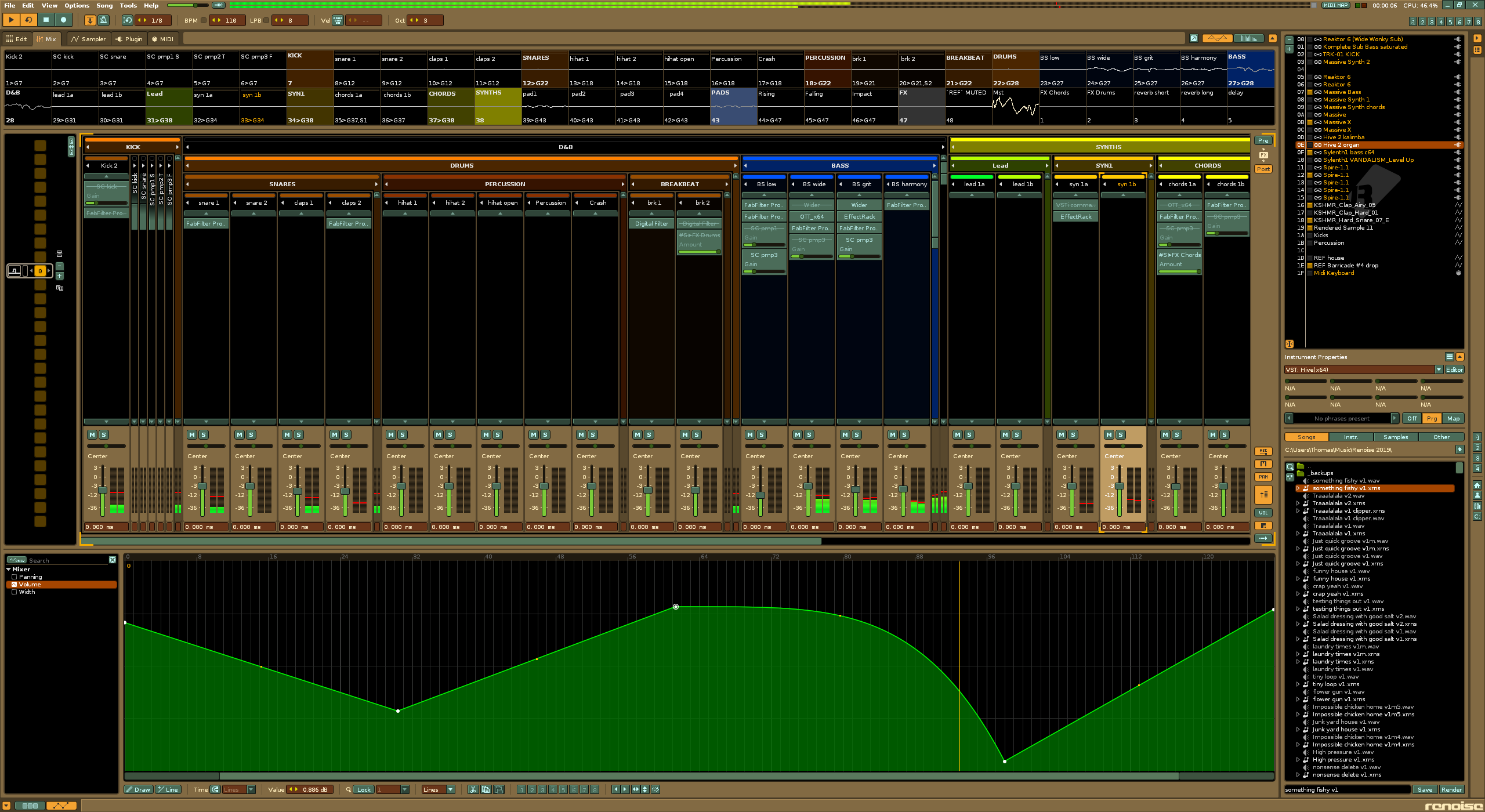
Brownie Night (Shockbroker).xrnc (5.0 KB)
how did you add images to the background like that ive been trying to do that for a while
@unconventionalmauric You have to use the files in Texture Folder. 
happy tracking