Hi guys, I’m a brand new forum member!
My quest to find the perfect DAW finally led me here to Renoise. I love it, and think I’ll be using it for many years!
I grew up using trackers (Octamed, Pro Tracker) and have always preferred the Tracker style of interface to modern-style DAWs. I love the control, power, and precision a tracker offers - all the note information visible as code, quickly editable with keys! 
However, as we know, modern-style DAWs do have a couple of advantages over trackers:
- “Piano roll” lets you see the general shape of your melodies
- Track waveforms let you see what each track is doing at any given moment
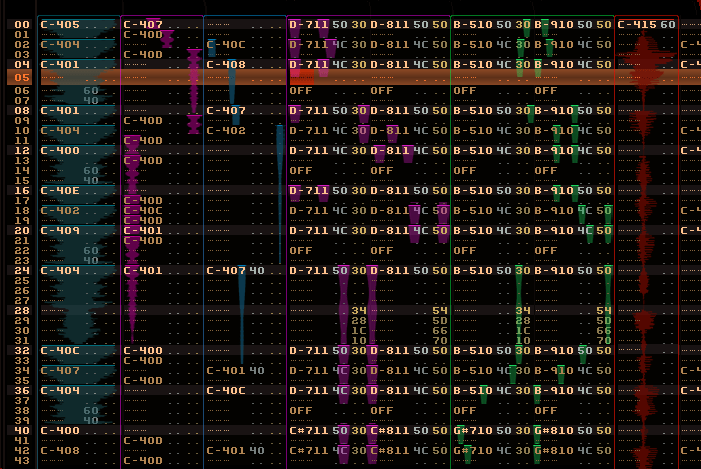
As a graphic designer with a passion for interface design, I’d like to present my own solution to this problem - how I wish Renoise looked.
I know people have discussed solutions in the past (eg here) but I haven’t seen anything quite like my idea:
Features of my design:
- I’ve never liked horizontal piano rolls; my piano roll is vertical, with notes arranged left to right like a keyboard.
- There’s no piano keyboard image. I don’t need one, I only need to see the shape of the melodies
- Notes are entered with keys, same as always. I hate the idea of using the mouse to “draw” notes.
- Each melody range (from lowest to highest note) automatically stretches to fill the column width
- That means if a track only has samples in one pitch (eg vocals, kick drum) it fills the entire width, which is what you want
- Each note is a mono waveform, with a solid line at the top to clearly indicate the start of each new sample
- Unlike other piano rolls I’ve seen, the width of each note slightly overlaps the adjacent notes, making better use of the space
- Another feature of my idea is that multiple tracks can be “grouped” (see tracks 4-5 and 6-7 above). This combines all their notes together in the same space, ideal for chords
- Note that this is only a rough sketch. I would gladly develop the design further if anyone was interested. (I have a few other ideas but don’t want to get ahead of myself.)
- Also note the basic skin used here is not mine, it’s based on some random screenshot I downloaded. (Funny thing is, I haven’t even downloaded Renoise yet, I’m far too busy redesigning the interface!)
 LOL
LOL


