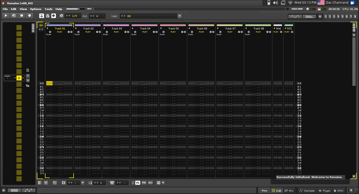
First, an image to get you started. Please click and look before reading the rest.
All (my) monitors are wide screen. This has been the case for years now. Gone are the VGA cathode tubes of yesteryear. What that means is I have more pixels to waste from left to right than I do from top to bottom.
IMHO Since trackers are vertical it is extremely important to design for them, not against them!
Problem:
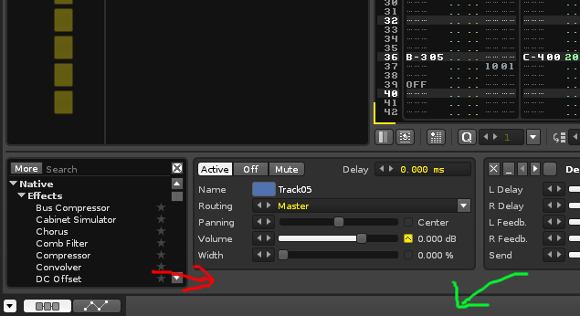
In the above screenshot the red arrow is “reserved space” for a scrollbar while the green arrow is unused space that does nothing. I can pull up half a dozen vertical bars (that do more or less nothing) like this in the current interface but am too lazy to makes more screenshots…
Problem:
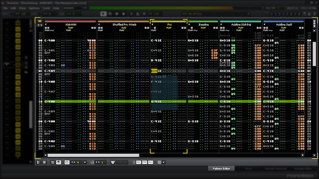
As a thought experiment, try to make as much room as possible for the tracker (the spreadsheet) by hiding everything else.
No matter how hard I try to hide everything I end up with 3cm of task bars on my laptop that sit there idling. 2cm at the top and 1cm at the bottom. That’s 20% of the screen for my X220!
Contrast:
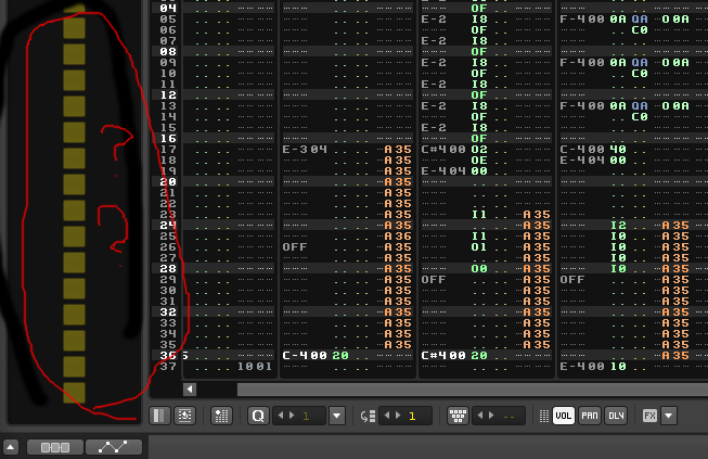
Above is as small as I can get Pattern Sequencer. So much empty space here? No actual information? Much worse if you expand it? At least it’s horizontal space, but couldn’t it be put to better use?
Executive summary.
I just want to bring this up because the new Renoise interface, although slick and improved, seems to me a hodgepodge of tabs stacked on top of taskbars stacked on top of status bars stacked on top of accordions. If you guys are going for a total revamp please think about the space you are using on the monitors we now have. Simply stated, it makes me think of the first image I asked to be clicked and every time you put a horizontal task bar in my face I cry.
Thank you for your consideration.
Disclaimer: I understand the second screenshot is misleading. There is usually some valuable info here. Still, this is a screenshot from an actual demo song (The Path). Still, I cannot hide this space…


